
First impressions begin at the front door, where small styling decisions quietly shape how a home feels. An entryway decorative tray offers structure, function, and visual balance in one compact surface, keeping essentials organized while signaling intentional design. From layered textures to curated everyday objects, a well-planned tray arrangement reduces clutter and elevates usability without overwhelming limited space. Homeowners seeking practical yet stylish solutions benefit from understanding scale, material contrast, and purposeful styling. These ideas help create a welcoming drop zone that supports daily routines, complements interior aesthetics, and adds instant polish, making entryway trays a smart, high-impact design choice.
Daily Drop Minimal Tray
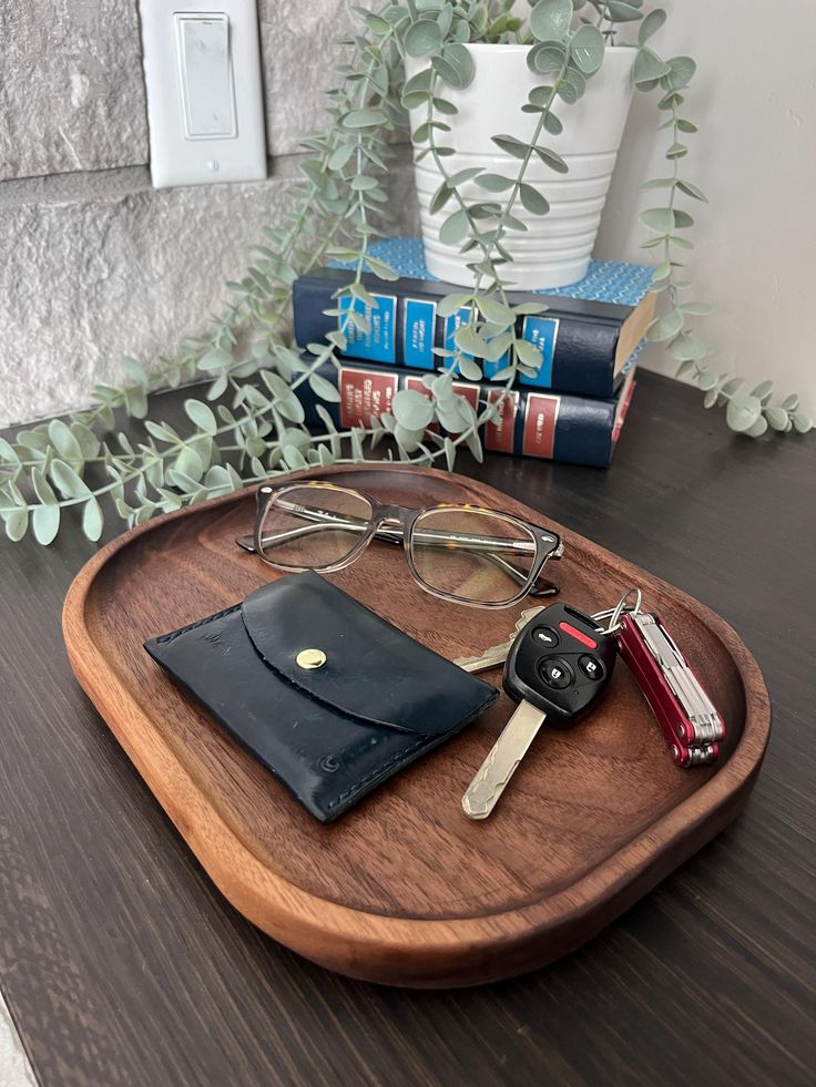
Everyday entry points benefit from a pared-back surface that supports routine without visual noise. This arrangement relies on a shallow tray in stone, matte metal, or sealed wood to hold only what arrives and leaves daily. Keys, earbuds, transit cards, and a slim wallet earn designated placement, reducing last-minute searching. Neutral finishes prevent distraction and allow the tray to blend with surrounding decor, whether placed on a console, shelf, or narrow ledge. Proportion matters; the tray should feel intentional rather than oversized, leaving breathing room around it. A single grounding element, such as a small paperweight or smooth pebble, adds weight without clutter. Maintenance stays effortless because excess items become immediately noticeable and are easy to remove. This setup suits compact entryways, apartments, or shared homes where multiple routines intersect. The result supports efficiency, reinforces habits, and keeps surfaces visually calm. By limiting what appears here, the space communicates order and reliability, setting a composed tone upon arrival and departure. Consistency is key; returning items to the same place daily ensures the tray functions as a reliable anchor rather than a catchall. Over time, this restrained approach reduces friction and supports smoother transitions throughout the day.
Sculptural Object Trio Tray
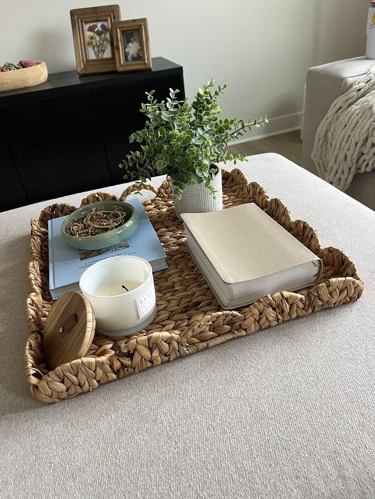
Visual interest emerges when form leads the arrangement rather than quantity. This concept centers on three sculptural pieces that differ in height, material, and silhouette while sharing a cohesive palette. A ceramic vessel, a carved wood object, and a small metal accent create rhythm without overcrowding the tray. Negative space is essential, allowing each form to read clearly. Placement follows an uneven triangle, guiding the eye naturally across the surface. Functional items remain secondary, tucked discreetly behind or integrated into sculptural forms, such as a lidded bowl for keys. This approach works especially well in design-forward homes where the entryway doubles as a visual statement. Light interacts with varied surfaces, adding depth throughout the day. The tray itself should be understated so the objects remain the focus. Seasonal updates are minimal; swapping one piece refreshes the entire look. This styling signals intention and taste without appearing staged. By limiting the arrangement to three considered elements, the tray feels curated rather than decorative, offering a refined first impression that balances artistry with subtle practicality.
Soft Neutral Layered Tray
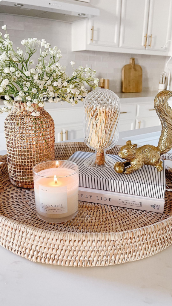
Calm, welcoming entryways often rely on tonal harmony rather than contrast. This setup builds interest through layers of soft neutrals such as warm beige, linen, clay, and muted gray. A textured tray forms the base, supporting a fabric-lined catch dish, a ceramic container, and a low-profile accessory. Variation comes from material shifts instead of color changes, keeping the look cohesive. Rounded edges and matte finishes help the arrangement feel approachable and relaxed. Items used daily remain accessible but visually blended, preventing the tray from feeling busy. This approach pairs well with natural light and works seamlessly in both modern and transitional interiors. The absence of sharp contrast allows surrounding elements, like wall art or lighting, to stand out without competition. Regular upkeep involves simple editing rather than restyling. The tray remains adaptable, accommodating small additions without losing balance. This method appeals to those seeking a quiet, polished entry without strong visual statements, offering an inviting pause before moving further into the home.
Season-Swap Styling Tray

Flexibility defines this arrangement, making it ideal for those who enjoy subtle updates throughout the year. A neutral tray anchors the setup while interchangeable accents reflect seasonal shifts. Warmer months may introduce light wood, glass, or fresh greenery, while cooler seasons bring darker ceramics, woven textures, or metallic finishes. Core items remain consistent, ensuring function stays intact. The key lies in limiting swaps to one or two elements, preventing unnecessary storage demands. This strategy keeps the entryway feeling current without requiring a full refresh. Colors shift gently rather than dramatically, maintaining cohesion with existing decor. Placement remains familiar, supporting daily routines while allowing visual variation. This approach suits households that appreciate change without constant redesign. By planning a small rotation of accessories, the tray evolves naturally over time. The result feels thoughtful and intentional, offering a refreshed welcome that aligns with the rhythm of the year while preserving practicality and order.
Mirror-Backed Light Catch Tray
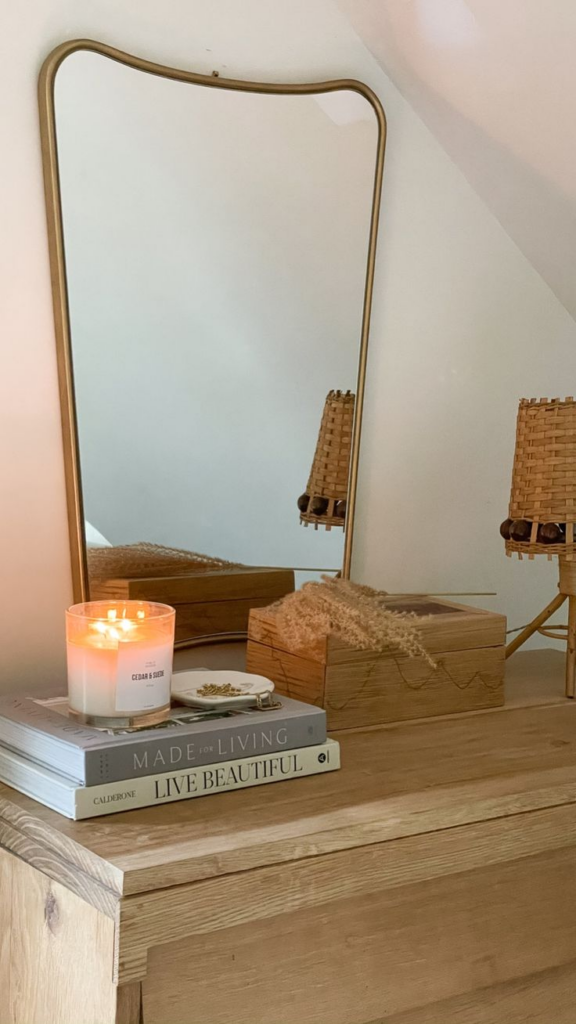
Reflective surfaces introduce brightness and depth, particularly in entryways with limited natural light. This arrangement uses a mirrored or high-gloss tray to amplify surrounding illumination. Light bounces across the surface, making the space feel larger and more open. Items placed here should remain minimal to avoid visual clutter, allowing reflections to stay clean. Glass containers, polished metal accents, and clear forms complement the reflective base without overwhelming it. Functional pieces appear lighter, almost floating against the mirrored backdrop. Placement near a wall sconce or window enhances the effect further. Fingerprints and dust become more visible, so restraint is essential. Regular wiping keeps the tray looking intentional rather than busy. This styling works well in narrow halls or darker foyers where added brightness improves first impressions. The reflective quality elevates simple objects, lending a subtle sense of refinement while maintaining everyday usability.
Green Accent Micro-Tray
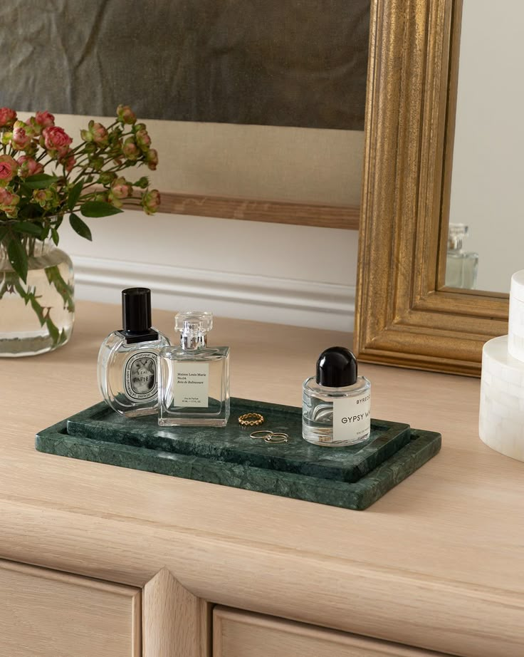
A compact tray with a living element introduces freshness without demanding space. This setup centers on a small plant or preserved greenery paired with essential items. The tray size remains intentionally modest, ensuring the arrangement never feels crowded. Greenery softens hard surfaces and adds visual life to consoles or shelves. Low-maintenance options such as succulents or faux botanicals keep upkeep manageable. Supporting items stay minimal, often limited to keys or a single accessory. Natural materials like wood or stone complement the organic focal point. This approach suits smaller entryways where every inch counts. The presence of green offers a calming transition into the home, balancing function with warmth. Regular trimming or dusting maintains a clean appearance. By keeping scale in check, the tray feels purposeful rather than decorative, delivering a fresh welcome without sacrificing practicality or order.
Hotel-Inspired Symmetry Tray
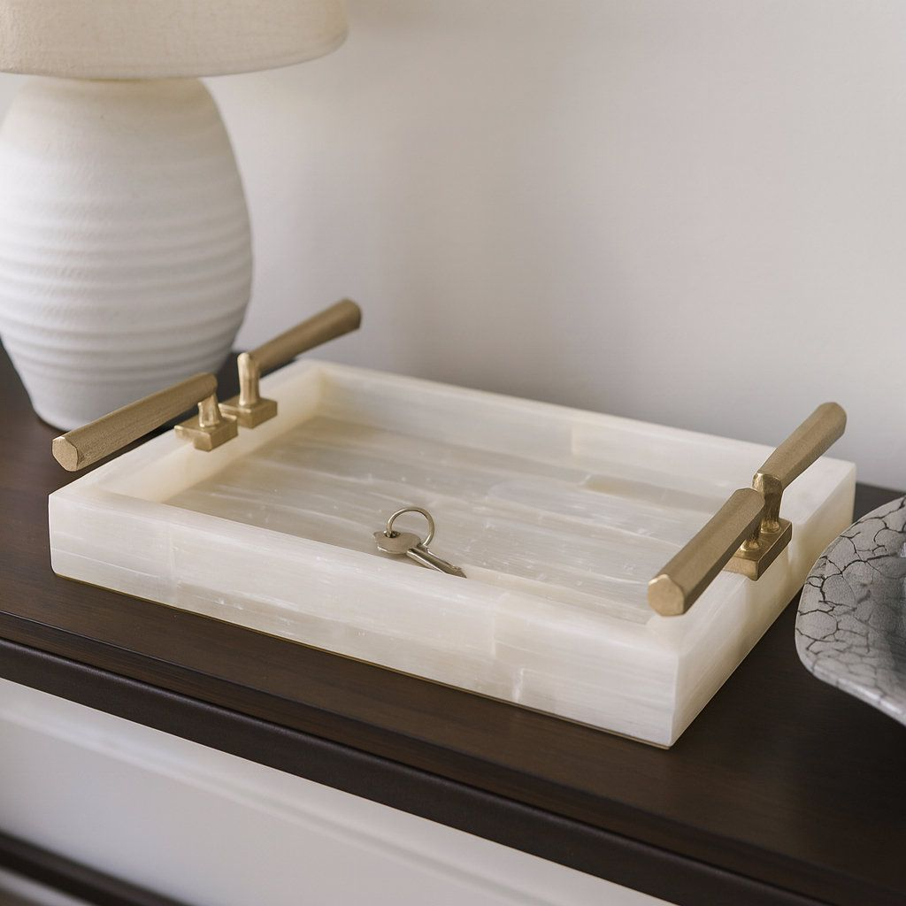
Order and balance define this arrangement, drawing inspiration from hospitality interiors. Symmetry creates an immediate sense of calm and polish. Matching containers placed on either side of a central element establish structure. The tray itself should be proportionate to the surface, anchoring the composition. Neutral colors reinforce the refined feel, while subtle texture prevents flatness. Functional items are duplicated when possible, reinforcing balance. This styling works particularly well in formal entryways or homes with classic design cues. The predictable layout simplifies daily use, as items always return to the same position. Maintenance involves preserving alignment rather than frequent editing. This approach communicates reliability and quiet luxury, offering a composed welcome that feels intentional without excess decoration.
Hidden Storage Tray Setup

Function takes priority in this arrangement, addressing the need to conceal everyday clutter. A tray with integrated compartments or paired with lidded containers keeps essentials accessible yet out of sight. Visual calm remains intact even during busy routines. Materials lean toward durable finishes that withstand frequent handling. The exterior stays simple, allowing the hidden storage to do the work. This setup suits households with multiple users or high traffic. Items remain sorted, reducing time spent searching. The tray reads as decorative while functioning as an organizational tool. Regular clearing prevents overflow. By prioritizing concealment, the entryway maintains a tidy appearance without sacrificing convenience or speed.
Scent-First Welcome Tray
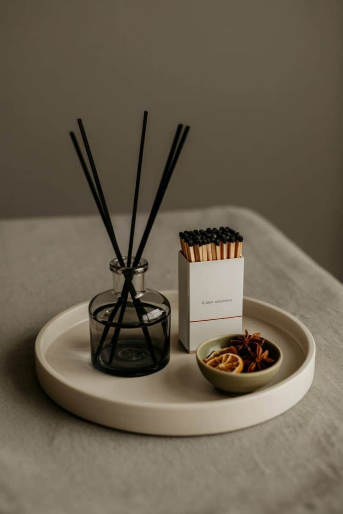
Atmosphere begins before visual details register. This concept places fragrance at the forefront using candles, diffusers, or scent stones. The tray supports one primary scent source, complemented by minimal functional items. Neutral containers prevent distraction, allowing fragrance to set the tone. Placement ensures airflow carries the scent gently into the space. Seasonal adjustments keep the experience fresh without altering the structure. This approach enhances the emotional impact of arrival, offering a subtle sensory cue that the home begins here. Careful selection avoids overpowering notes. The tray remains uncluttered, reinforcing the idea that scent, not objects, leads the experience.
Texture-Contrast Statement Tray
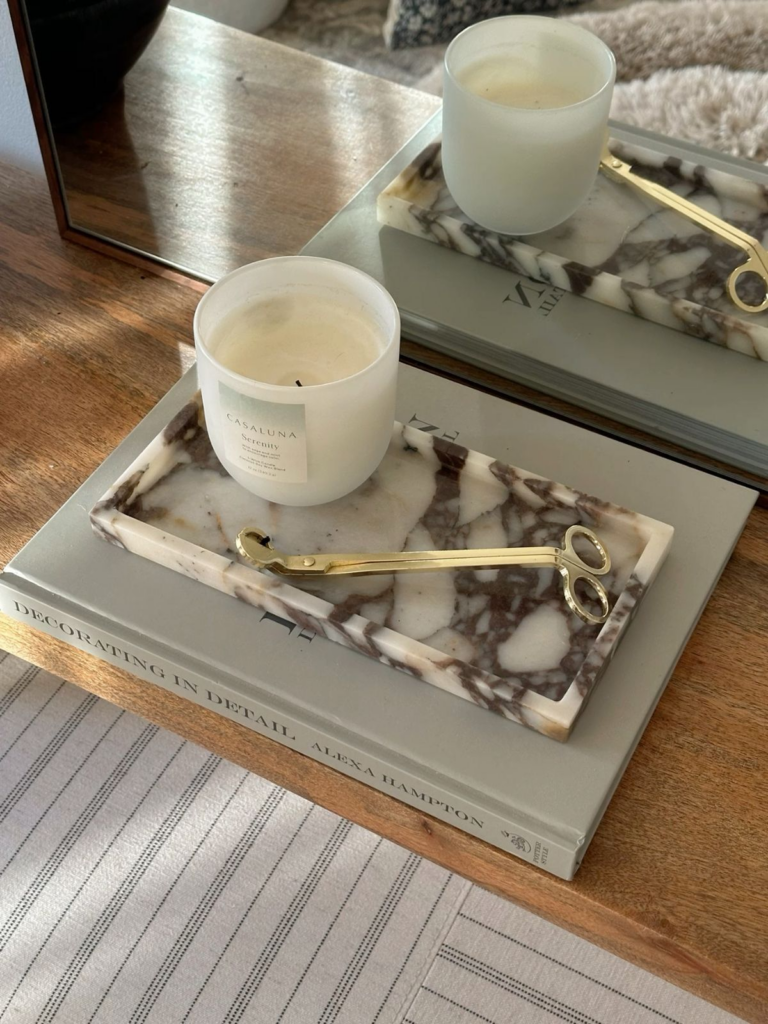
Interest emerges through tactile variation rather than color. This arrangement pairs contrasting textures such as smooth marble, rough stone, woven fiber, and polished metal. The tray acts as a neutral stage, allowing textures to interact. Functional items become part of the composition through material choice. Balance comes from limiting the number of elements while maximizing contrast. This setup suits contemporary spaces seeking depth without bold color. Light highlights surface differences throughout the day. Maintenance focuses on preserving material quality. The result feels intentional and layered, offering visual richness while remaining practical.
Vertical Accent Tray Styling
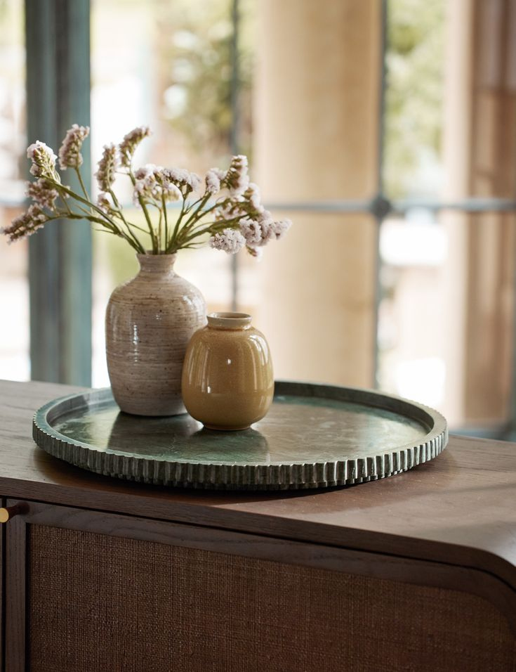
Height variation adds dimension to entryway surfaces. This setup introduces a vertical element such as a tall vessel, slim sculpture, or narrow lamp alongside low-profile items. The tray anchors the composition, preventing the vertical piece from feeling disconnected. Proportion remains critical; height should complement, not overpower. This approach draws the eye upward, making small spaces feel more expansive. Functional items remain accessible at the base. The vertical accent becomes a visual marker, guiding movement through the space. This styling works well beneath wall art or mirrors, reinforcing vertical lines. Regular editing keeps the balance intact.
Monochrome Entry Tray Edit

Unified color palettes create cohesion and clarity. This arrangement commits to a single tone, varying only in shade and finish. Black, white, or gray palettes work particularly well, offering timeless appeal. The tray and accessories blend seamlessly, allowing form and texture to stand out. Functional items disappear visually, reducing perceived clutter. This approach suits modern interiors where restraint defines style. Maintenance involves preserving the color story by removing off-tone items promptly. The result feels intentional and refined, delivering a calm, organized entry that supports daily routines without visual distraction.