
First impressions often hinge on how well the entryway functions and feels within seconds of walking inside. Poor layout choices, cluttered surfaces, and overlooked lighting can quietly undermine both style and practicality. Many homes suffer from avoidable entryway mistakes that affect daily routines, storage efficiency, and overall flow. Understanding these common design errors helps homeowners improve organization, safety, and visual balance without costly upgrades. This guide highlights practical insights rooted in real-world interior design principles, offering clear solutions that support better space planning, cleaner sightlines, and a more welcoming entrance that works effortlessly every day.
Oversized Furniture in Tight Entrances

Space pressure often begins the moment bulky pieces meet narrow entry dimensions. Large consoles, deep benches, or wide armoires overwhelm circulation, visually compressing the area and making movement feel awkward. Entryways function as transition zones, not lounging spaces, so scale must support passage rather than presence. When furniture dominates floor depth, doors swing poorly, walkways narrow, and storage becomes inconvenient instead of helpful. Visual clutter also increases when proportions feel mismatched, causing even well-styled homes to appear cramped. Selecting slimmer silhouettes, open-leg designs, or wall-mounted options restores breathing room without sacrificing utility. Depth matters more than width in small entries, and pieces exceeding twelve to fourteen inches often create bottlenecks. Clearances around doors, closets, and adjacent rooms should remain unobstructed to maintain flow. Prioritizing function over statement sizing prevents daily frustration while supporting better organization. Compact furniture improves sightlines, enhances natural light movement, and reduces accidental wear on walls and finishes. Entry areas benefit from restraint, where each piece earns its footprint through storage efficiency or practical use. Balanced scale keeps arrivals smooth, departures stress-free, and first impressions visually calm.
No Defined Drop Zone
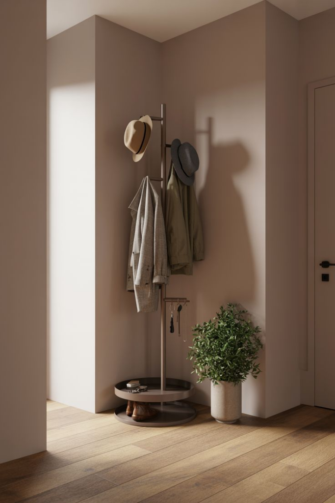
Daily routines unravel quickly when essentials lack a designated landing spot. Keys drift onto countertops, mail piles up unpredictably, and bags migrate from room to room, creating visual noise and wasted time. Without a defined drop zone, entryways fail their most practical purpose: managing transitions in and out of the home. Disorganization spreads because there is no clear cue guiding behavior. A functional drop zone sets boundaries, signaling where frequently used items belong. Hooks, trays, shelves, or drawers help establish order while preventing clutter creep. The absence of this system often leads to improvised storage that feels messy rather than intentional. Entryways should support habits, not fight them. When surfaces remain undefined, clutter accumulates horizontally, reducing usable space and increasing stress. A clearly planned landing area improves efficiency and keeps surrounding rooms tidy. Even minimal layouts benefit from one consistent placement point for essentials. The goal is predictability, not decoration. Well-defined zones streamline mornings, simplify returns home, and reduce misplaced items. Structure creates calm, reinforcing routines through thoughtful design rather than constant cleanup efforts.
Ignoring Vertical Wall Space

Untapped wall height represents one of the most overlooked opportunities in entryway design. When vertical surfaces remain bare, valuable storage potential disappears, forcing clutter onto floors and tabletops. Entryways often lack square footage, making upward expansion essential. Hooks, wall shelves, peg rails, and slim cabinets transform blank walls into functional assets without interrupting movement. Ignoring this dimension limits organization and reduces visual balance. Vertical elements also guide the eye upward, making compact spaces feel taller and more open. Practical storage placed at varying heights accommodates coats, bags, hats, and accessories efficiently. Without vertical planning, items end up stacked or scattered, creating disorder. Walls near doors, corners, and narrow passages offer ideal placement zones that do not interfere with circulation. Proper spacing ensures accessibility while maintaining clean sightlines. Wall-mounted solutions reduce floor congestion and support daily routines. Functional height layering blends convenience with aesthetics, creating an entry that feels intentional rather than improvised. Maximizing wall space improves flow, boosts storage capacity, and enhances overall usability without increasing the footprint.
Poor Lighting Choices
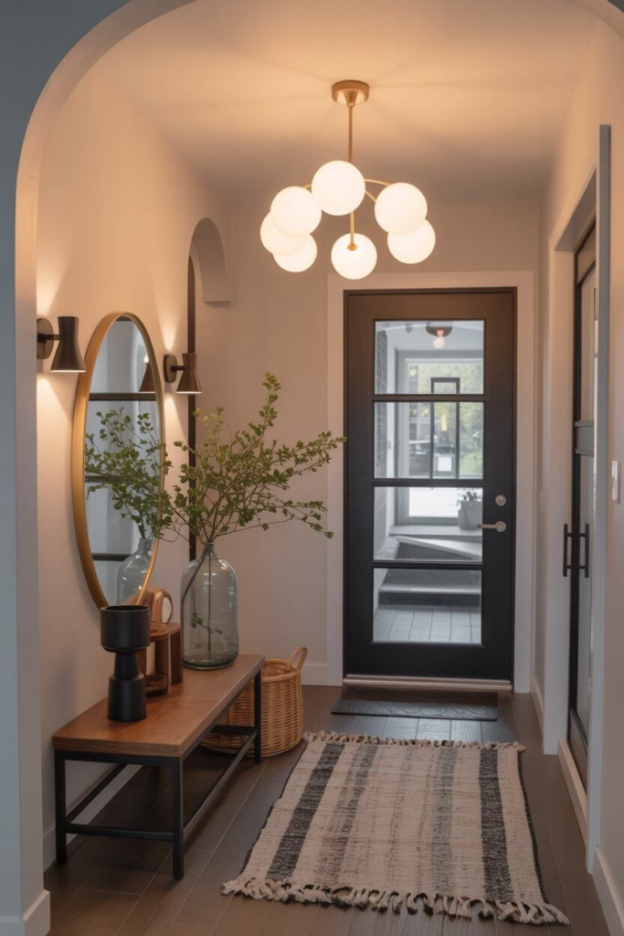
Lighting missteps often undermine an entryway’s usability and atmosphere. Dim fixtures create shadows that make spaces feel unwelcoming, while harsh overhead lights flatten textures and highlight clutter. Entryways require balanced illumination to support visibility, safety, and mood. Relying on a single ceiling light rarely provides adequate coverage, especially during evening hours. Layered lighting improves both function and comfort by combining ambient, task, and accent sources. Poor placement leads to glare, dark corners, or uneven brightness that distorts perception. Entry lighting should support activities like finding keys, checking appearance, and navigating steps. Warm color temperatures feel inviting, while cooler tones can appear stark in transitional areas. Neglecting dimmers removes flexibility, forcing one static brightness level regardless of time or need. Well-planned lighting enhances architectural features and improves spatial clarity. Thoughtful fixture selection elevates the experience of entering and leaving the home. Correcting lighting errors restores warmth, clarity, and confidence while reinforcing a welcoming first impression.
Wrong Rug Size or Shape
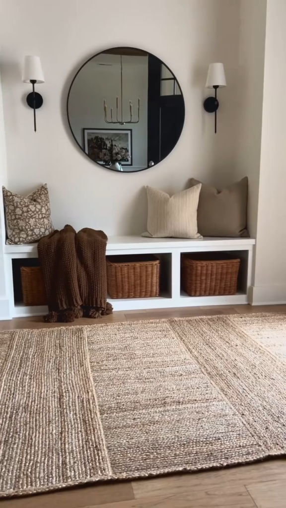
Floor coverings often anchor an entry visually, yet incorrect sizing disrupts both function and proportion. Rugs that are too small appear disconnected, while oversized options block doors and create tripping hazards. Shape matters as much as scale; long runners suit narrow halls, while compact foyers benefit from proportionate rectangles or rounds. Misalignment causes awkward edges that interrupt flow and look unintentional. Entry rugs should define the zone without overwhelming it. Incorrect placement leads to curling corners, uneven wear, and maintenance issues. Durable materials suited for high traffic perform better than delicate fibers. Proper sizing allows doors to open freely and furniture legs to rest comfortably. Rugs that float awkwardly undermine cohesion and practicality. Visual balance improves when edges align with architectural lines. Selecting the correct rug enhances safety, cleanliness, and spatial definition while reinforcing a polished appearance. Thoughtful choices prevent frustration and ensure the entry functions as intended.
Overdecorating the Console Table
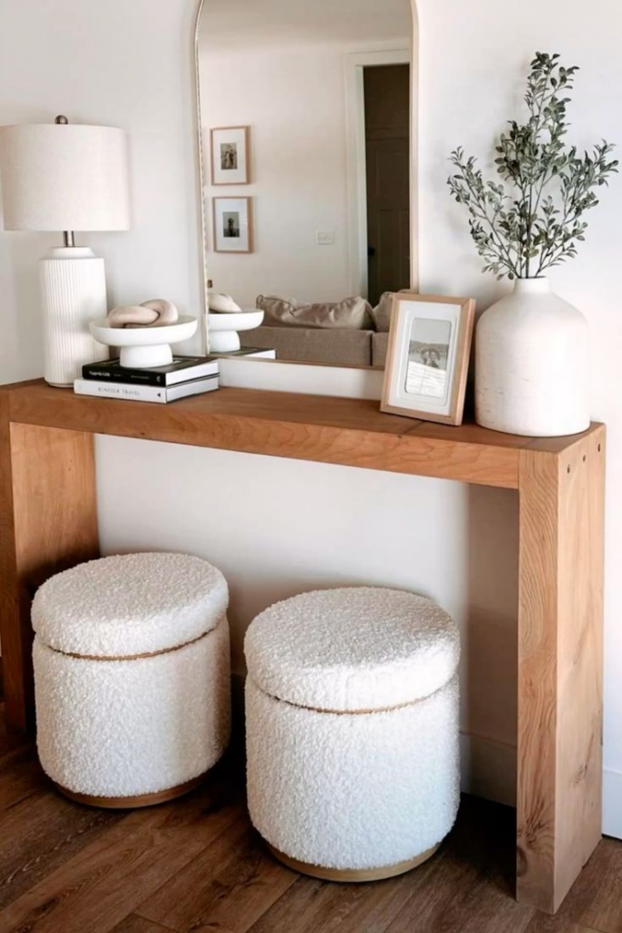
Surface overload quickly turns an entry from welcoming to chaotic. Decorative excess competes for attention and reduces usable space for essentials. Console tables work best when styled with intention, not abundance. Too many objects obscure functionality, making daily routines inconvenient. Visual clutter also exaggerates small imperfections and dust buildup. Entry consoles should balance form and function, supporting both aesthetics and practicality. Overdecorating often stems from filling space rather than editing thoughtfully. Items should vary in height, texture, and scale without overcrowding. Negative space plays a critical role, allowing key pieces to stand out. Functional objects like trays or bowls should remain accessible, not buried beneath decor. Streamlined styling improves usability and maintains visual calm. Intentional restraint keeps the entry organized and refined, ensuring the console enhances rather than hinders daily life.
No Mirror Placement Strategy

Mirrors offer more than reflection when positioned with purpose. Poor placement wastes their ability to expand light, improve visibility, and support daily routines. Random mounting height or awkward alignment diminishes usefulness. Mirrors placed too high, too low, or far from light sources fail to perform effectively. Strategic positioning enhances brightness and creates a sense of openness. Functional placement supports quick appearance checks before leaving. Reflective surfaces should align with sightlines and available lighting. Ignoring scale leads to mirrors that feel disconnected from surrounding furniture. Proper sizing anchors the entry visually while supporting proportion. Mirrors also help bounce natural light deeper into interior spaces. Thoughtful placement strengthens both form and function, improving usability without additional furnishings.
Dark Colors Without Balance

Moody palettes can feel sophisticated, yet imbalance creates heaviness in confined entries. Dark walls absorb light, making spaces feel smaller when not offset properly. Without contrast, details disappear and navigation feels unclear. Balance comes from pairing darker tones with reflective surfaces, lighter flooring, or adequate lighting. Texture variation prevents flatness and visual fatigue. Entryways require clarity and openness, even when using deeper hues. Excessive darkness without relief reduces warmth and approachability. Thoughtful contrast restores dimension and prevents gloom. Strategic accents maintain depth while preserving brightness. Balanced color application enhances drama without sacrificing function or comfort.
Shoes Left Fully Exposed
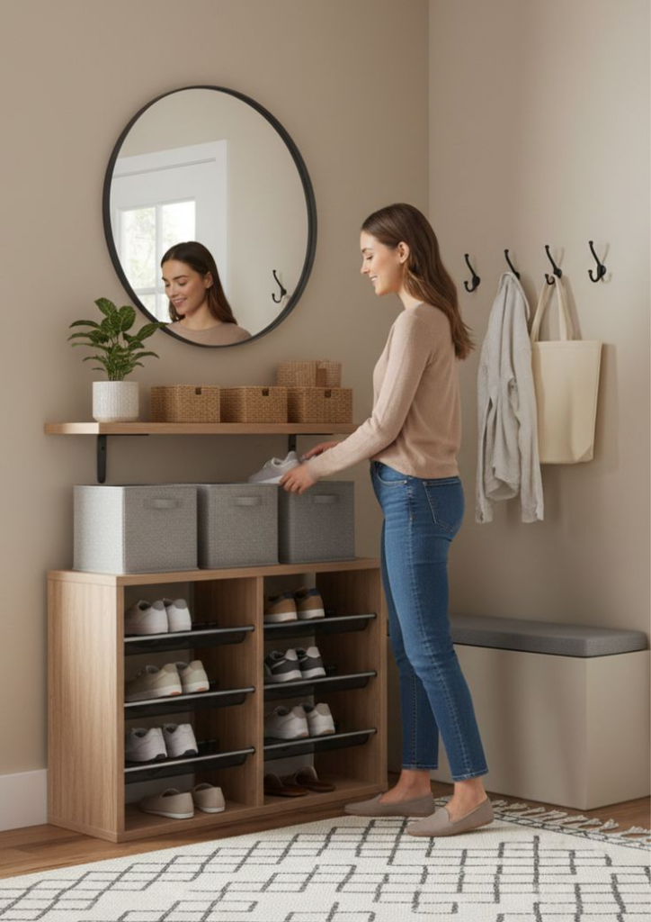
Footwear chaos often becomes the most visible entryway issue because shoes naturally accumulate near the door. When pairs are left uncovered, visual disorder increases instantly, making even a clean space appear cluttered. Exposed shoes also disrupt movement, narrowing walkways and creating tripping risks, especially in high-traffic households. Beyond appearance, uncovered footwear introduces dirt, moisture, and odors that spread across flooring and nearby furnishings. Entryways function as buffer zones between outdoors and interiors, so containment is essential. Without proper storage, shoes compete with décor and undermine any attempt at cohesive styling. Structured solutions such as closed cabinets, tilt-out compartments, or storage benches maintain accessibility while controlling visual noise. Even baskets require intentional limits to avoid overflow. The goal is concealment with convenience, not inconvenience. Organized shoe storage protects floors, supports cleanliness, and reinforces a sense of order the moment someone enters the home. When footwear is managed deliberately, the entry feels calmer, more hygienic, and far easier to maintain daily without constant straightening or frustration.
Lack of Seasonal Rotation

Entryways often struggle because they remain styled for a single season year-round. Heavy coats linger during warmer months, while lightweight accessories disappear when colder weather arrives, creating inefficiency and clutter. Seasonal needs change, yet static layouts force unnecessary items to remain visible and accessible. This disconnect affects both function and appearance. Without rotation, storage areas overflow, hooks become crowded, and daily routines feel less intuitive. Seasonal adjustment does not require full redesign; it simply involves reassessing what deserves front-row placement. Current-weather items should remain reachable, while off-season pieces move into secondary storage. This approach keeps the space responsive rather than overloaded. Rotating textiles, accessories, and functional pieces also refreshes visual interest without additional purchases. Entryways benefit from adaptability, supporting comfort throughout the year. Regular seasonal edits reduce wear on frequently used items and make transitions smoother. A space that evolves with changing conditions feels intentional, efficient, and easier to maintain long term.
Blocking Natural Walkway Flow

Movement through an entryway should feel instinctive, yet poor layout decisions often interrupt that experience. Furniture placed directly in traffic paths forces awkward navigation and creates daily frustration. Entryways serve as passage points, not display zones, so circulation must remain unobstructed. When benches, consoles, or décor encroach on walkways, doors swing improperly and foot traffic becomes congested. This issue intensifies in narrow layouts, where every inch matters. Natural flow follows the shortest, clearest route between doorways and adjacent rooms. Interrupting that path compromises safety, accessibility, and comfort. Clearances around doors and corners are essential for smooth transitions. Visual cues such as aligned furniture edges and open sightlines reinforce intuitive movement. When flow is respected, the entry feels calmer and more welcoming. Proper spacing improves functionality without sacrificing style. An entryway that supports effortless movement enhances everyday routines and reduces wear on both furnishings and finishes.
Forgetting Personal Style Touches
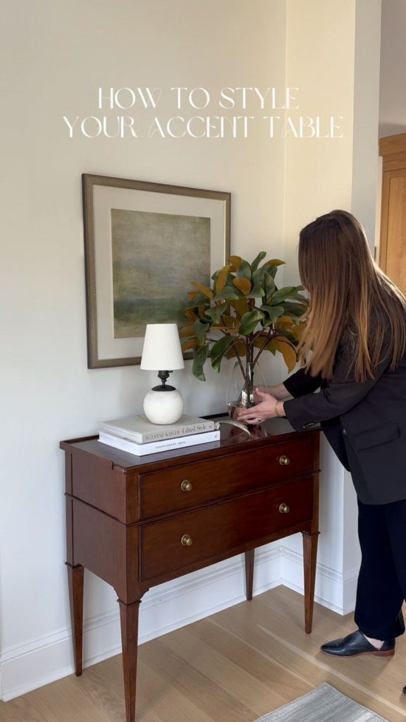
Function alone cannot make an entryway memorable. Spaces that lack personal expression often feel generic, disconnected from the rest of the home. When individuality is absent, the entry loses warmth and emotional impact. Personal touches provide context, telling a subtle story about the people who live there. This does not require excess decoration; even minimal spaces benefit from thoughtful details. Artwork, heirloom objects, textured materials, or meaningful color choices add character without clutter. Ignoring these elements results in spaces that feel temporary or unfinished. Personalization also improves comfort, making arrivals feel familiar rather than transitional. The entryway sets the tone for the entire home, so authenticity matters. Thoughtful curation ensures the space reflects lifestyle and taste instead of trends alone. When personal style is integrated intentionally, the entry becomes inviting, grounded, and genuinely reflective of the household it serves.