
Color sets expectations the moment the front door opens, making paint selection one of the most influential entryway decisions. The right shades can brighten narrow spaces, enhance natural light, and create visual continuity with adjoining rooms. Paint also helps define mood, whether the goal is calm, warmth, or subtle contrast. Because entryways experience heavy foot traffic, durability and undertone choice matter as much as style. This topic is especially relevant for homeowners seeking noticeable impact without major renovation. The guide ahead focuses on paint colors that work in real homes, offering practical insight into tones that improve flow, hide wear, and create a welcoming first impression.
Warm Greige With Soft Beige Undertones
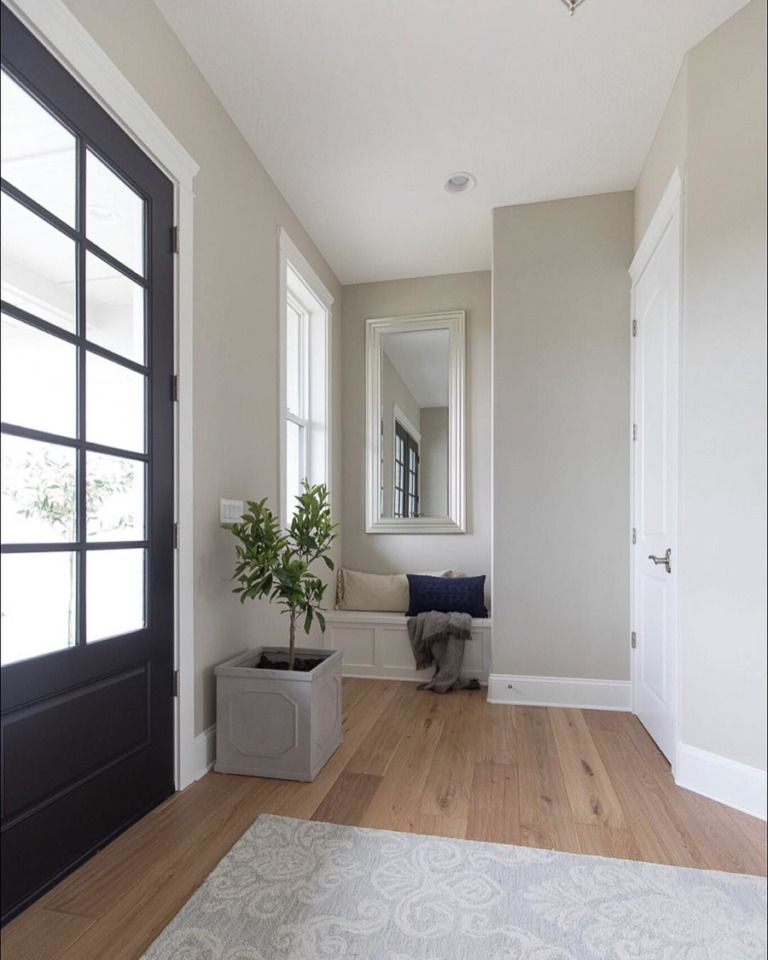
Natural light often exposes how transitional spaces can feel visually disconnected from the rest of the home, and this balanced neutral resolves that issue effectively. Greige with beige undertones bridges cool and warm palettes, allowing entryways to feel cohesive rather than stark. The subtle warmth prevents walls from appearing flat while still maintaining a clean, contemporary appearance. This shade performs exceptionally well in homes with mixed flooring finishes such as wood, tile, or stone. Artificial lighting enhances its softness rather than dulling it, making it reliable for narrow or windowless foyers. Trim in warm white or muted cream sharpens definition without creating harsh contrast. Metal accents in brushed brass, aged bronze, or matte black remain visually grounded against this tone. Artwork, mirrors, and wood consoles gain prominence without overwhelming the space. Seasonal décor transitions seamlessly, from autumn textures to lighter spring styling. The understated complexity of this color also disguises scuffs and fingerprints better than cooler grays. Homes aiming for resale appeal benefit from its versatility, as it suits modern, traditional, and transitional interiors alike. When applied in satin or eggshell finishes, walls reflect light subtly, enhancing depth without glare. This choice delivers long-term adaptability while maintaining a welcoming, polished first impression for daily use.
Muted Clay Taupe For Grounded Warmth
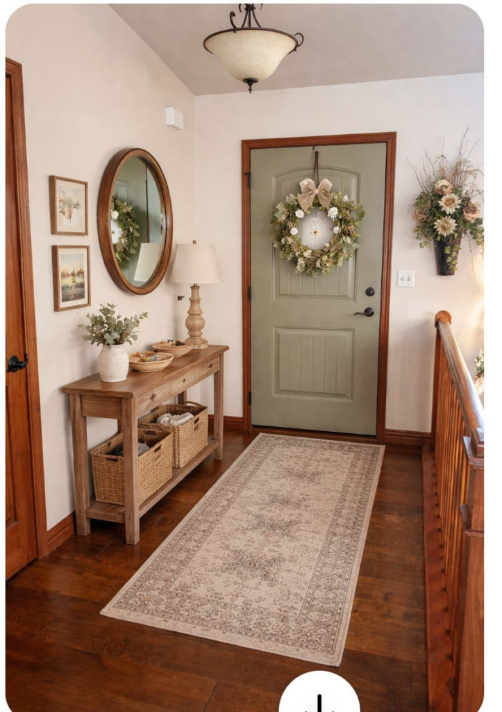
Entryways often require color solutions that feel stable rather than decorative, and clay-infused taupe answers that need precisely. Earth-derived undertones bring visual weight that anchors open layouts and high ceilings without darkening the space excessively. The warmth feels intentional rather than trendy, supporting a sense of permanence as soon as guests step inside. This shade works particularly well with natural materials such as limestone flooring, oak staircases, and woven runners. Under warm lighting, the color deepens gracefully, while daylight keeps it balanced and calm. Wall art and statement mirrors stand out clearly against this backdrop without competing for attention. The tone complements both contemporary furniture and heritage-inspired pieces, making it ideal for homes blending old and new elements. Trim in soft ivory or pale taupe ensures continuity rather than sharp contrast. Subtle variations within the pigment help mask everyday wear, especially in high-traffic zones. Entry doors painted in darker brown, charcoal, or muted green pair seamlessly with this wall color. Overall, this option supports a grounded atmosphere that feels composed and welcoming. It avoids the coldness of gray while offering more depth than beige, creating a confident yet understated arrival experience.
Dusty Olive Green With Gray Balance
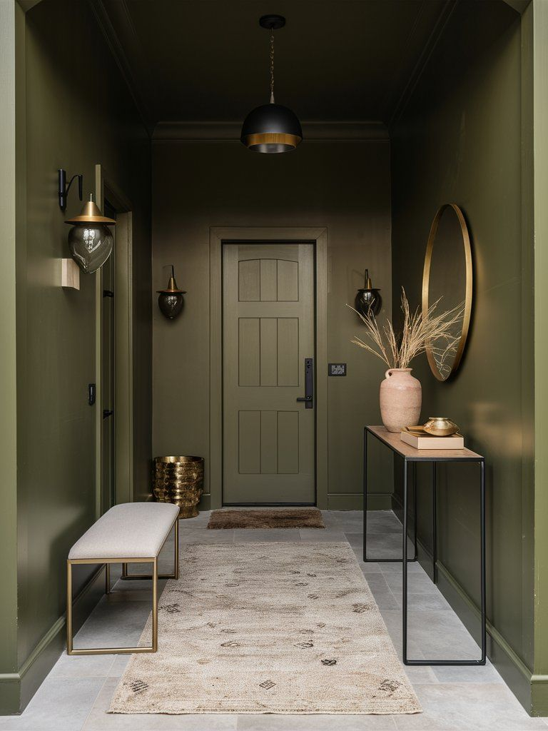
Muted green tones introduce character without overwhelming compact or transitional spaces. A dusty olive balanced with gray undertones offers visual interest while maintaining neutrality suitable for entryways. The gray base prevents the green from appearing too rustic or bold, keeping the overall effect refined and versatile. This color pairs exceptionally well with black-framed mirrors, warm wood benches, and stone flooring. Natural light enhances the organic quality, while artificial lighting softens the hue rather than distorting it. Seasonal décor benefits from this adaptable base, accommodating both warm autumn accents and lighter spring textures. The color subtly references nature, which helps entryways feel calm rather than rushed. Homes with open-plan layouts appreciate how this shade transitions smoothly into adjacent rooms without abrupt contrast. Trim in warm white or pale greige maintains clarity while preserving softness. Metallic finishes such as antique brass or brushed nickel remain balanced against this backdrop. Practical benefits include reduced visibility of scuffs and dust marks. Overall, this tone delivers a composed, welcoming atmosphere that feels thoughtful rather than decorative. It suits homeowners seeking a neutral alternative that still carries personality and depth, especially in frequently used entrance areas.
Soft Mushroom Neutral For Low-Light Entryways

Limited natural light can make entryways feel enclosed, yet color selection can significantly improve perception. Mushroom-toned neutrals provide warmth and softness without reflecting yellow or gray excessively. This balance ensures walls feel inviting rather than dull, even under artificial lighting. The subtle taupe-beige blend works particularly well in narrow foyers or interior-facing entrances. Light bounces gently across surfaces, reducing harsh shadows and improving overall brightness. Flooring in medium wood tones or light stone benefits from this color’s adaptability. Furniture and storage pieces appear cohesive rather than visually heavy. Trim finished in creamy white adds contrast while maintaining continuity. Artwork and mirrors remain readable without clashing undertones. The understated warmth supports a relaxed transition from outdoors to indoors. Maintenance advantages include better concealment of smudges and wear, especially around doorways. This color also suits rental properties or shared living spaces due to its broad appeal. Homes aiming for understated elegance rather than dramatic impact benefit most. Overall, mushroom neutral offers a dependable solution for entryways lacking daylight, delivering visual comfort, versatility, and long-term usability without feeling generic or flat.
Smoky Blue-Gray With Warm Depth
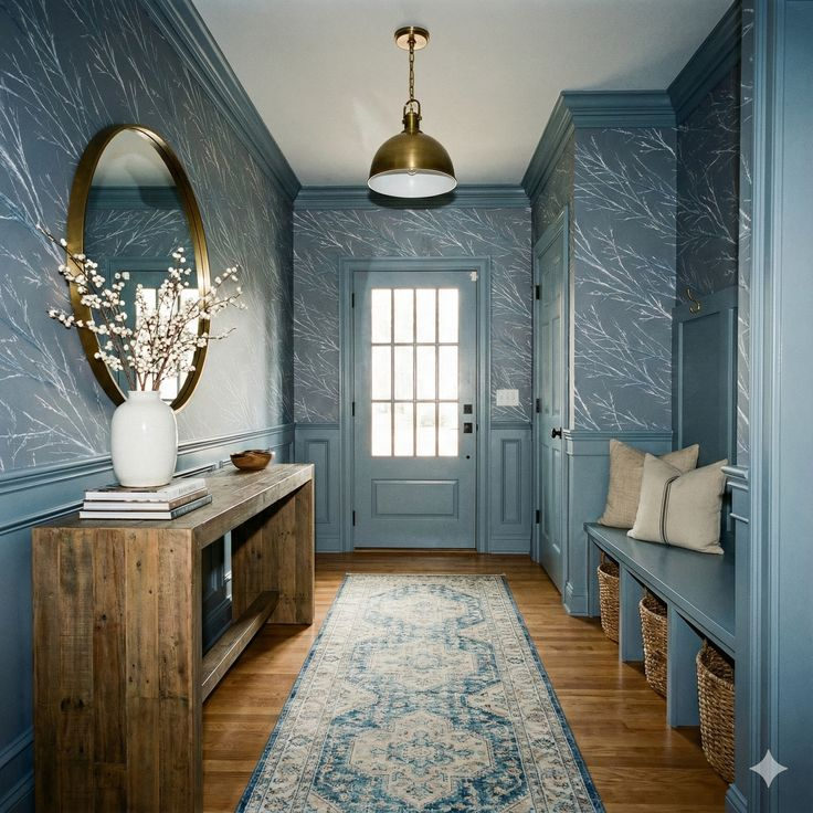
Cool tones often struggle in entryways, yet a smoky blue-gray with warm undertones achieves balance effectively. The warmth prevents the color from feeling icy while retaining a refined, modern appearance. This shade works particularly well in homes with coastal, transitional, or contemporary aesthetics. Natural light enhances its depth, revealing subtle complexity rather than flat color. Artificial lighting maintains softness, avoiding harsh blue casts. Wood accents, especially walnut or oak, create contrast that feels intentional and grounded. Metal fixtures in brushed brass or matte black remain visually crisp. This tone pairs well with neutral runners and textured wall décor. It introduces calm without sacrificing presence, making entryways feel composed rather than sterile. Trim in soft white or pale gray maintains clarity without stark contrast. The color performs well in medium to large foyers, where depth adds sophistication. Practical benefits include reduced visibility of dust and fingerprints. Overall, this option offers a refined alternative to standard gray, delivering warmth, depth, and adaptability suitable for everyday use and long-term appeal.
Creamy Off-White With Subtle Yellow Base

Bright entryways require warmth to avoid appearing clinical, and a creamy off-white with a gentle yellow base provides that balance. The undertone introduces softness without reading overly warm or dated. Natural light enhances brightness, while artificial lighting remains flattering rather than harsh. This color works well in compact or expansive foyers, improving openness and clarity. Architectural details such as molding and paneling remain visible without heavy contrast. Flooring in darker wood or stone gains definition against this lighter backdrop. Furniture and décor benefit from increased flexibility, allowing seasonal updates without repainting. Trim finished in clean white maintains structure while preserving warmth. The subtle yellow base prevents gray shadowing common in cooler whites. Maintenance remains manageable, as the warmth disguises minor scuffs better than stark white. This choice supports resale appeal due to its universal compatibility. Overall, it delivers a polished yet welcoming entry experience that feels timeless, adaptable, and visually clean without appearing sterile or flat.
Faded Terracotta With Neutral Wash

Earth-inspired tones bring character to entryways, and a softened terracotta with neutral balance achieves warmth without intensity. The washed finish prevents the color from feeling overpowering, keeping the space approachable. Natural light enhances its warmth, while artificial lighting maintains softness rather than exaggeration. This shade pairs well with stone floors, wood benches, and woven textures. The neutral base ensures compatibility with modern and traditional décor alike. Artwork and mirrors stand out clearly without competing undertones. Seasonal accents transition smoothly, from cooler winter textures to lighter summer materials. Trim in warm white or pale beige supports cohesion. Practical advantages include effective camouflage of wear in high-traffic zones. This color introduces personality while remaining livable for daily use. Homes seeking subtle distinction without bold statements benefit most. Overall, faded terracotta offers grounded warmth and visual interest, creating an inviting first impression that feels intentional rather than decorative.
Quiet Sage With Earthy Undertone

Muted greens create calm transitions, and sage with earthy depth performs particularly well in entryways. The subdued tone avoids brightness while maintaining a fresh, natural presence. Gray and beige undertones keep the color neutral rather than botanical. This shade complements wood flooring, stone tiles, and neutral runners seamlessly. Natural light enhances its softness, while artificial lighting preserves warmth. Metal accents in brass or black remain balanced and refined. Trim in creamy white maintains clarity without stark contrast. Practical benefits include reduced visibility of marks and dust. The color supports both modern and traditional interiors, offering adaptability across styles. Seasonal décor remains cohesive year-round. Overall, quiet sage delivers understated sophistication, offering a calming arrival experience that feels thoughtful and enduring.
Stone Beige With Slight Pink Cast

Warm neutrals gain dimension through subtle undertones, and stone beige with a hint of pink provides gentle refinement. The pink cast remains understated, preventing sweetness while enhancing warmth. Natural light reveals depth, while artificial lighting stays flattering. This shade works well with wood, stone, and metal finishes. Trim in soft white sharpens edges without contrast. Furniture and artwork appear cohesive rather than washed out. Maintenance benefits include effective concealment of everyday wear. The color supports resale appeal due to its neutrality with character. Overall, it delivers warmth, balance, and visual softness ideal for entryways seeking quiet elegance.
Moody Charcoal With Warm Brown Hints
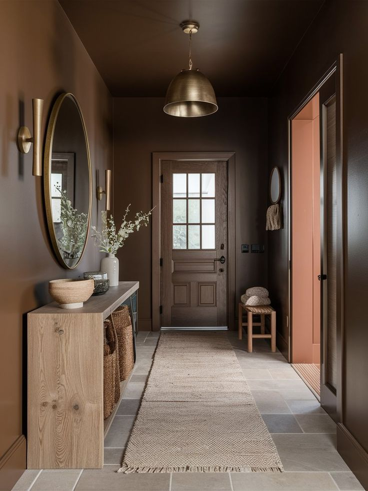
Darker entryways require warmth to remain inviting, and charcoal with brown undertones achieves that balance. The depth adds drama without coldness. Natural light reveals complexity, while artificial lighting maintains richness. This shade suits larger foyers or homes with ample lighting. Wood accents and metallic fixtures stand out clearly. Trim in warm white provides structure. Practical benefits include excellent concealment of wear. Overall, it offers sophistication and impact while remaining welcoming and grounded.
Sand-Toned Neutral With Coastal Feel

Light, airy neutrals support relaxed entryways, and sand-toned hues deliver warmth without heaviness. The coastal influence remains subtle rather than thematic. Natural light enhances brightness, while artificial lighting stays soft. This shade pairs well with light wood, woven textures, and stone floors. Trim in white maintains freshness. Maintenance remains manageable due to balanced warmth. Overall, it creates an open, welcoming entry experience with effortless versatility.
Putty Gray With Soft Warm Finish
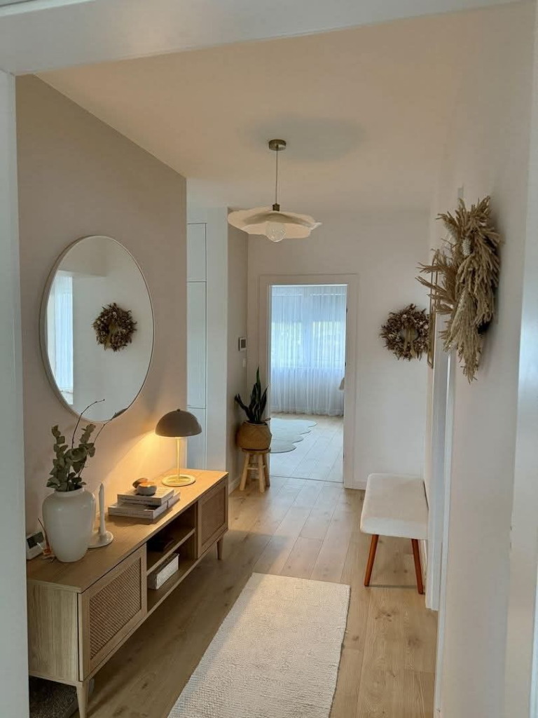
Balanced grays perform best in transitional spaces, and putty gray with warmth avoids sterility. The undertone supports varied lighting conditions without shifting cold. Wood, metal, and stone finishes integrate seamlessly. Trim in creamy white maintains definition. Practical benefits include reduced visibility of marks. This color suits modern and traditional homes alike. Overall, it delivers reliability, warmth, and adaptability for high-traffic entryways seeking long-term appeal.