
First impressions at home benefit from color choices that feel calm, clean, and intentional. Light blue and grey entryways answer that need by balancing freshness with structure, making them ideal for modern homes, apartments, and narrow foyers. Light blue visually opens the space and adds a relaxed tone, while grey grounds the entry with neutrality and durability. This combination works well with natural light, layered textures, and everyday storage solutions. For readers seeking a clutter-free, welcoming entrance that feels current without being overpowering, light blue and grey provide a practical, design-forward solution that supports both aesthetics and daily functionality.
Dusty blue accent wall
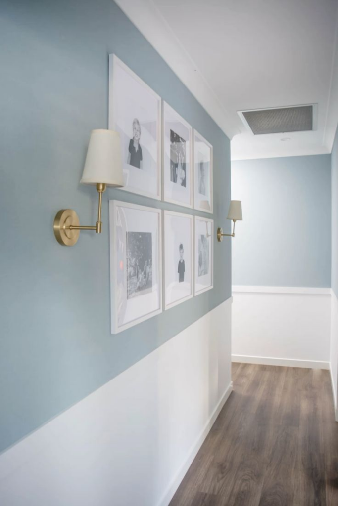
Muted blue tones introduce calm visual balance in an entryway where first impressions matter. A dusty blue accent wall works especially well with neutral greys because it softens the space without overpowering it. This shade reflects light gently, making narrow or windowless entryways feel more open while still adding depth. Matte or eggshell finishes reduce glare and hide minor wall imperfections, which is practical for high-traffic areas near doors. Pairing the wall with grey trim, hooks, or benches keeps the palette cohesive and avoids sharp contrast. For durability, washable interior paint is recommended, as entry walls often experience scuffs from bags and coats. Lighting plays a crucial role; warm LED bulbs prevent the blue from looking cold, while wall sconces highlight texture and color consistency. This accent wall also creates a clear visual anchor for mirrors, console tables, or artwork, helping the entry feel intentional rather than transitional. When styled correctly, dusty blue supports both modern and transitional interiors, blending easily with wood, metal, and fabric finishes. It delivers color confidence without visual noise, making it a reliable choice for homeowners seeking subtle personality with long-term appeal.
Grey storage bench with blue cushions
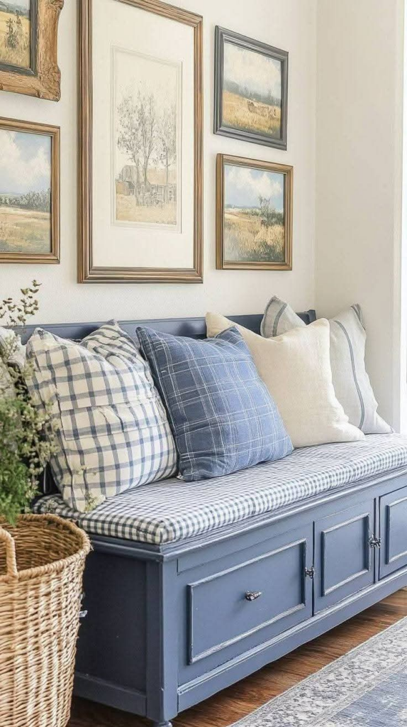
Functional seating immediately improves daily routines in an entryway, especially in homes with limited space. A grey storage bench paired with blue cushions offers both practicality and coordinated color flow. The neutral bench base grounds the space visually, while blue cushions introduce softness and comfort without dominating the palette. Upholstered cushions also reduce noise and add tactile contrast against hard flooring. Storage beneath the seat keeps shoes, bags, or seasonal accessories organized, reducing visible clutter near the door. Durable fabrics such as performance linen or tightly woven polyester are ideal for cushions, as they resist wear and clean easily. Cushion shades ranging from powder blue to muted slate maintain harmony with light blue and grey themes. Proper bench height ensures comfortable seating, while closed or lift-top storage keeps the entry looking tidy. Placing the bench against a wall or under hooks maximizes efficiency in small entryways. This setup supports real-life use while reinforcing a cohesive design language. The combination feels approachable and well-considered, offering everyday comfort alongside understated style that fits seamlessly into contemporary and transitional homes.
Light blue front door
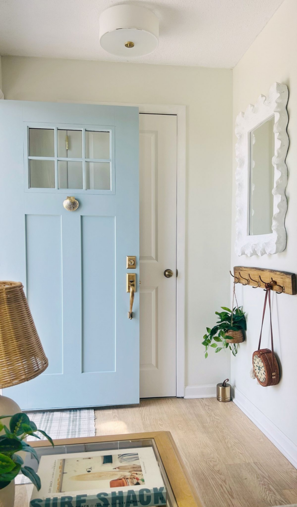
Color choice at the entry door influences curb appeal and interior continuity at the same time. A light blue front door provides a welcoming transition while complementing grey interiors effortlessly. This shade reflects natural light well, preventing the entrance from feeling heavy or enclosed. When viewed from inside, the door becomes a subtle focal point without competing with surrounding elements. Semi-gloss finishes are recommended for durability and ease of cleaning, especially in high-touch areas. Hardware in brushed nickel or matte black pairs cleanly with blue tones and grey surroundings. Weather-resistant paint ensures the color remains consistent despite sun exposure or humidity. A light blue door also works well with neutral flooring, shiplap walls, and patterned rugs, tying the entire entryway together visually. For smaller spaces, the lighter hue visually expands the area, creating an inviting atmosphere from the moment guests arrive. This approach balances personality with restraint, making it suitable for homeowners who want color without commitment to bold trends. Over time, the door continues to feel fresh and adaptable, supporting seasonal décor changes without clashing.
Grey shiplap wall treatment

Textural wall treatments add dimension without relying on strong color contrast. Grey shiplap offers subtle architectural interest that suits both modern farmhouse and contemporary entryways. Horizontal panels visually widen narrow spaces, while vertical installations emphasize ceiling height. Painted in soft grey, shiplap acts as a neutral backdrop that complements light blue accents seamlessly. The finish hides minor wall flaws and adds durability in areas prone to contact. Moisture-resistant materials such as MDF or PVC shiplap work well near exterior doors where temperature changes occur. Consistent panel spacing ensures a clean, professional look that feels intentional rather than decorative. Shiplap pairs naturally with hooks, mirrors, and benches, helping define functional zones in the entry. Proper lighting enhances shadow lines between panels, adding depth without overwhelming the space. This wall treatment supports long-term design flexibility, allowing accessories and textiles to change while the structure remains timeless. Grey shiplap delivers warmth and order, making the entryway feel structured, calm, and visually cohesive from every angle.
Blue and grey patterned rug
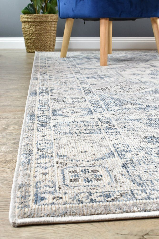
Floor coverings play a critical role in both comfort and visual cohesion within an entryway. A blue and grey patterned rug anchors the space while disguising dirt and wear from daily foot traffic. Patterns with subtle contrast prevent stains from showing while reinforcing the overall color palette. Low-pile or flatweave rugs are ideal for doors that open inward, ensuring smooth operation and reduced tripping risk. Materials such as polypropylene or wool blends offer durability and easy maintenance. The mix of blue and grey connects wall colors, furniture, and accessories into a unified look. Rug sizing matters; extending slightly beyond the door swing area creates balance and improves usability. Non-slip rug pads improve safety and prevent shifting on tile or wood floors. Visually, the rug defines the entry zone, especially in open-plan layouts where boundaries are less obvious. This practical layer adds warmth underfoot while reinforcing design consistency. A well-chosen patterned rug quietly supports both function and style, making the entry feel complete rather than unfinished.
Grey console with blue accents
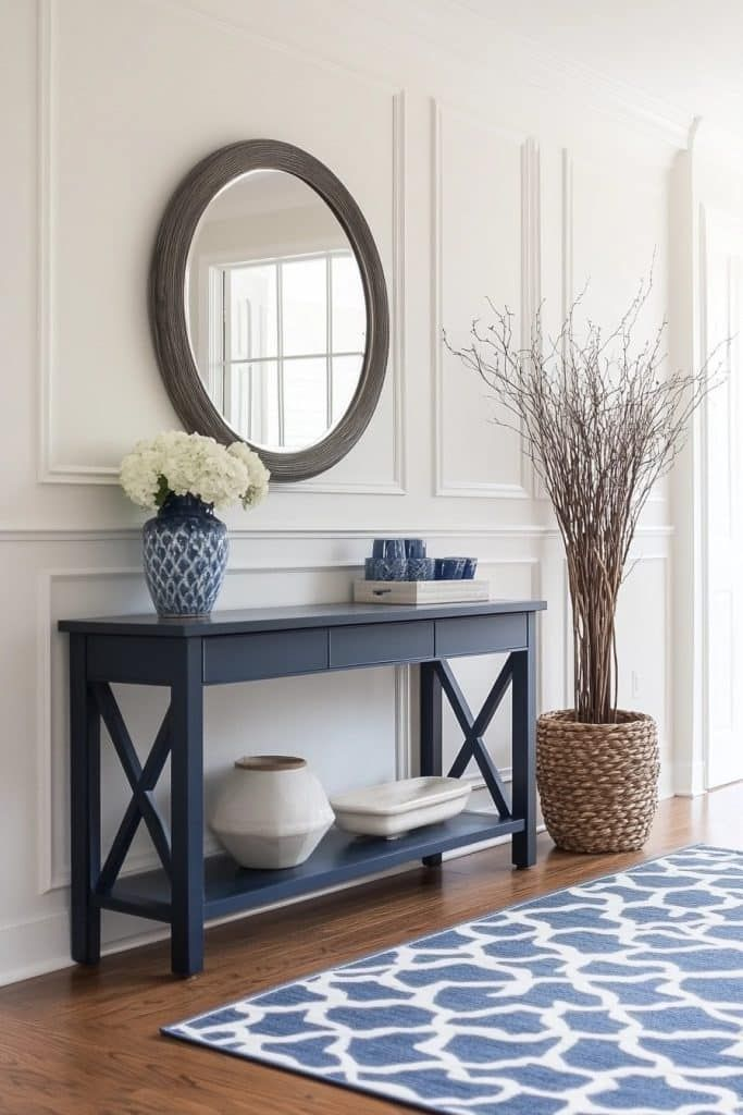
A console table provides structure and storage without overwhelming limited entryway space. Grey finishes keep the piece visually grounded, allowing blue accents to add controlled interest. Accent elements may include ceramic bowls, vases, or trays that echo surrounding textiles and wall tones. Slim-profile consoles work best in narrow entryways, offering surface space without obstructing movement. Durable finishes resist scratches from keys or bags, maintaining a polished appearance over time. Blue accessories should remain minimal to avoid clutter, focusing on cohesion rather than decoration overload. Drawers or lower shelves increase functionality by housing everyday essentials. Positioning the console beneath a mirror enhances light reflection and improves daily usability. This setup supports organization while reinforcing a calm color scheme. The balance between neutral structure and subtle color detail ensures the entry feels curated but practical. Over time, accent pieces can rotate seasonally while the grey base remains constant. This approach keeps the entryway adaptable, tidy, and visually consistent with the rest of the home.
Two‑tone blue/grey walls
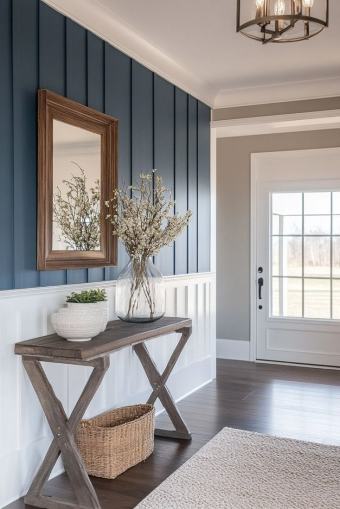
Dividing wall color into two complementary tones adds depth without relying on bold contrast. A blue and grey two-tone treatment helps visually structure an entryway while maintaining softness. Typically, the darker shade grounds the lower portion, protecting walls from scuffs, while the lighter tone brightens the upper area. Chair rails or subtle trim provide a clean transition between colors. This technique works well in homes with standard ceiling heights, adding interest without visual clutter. Muted blues pair best with warm greys to avoid a cold appearance. Durable paint finishes on the lower section improve longevity in high-traffic zones. The two-tone approach also highlights architectural details such as door frames or molding. When coordinated with rugs and furniture, the walls feel intentional rather than decorative. This solution suits homeowners seeking definition and structure without committing to full accent walls. It enhances proportion, balances light, and delivers a refined entry experience that remains relevant across design trends.
Sky blue trim around doorway

Detail-focused color placement can subtly transform an entryway. Sky blue trim around a doorway frames transitions while introducing gentle contrast against grey walls. This approach draws attention to architectural lines without overwhelming the space. Lighter blue tones reflect light effectively, making doorways appear more open and inviting. Satin finishes are ideal for trim, offering durability and easy cleaning. Precise paint application ensures crisp edges, which are essential for a polished result. Sky blue pairs especially well with neutral flooring and white or grey doors. The trim acts as a visual connector between rooms, guiding movement through the home. This detail works well in smaller entries where full accent walls may feel excessive. Over time, the trim remains adaptable, complementing seasonal décor changes and evolving styles. It adds character through restraint, proving that thoughtful color placement can elevate functionality and flow without unnecessary complexity.
Grey peg rail with blue baskets
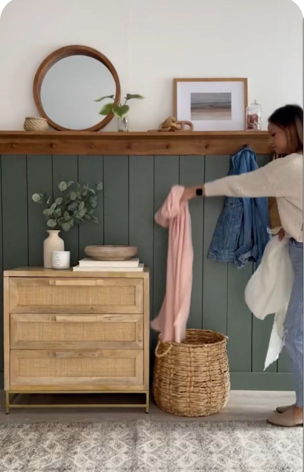
Wall-mounted storage improves organization while preserving floor space in an entryway. A grey peg rail provides a neutral base that blends easily with surrounding walls. Blue baskets introduce color while serving a practical purpose, holding gloves, scarves, or daily essentials. This combination keeps frequently used items accessible without visual clutter. Peg rails are particularly effective in narrow entries where cabinets may feel bulky. Secure installation ensures the rail supports weight safely over time. Baskets made from fabric or woven materials add texture and softness against painted surfaces. Color consistency between baskets and other blue elements maintains design cohesion. Labeling baskets can further improve functionality for busy households. This setup encourages tidy habits while reinforcing a calm, organized atmosphere. The mix of open storage and muted color keeps the entry approachable and efficient. It supports real-life use while maintaining a clean, intentional appearance that works across various interior styles.
Blue framed mirror
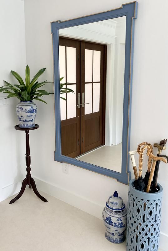
Mirrors enhance both light and spatial perception in entryways. A blue framed mirror adds subtle color while serving a functional role for last-minute checks before leaving home. The frame color ties into surrounding accents, reinforcing a cohesive palette without overwhelming the wall. Rounded or rectangular frames work equally well, depending on the overall style. Matte or satin finishes prevent glare and fingerprints. Proper placement at eye level ensures usability for most household members. When positioned opposite natural light, the mirror amplifies brightness and reduces shadowed areas. Blue frames pair effectively with grey walls, consoles, and flooring, acting as a visual bridge between elements. Size selection matters; oversized mirrors expand small spaces, while medium sizes suit compact layouts. This piece delivers everyday practicality alongside refined style. Over time, the mirror remains versatile, adapting easily as surrounding décor evolves. It offers a balanced way to introduce color while maintaining clarity and function.
Grey tile flooring with blue runner
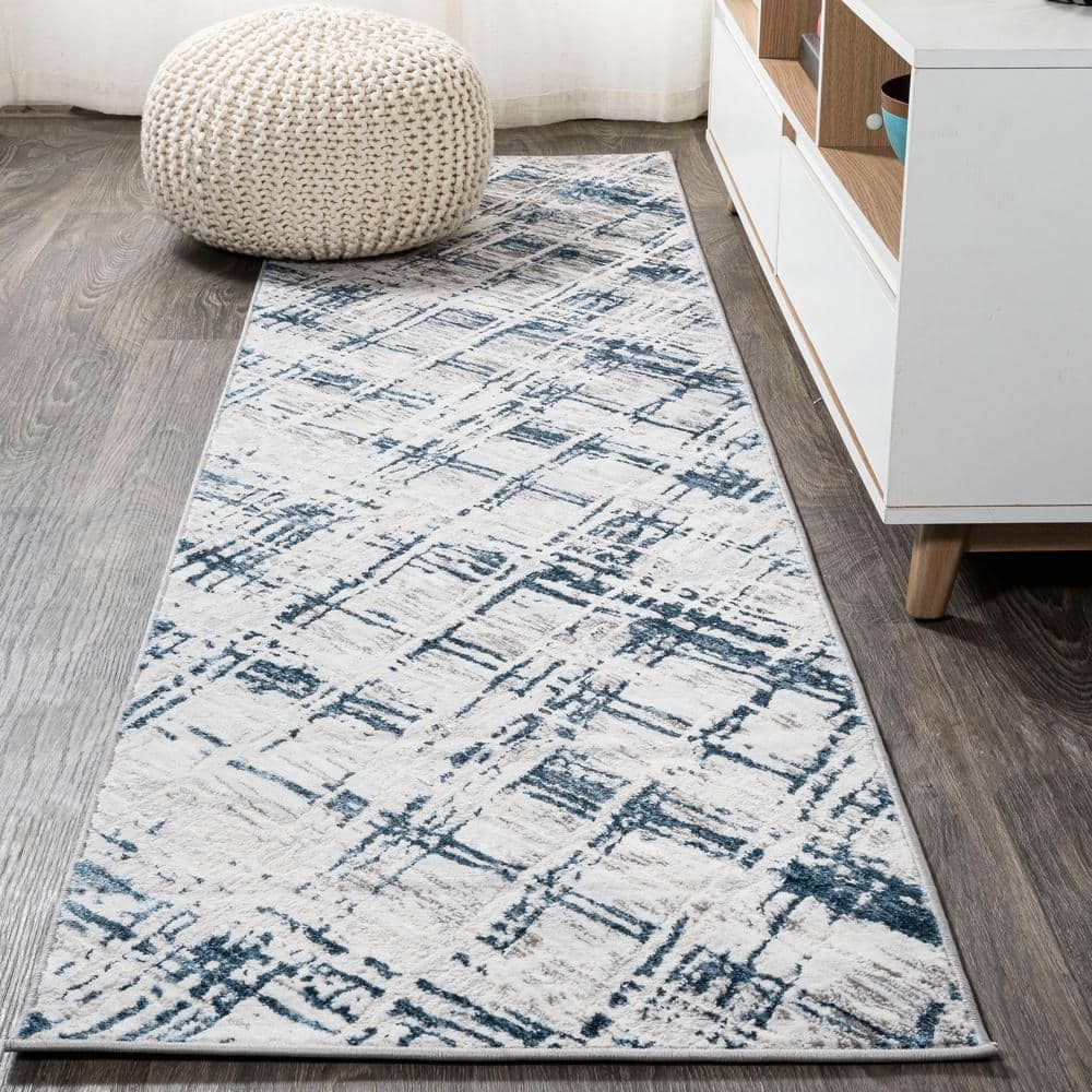
Durable flooring is essential in entryways exposed to moisture and dirt. Grey tile provides a resilient foundation while maintaining a neutral appearance. Its color conceals dust and wear better than lighter alternatives. A blue runner introduces warmth and softness underfoot, improving comfort and acoustics. Runners also protect high-traffic paths, extending tile longevity. Slip-resistant backing enhances safety, especially near exterior doors. Blue tones in the runner connect visually with wall accents and accessories, reinforcing a cohesive design. Tile patterns such as large-format or subtle texture add interest without competing with the runner. Easy-to-clean materials ensure low maintenance over time. This combination balances practicality with style, making the entry both functional and welcoming. Seasonal runner changes allow subtle updates without major renovation. Together, grey tile and a blue runner deliver structure, comfort, and visual continuity that supports everyday use.
Soft blue artwork wall

Wall art personalizes an entryway while reinforcing its color scheme. A collection of soft blue artwork introduces calm visual interest without overpowering the space. Abstract prints, coastal photography, or minimal illustrations work particularly well with grey backdrops. Consistent framing creates cohesion, even when artwork styles vary slightly. Lightweight frames simplify installation and adjustment. Proper spacing between pieces ensures the wall feels curated rather than crowded. Blue tones should remain muted to maintain harmony with surrounding elements. Artwork placement at eye level improves visibility and balance. This approach transforms blank walls into purposeful design features. The display adds personality while remaining adaptable, as pieces can rotate over time. It supports a welcoming atmosphere that feels intentional from the moment someone enters the home. Through thoughtful selection and arrangement, a soft blue artwork wall enhances the entryway’s identity without sacrificing simplicity or function.