
Wall color decisions in an entryway influence first impressions more than any other design choice. Poor shade selection can make this space feel cramped, disconnected, or harsh under natural and artificial light. Undertones, finish levels, and contrast with flooring often create issues that go unnoticed until the area feels visually off. Since entryways link multiple rooms, mistakes here affect the entire home’s flow and cohesion. Understanding common color missteps helps prevent costly repaints and design frustration. The ideas ahead focus on clarity and correction, offering practical guidance to ensure entryway walls support balance, brightness, and a welcoming transition into the home.
Ignoring Natural Light Direction
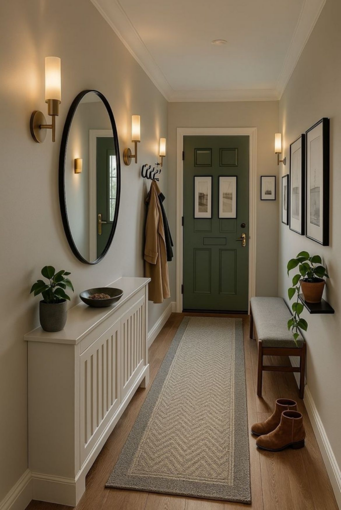
Light entering an entryway shapes how wall color is perceived throughout the day, yet many homeowners overlook this factor entirely. North-facing entries often receive cooler, muted light that can drain warmth from paint, making neutrals feel flat or gray. South-facing spaces amplify warmth and brightness, sometimes exaggerating yellow or red undertones. East-facing walls glow softly in the morning but cool quickly, while west-facing entries shift dramatically from dull daylight to intense evening warmth. Selecting paint without accounting for these shifts leads to disappointment once the color is applied. Testing samples at different times reveals how shadows, reflections, and brightness interact with the chosen shade. Mid-tone neutrals with balanced undertones usually perform better in fluctuating light. Subtle warmth helps offset cool daylight, while restrained saturation prevents harsh glare in brighter exposures. Ignoring light direction often results in repainting, wasted time, and inconsistent visual flow from adjacent rooms. Successful entryway color planning starts by observing sunlight patterns for several days, then choosing hues that remain stable from morning to night.
Going Too Dark in Narrow Entries
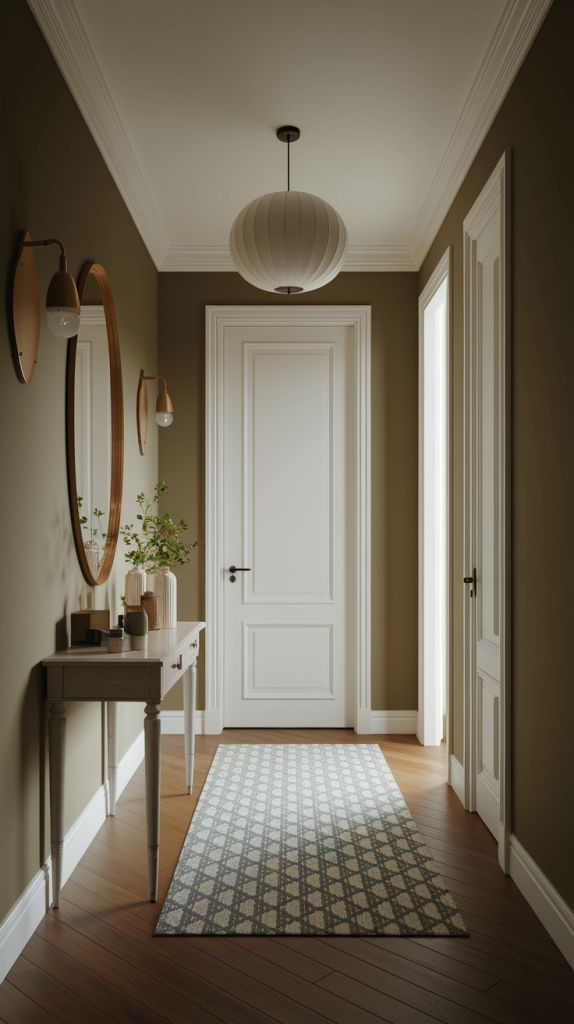
Tight entryways already struggle with limited visual breathing room, and dark wall colors can intensify that constraint. Deep shades absorb light instead of reflecting it, causing narrow halls to feel compressed and heavy. Without sufficient width or natural light, darker tones emphasize shadows, corners, and architectural breaks, making the space appear smaller than it is. This mistake often stems from trying to add drama without considering scale. While moody colors work in larger foyers, confined entries benefit from lighter or mid-range tones that bounce light across surfaces. Soft neutrals, warm off-whites, and muted greiges help maintain openness while still offering character. If darker color is desired, limiting it to an accent wall or lower portion with wainscoting preserves balance. Strategic contrast through trim, mirrors, and lighting fixtures further prevents a boxed-in effect. Wall color should enhance circulation, not restrict it visually. Choosing depth without considering proportions leads to a cramped first impression. Thoughtful shade selection paired with reflective finishes and layered lighting keeps narrow entryways feeling approachable, functional, and visually calm rather than closed off.
Ultra-White Without Warmth
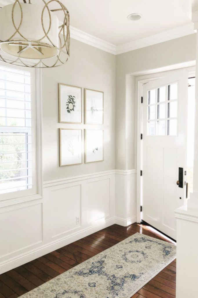
Pure white walls may seem like a safe choice, but overly stark whites often create a cold, unfinished feel in entryways. Many ultra-white paints contain blue or gray undertones that react poorly to limited or indirect light, producing a clinical appearance. Entryways serve as transitional zones, and harsh whites can disrupt the emotional flow between outdoors and interior spaces. Without warmth, walls feel flat and uninviting, especially alongside natural materials like wood floors or stone tiles. Slightly warmed whites with creamy, beige, or soft taupe undertones provide a more welcoming effect while still maintaining brightness. These nuanced whites soften shadows and complement a wider range of finishes. Trim, doors, and ceilings also appear more cohesive when the wall color carries subtle warmth. Another issue arises when ultra-white walls highlight imperfections, making minor flaws more noticeable. A balanced white diffuses light gently and supports a polished look. Selecting white should involve testing samples under real lighting conditions, ensuring the color supports comfort and continuity rather than sterility. The goal is clarity without coldness, creating an entry that feels intentional and livable.
High-Gloss on Imperfect Walls
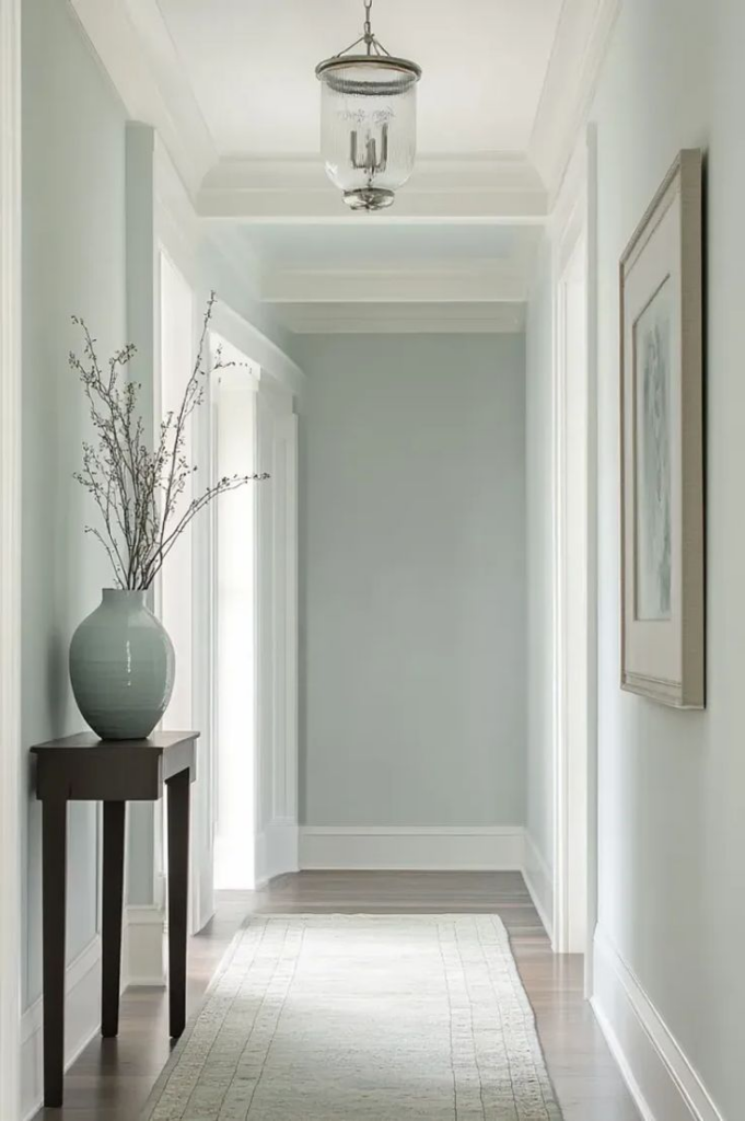
High-gloss paint reflects light aggressively, which magnifies every surface flaw in an entryway. Minor dents, uneven drywall seams, and patchwork repairs become instantly visible under glossy finishes. Many homeowners choose sheen for durability or easy cleaning, unaware of its visual consequences. Entryways often endure wear, but gloss is rarely forgiving in these high-traffic areas. Light bouncing off shiny walls exaggerates texture inconsistencies, creating a distracting appearance that undermines overall design. Satin or eggshell finishes offer a more balanced solution, providing wipeable surfaces while minimizing reflections. These finishes soften wall irregularities and distribute light evenly. In older homes, where walls are rarely perfectly smooth, gloss can feel especially harsh. Preparation matters, but even meticulous sanding may not eliminate every imperfection. Choosing the right sheen is as important as selecting the right color. Matte finishes can work if durability is less critical, while modern washable mattes bridge performance and aesthetics. The key lies in matching sheen to wall condition, ensuring the entryway feels refined rather than revealing unintended flaws.
Matching Walls Exactly to Flooring
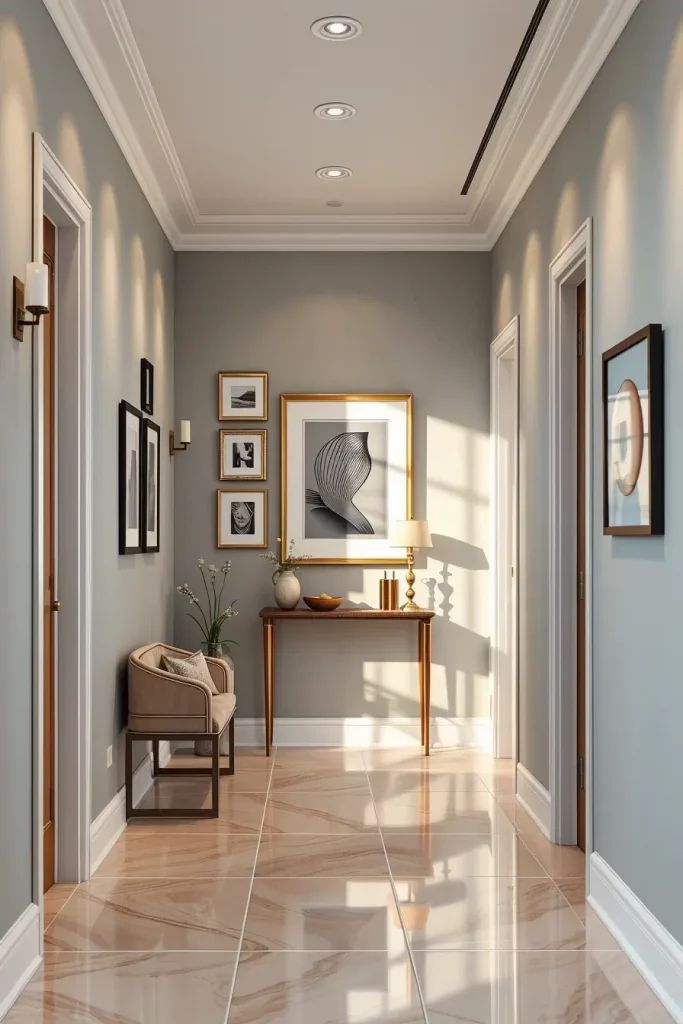
Using the same or nearly identical color on walls and floors can flatten an entryway’s visual depth. When surfaces blend too closely, architectural definition disappears, making the space feel monotonous. Flooring often carries texture, grain, or pattern that walls cannot replicate, so exact color matching creates imbalance. Instead of harmony, the result is a blurred boundary that lacks contrast. Entryways benefit from subtle differentiation that guides the eye and defines planes. Walls should complement flooring, not compete or disappear against it. Lighter walls paired with darker floors, or vice versa, establish clarity and proportion. Undertones play a crucial role; even similar colors can clash if their base tones differ. Many mismatches stem from viewing samples separately rather than together. Testing wall paint alongside flooring material reveals whether the combination supports cohesion. Contrast does not require boldness; even slight tonal variation improves visual interest. Thoughtful separation between vertical and horizontal surfaces enhances flow into adjacent rooms. Successful entryway design relies on balance, ensuring walls frame the floor rather than mimic it exactly.
Overusing Trend Colors
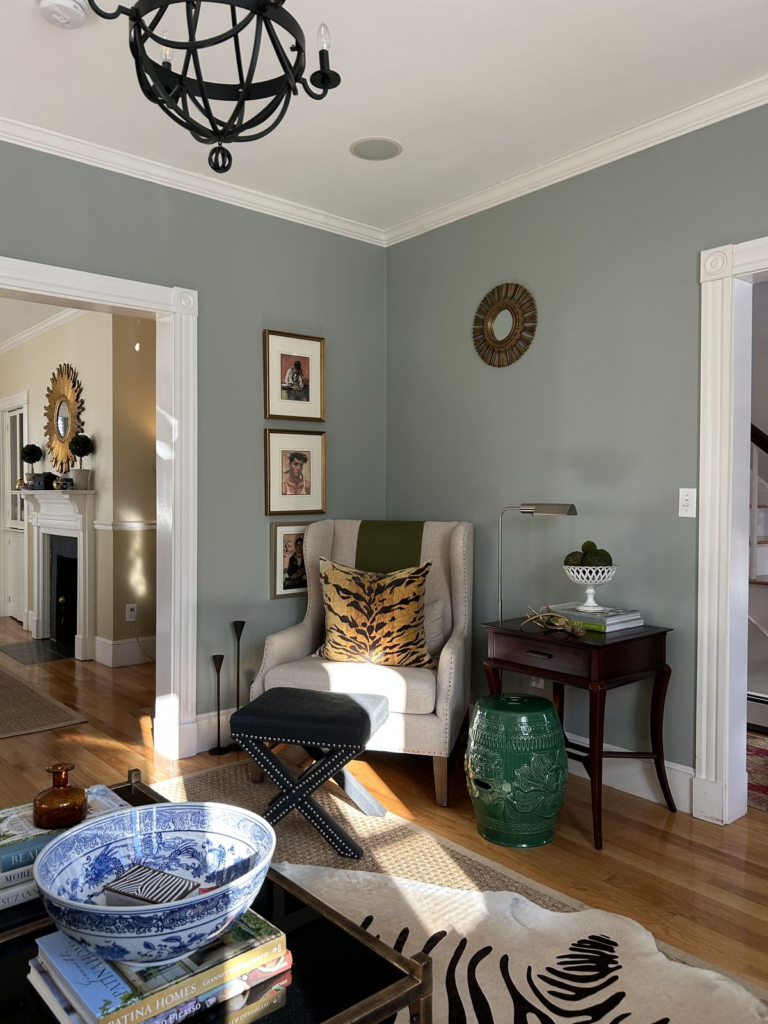
Trend-driven colors gain popularity quickly but often fade just as fast. Applying them extensively in an entryway risks creating a dated look within a few years. Entryways act as visual anchors for the home, making longevity especially important. Trend shades are often bold or highly specific, which limits flexibility with decor and adjacent room palettes. Overuse can feel overwhelming and reduce resale appeal. Instead of full-wall coverage, trends work better as accents through artwork, accessories, or smaller architectural details. Neutral foundations allow these colors to rotate without major repainting. Another issue involves trend colors clashing with fixed elements like flooring, trim, or stair railings. What looks appealing online may not translate well under different lighting conditions. A measured approach blends current style with timeless appeal. Selecting adaptable hues ensures the entryway remains relevant and cohesive over time. Trends should enhance personality, not dictate the entire space. Strategic restraint preserves balance while still allowing expression.
Skipping Undertone Testing
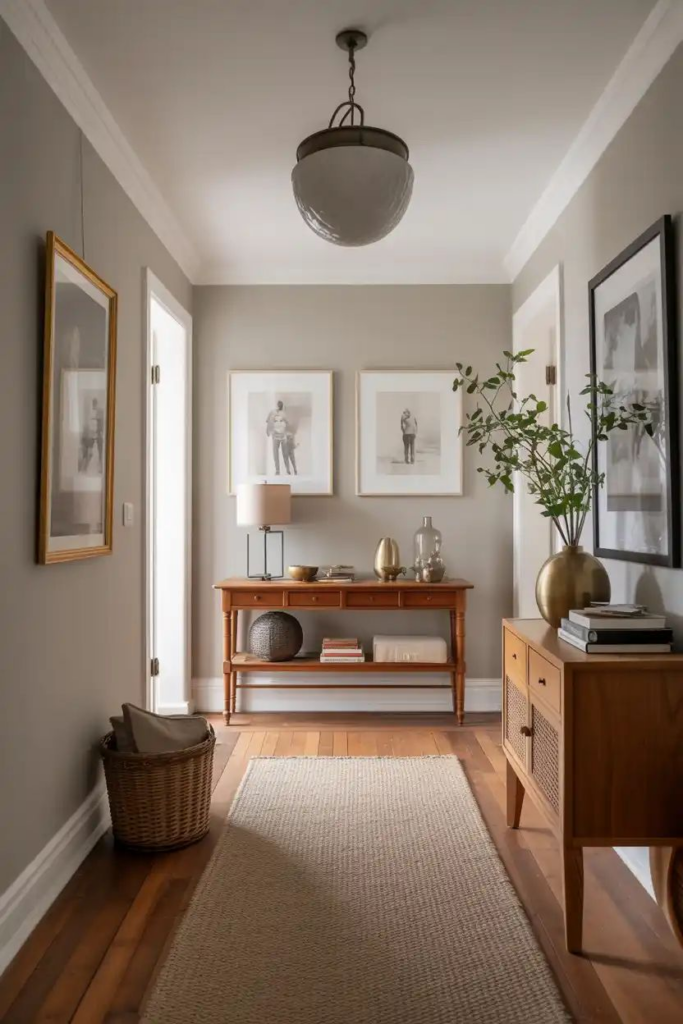
Paint undertones quietly influence how a color behaves once applied, yet many skip proper testing. Two shades labeled similarly can appear drastically different depending on their base pigments. Gray may lean blue, green, or purple, while beige can shift pink or yellow. Without testing, these undertones may clash with flooring, cabinetry, or natural light. Entryways amplify this issue because they often connect multiple rooms with varying palettes. Sampling paint directly on walls allows observation across daylight and artificial lighting. Viewing samples next to fixed finishes reveals compatibility issues early. Undertones become more noticeable in larger areas than on small swatches. Ignoring this step often leads to repainting after installation. Balanced undertones create seamless transitions and visual calm. Successful color selection depends on patience and observation rather than assumptions based on names or labels. Testing ensures the final result aligns with expectations and supports long-term satisfaction.
Painting All Walls the Same Shade
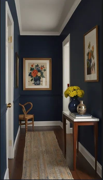
Uniform wall color throughout an entryway can unintentionally reduce dimension. While consistency feels safe, it may overlook architectural opportunities. Niches, stair walls, or adjoining corridors benefit from subtle variation that guides movement. A single shade can flatten depth, especially in larger or oddly shaped entries. Using tonal shifts or accent sections introduces structure without overwhelming the space. For example, slightly deeper tones on focal walls ground the area, while lighter shades maintain openness. Trim, paneling, or upper wall sections can also vary gently to add interest. This approach maintains cohesion while enhancing spatial clarity. Overly uniform color often appears static and uninspired. Strategic variation supports both function and aesthetics. The goal is flow with definition, ensuring the entryway feels intentional rather than monotonous. Thoughtful differentiation improves wayfinding and visual comfort.
Choosing Beige Without Contrast

Beige remains popular for its warmth, but without contrast it can feel dull. Walls, trim, and floors in similar beige tones blend together, creating a washed-out appearance. Entryways need visual cues to define edges and transitions. Without contrast, architectural details fade and the space lacks focus. Introducing variation through trim color, wall depth, or complementary accents restores balance. Cooler or warmer counterpoints prevent beige from appearing lifeless. Texture also plays a role; matte walls paired with semi-gloss trim add subtle distinction. Lighting fixtures and hardware further enhance definition. Beige works best as a backdrop when supported by layered elements. Avoiding contrast results in a bland first impression. Thoughtful pairing ensures warmth without monotony, allowing beige to feel refined rather than flat.
Forgetting Ceiling Color Impact
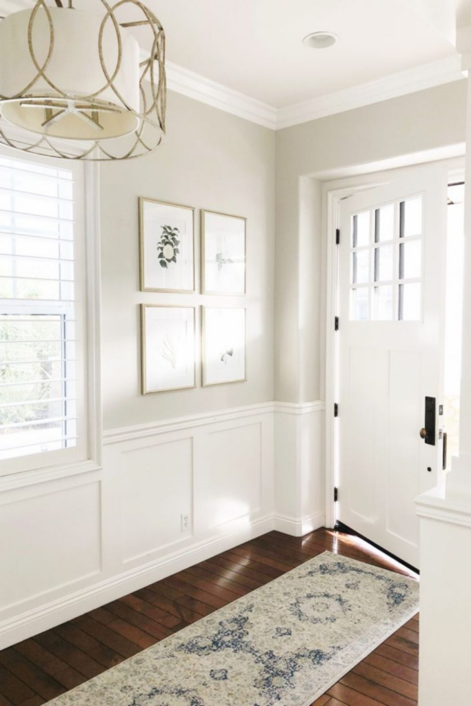
Ceilings influence how walls are perceived, yet they are often ignored during color selection. A stark white ceiling paired with warm walls can create visual disconnection. Conversely, ceilings that are too dark may lower perceived height. Entryways benefit from ceiling colors that support proportion and flow. Slightly softened whites or lighter versions of wall colors maintain cohesion. In taller entries, subtle ceiling contrast adds intimacy without heaviness. Lighting reflects off ceilings, affecting overall brightness. Ignoring this interaction can result in uneven illumination. Testing ceiling and wall combinations together ensures harmony. Thoughtful ceiling color selection enhances architectural balance and comfort.
Bold Colors Without Anchors
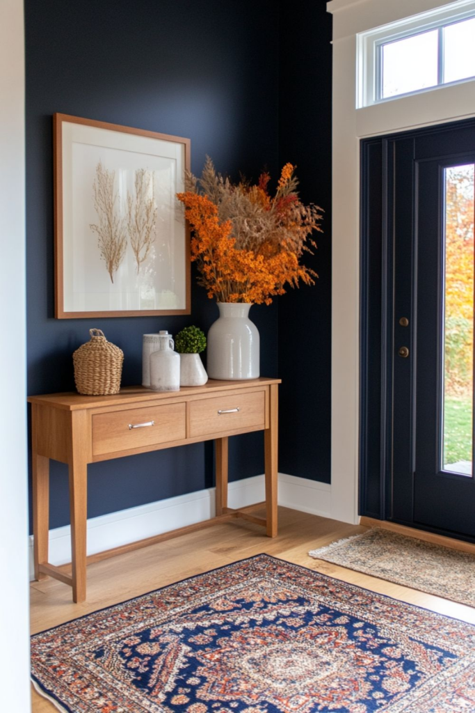
Strong wall colors can bring personality to an entryway, but problems arise when they stand alone without visual grounding. Saturated hues demand balance, and without supportive elements they quickly feel overpowering. An entry painted in a vivid tone with no neutral reference points often appears chaotic rather than intentional. Floors, trim, doors, or built-in features act as visual anchors that stabilize intensity. When these elements are missing or equally bold, the eye has nowhere to rest. This mistake is common in small or transitional spaces where color impact is felt immediately. Anchors do not need to be dramatic; natural wood, soft neutrals, matte black accents, or even consistent metal finishes provide structure. Artwork, mirrors, and lighting fixtures also help distribute color weight across the space. Without anchors, bold walls can clash with adjacent rooms, disrupting flow. Entryways should feel confident yet controlled. A well-anchored color scheme ensures vibrancy feels curated, not accidental. The result is a welcoming first impression that showcases personality while maintaining visual order and long-term versatility.
Not Testing Night Lighting

Wall colors rarely look the same after sunset, yet nighttime conditions are often ignored during selection. Artificial lighting introduces variables that significantly alter paint appearance. Warm bulbs can amplify yellow or red undertones, while cooler lighting may push colors toward gray or blue. A shade that feels balanced in daylight can turn dull, muddy, or overly intense in the evening. Entryways are frequently used at night, making this oversight especially noticeable. Shadows deepen, contrast shifts, and reflective surfaces behave differently under lamps and overhead fixtures. Testing paint only during the day provides incomplete information. Observing samples under actual nighttime lighting reveals how the color truly performs. Bulb temperature, fixture placement, and ceiling height all influence results. Without testing, homeowners often discover issues only after installation, leading to frustration and repainting. Reliable color choices hold their character across lighting conditions. Viewing samples at multiple times ensures consistency, comfort, and confidence. Night testing protects the entryway from unexpected tonal shifts and supports a polished, dependable outcome.