
Small updates at the front door can significantly change how an entire home feels, both visually and functionally. An entryway refresh improves flow, boosts curb-to-couch appeal, and sets a welcoming tone without requiring major renovation. Simple changes such as updated lighting, refined color palettes, better storage solutions, or refreshed wall details help modernize the space while supporting daily routines. Because this area connects every room, even minor adjustments create a ripple effect throughout the home. This guide focuses on practical, high-impact refresh ideas that deliver noticeable results quickly, making it easier to create an entryway that feels current, organized, and thoughtfully designed.
Swap to a Statement Mirror
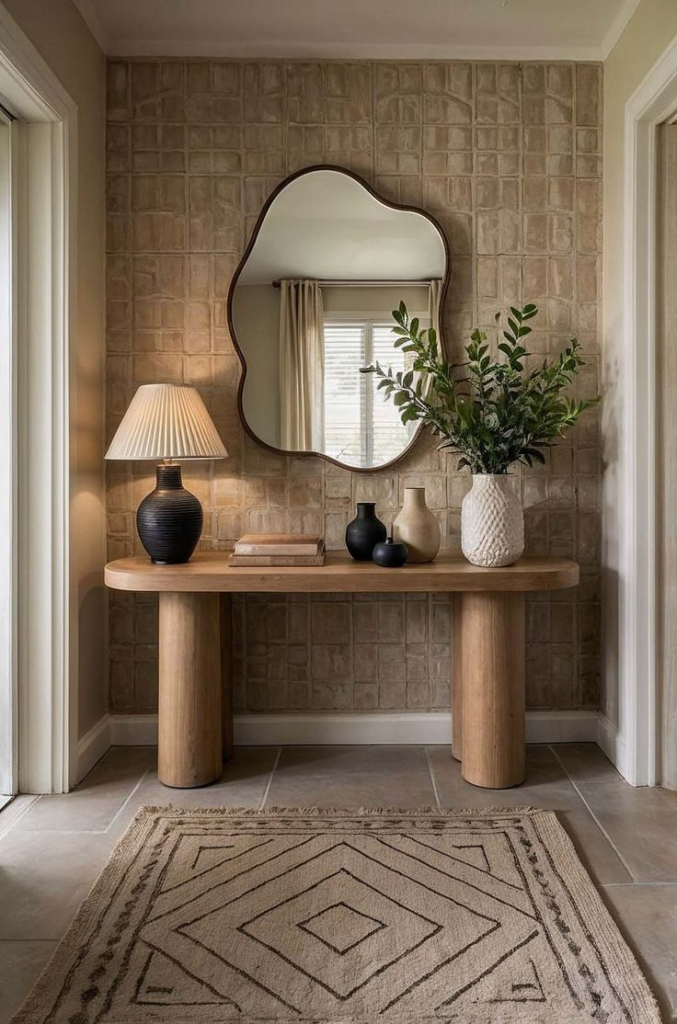
First impressions inside a home are shaped by how light and space interact, and reflective surfaces play a critical role in that experience. Replacing a basic mirror with a statement piece immediately alters perception, making an entryway feel larger, brighter, and more intentional. Oversized frames, arched silhouettes, or softly antiqued glass draw attention without requiring additional decor. Positioning matters more than size; a mirror placed opposite natural light helps bounce brightness deeper into the space, while one aligned with sightlines enhances flow. Frame material should relate to nearby finishes, such as wood tones, metal accents, or painted trim, to prevent visual disconnect. Avoid cluttering the area beneath the mirror, as negative space reinforces its impact. When selected thoughtfully, a single mirror can reduce the need for wall art, lighting adjustments, or extra accessories. This approach works particularly well in narrow or dark entryways where visual expansion is needed. A refined mirror choice also improves functionality, offering a practical last check before leaving while reinforcing a polished, welcoming aesthetic that feels deliberate rather than decorative excess.
Edit to One Clean Surface
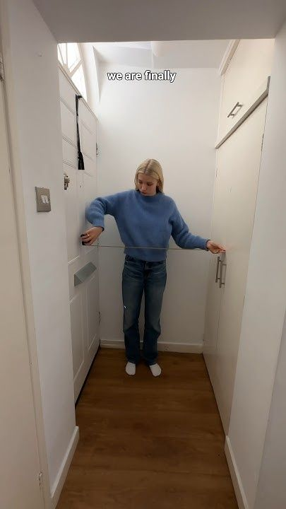
Calm often begins with restraint, especially in high-traffic transition areas. Reducing an entryway to one clear surface immediately improves organization, clarity, and ease of use. Whether that surface is a console top, floating shelf, or narrow bench, limiting what rests there prevents the space from feeling chaotic. Keys, mail, and small accessories quickly overwhelm tight areas, so thoughtful editing is essential. Select only items that serve daily purpose or reinforce visual balance, such as a tray, lamp, or sculptural object. Everything else should live elsewhere. This approach simplifies cleaning and reinforces predictable habits, making the entry easier to maintain long term. Surface editing also strengthens architectural features by allowing walls, flooring, and lighting to stand out. Homes with limited square footage benefit most from this strategy, as fewer visual interruptions make the area feel larger. Consistency is crucial; once the surface is simplified, maintaining it becomes intuitive rather than effortful. A single clean plane creates a composed foundation that supports additional updates without competing for attention or cluttering the arrival experience.
Layer a Slim Runner

Floor coverage influences comfort, sound absorption, and visual direction in an entryway. Introducing a slim runner subtly defines the pathway while protecting flooring from daily wear. Length matters more than width; a longer runner draws the eye inward, making the space appear extended rather than compressed. Low-pile materials work best, allowing doors to open freely and minimizing tripping risk. Texture should remain understated, relying on woven detail or tonal pattern instead of heavy contrast. Color selection plays a functional role as well, with mid-tone hues disguising dirt better than pale shades while still reflecting light. Proper padding underneath prevents slipping and adds softness underfoot. Placement should leave a consistent border of flooring visible on both sides to avoid crowding the space. Runners also reduce noise from footsteps, creating a quieter transition into the home. When chosen carefully, this single textile layer adds warmth, durability, and visual structure without requiring additional decor elements or rearrangement of furniture.
Upgrade Entry Lighting
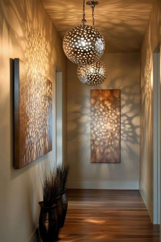
Lighting establishes mood before any other design element registers. Updating entry lighting improves safety, visibility, and atmosphere simultaneously. Overhead fixtures should provide even illumination without harsh glare, particularly in homes where natural light is limited. Warm color temperatures create a welcoming effect, while dimmable options allow adjustment throughout the day. Scale is essential; fixtures that are too small feel insignificant, while oversized options overwhelm tight spaces. Flush mounts, semi-flush designs, or compact pendants often provide the best balance. Wall-mounted lighting can supplement overhead sources, reducing shadows and enhancing depth. Thoughtful placement ensures light reaches mirrors, flooring, and door hardware effectively. Upgraded lighting also highlights architectural details, improving perceived quality without structural changes. Energy-efficient bulbs reduce maintenance while maintaining consistent output. When lighting is addressed early in an entry refresh, other updates appear more intentional and refined. A well-lit entry supports daily routines, enhances security.
Add a Tall Green Accent
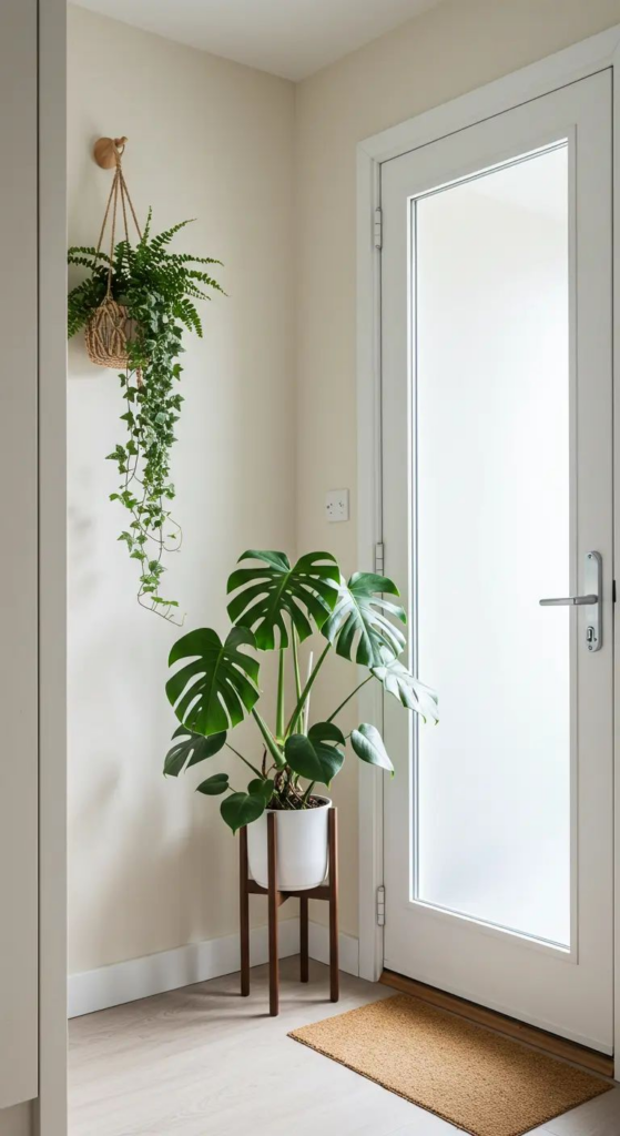
Vertical greenery introduces life, softness, and proportion to an entryway without occupying valuable floor space. A tall plant draws the eye upward, balancing door height and preventing the area from feeling compressed. Species selection should prioritize durability, particularly in spaces with fluctuating temperatures or inconsistent light. Faux options can work equally well when realism and scale are prioritized. Placement near corners or alongside furniture anchors the composition and avoids obstructing movement. Planters should complement surrounding finishes, keeping colors neutral or earthy for longevity. Greenery also improves perceived air quality and reduces visual hardness created by walls and flooring. Unlike smaller decorative items, a single tall plant delivers impact without clutter. Maintenance remains minimal when choices align with environmental conditions. This element works across design styles, from contemporary to traditional, making it a versatile addition. Over time, a vertical green accent becomes part of the home’s identity, offering a sense of arrival that feels calm, intentional, and refreshed.
Style a Micro Drop Zone

Daily routines rely on predictability, and a compact drop zone supports that rhythm without overwhelming limited space. Instead of spreading items across multiple surfaces, a contained area encourages consistency. A shallow tray, small bowl, or wall-mounted pocket keeps essentials accessible while maintaining order. The goal is control, not capacity. Restricting size prevents accumulation and forces regular clearing. Materials should feel durable and tactile, reinforcing everyday use. Placement near the door ensures convenience, while visual separation keeps the rest of the entry clean. This solution works especially well in shared households, reducing misplaced items and morning friction. A micro drop zone also minimizes visual noise by grouping necessities into a single, intentional element. When styled simply, it blends seamlessly into the entry rather than drawing attention. Over time, this small adjustment delivers outsized benefits, improving organization and reducing clutter without requiring storage furniture or structural changes.
Shift Art to Vertical Focus

Wall art placement influences how space is perceived, particularly in narrow entryways. Moving artwork into a vertical orientation emphasizes height and redirects attention upward. Tall pieces, stacked frames, or elongated forms visually stretch the walls, creating a more open impression. Scale matters; artwork should relate to wall size rather than furniture width alone. Centering pieces at eye level maintains balance while avoiding visual strain. Frames with minimal detailing prevent distraction and keep focus on composition. Consistency across materials strengthens cohesion, especially in transitional spaces that connect rooms. Vertical artwork also pairs well with mirrors, lighting, and tall plants, reinforcing a cohesive visual rhythm. Avoid overcrowding by limiting the number of pieces used. This strategy works particularly well when wall space is limited, allowing expression without consuming floor area. Thoughtful vertical art placement refines the entryway while supporting proportion and architectural flow.
Neutralize With Light Tones

Color choice directly affects brightness, perceived size, and emotional response. Light-toned palettes create an immediate sense of openness, especially in enclosed entryways. Soft neutrals reflect available light, reducing shadows and enhancing clarity. Undertones matter; warmer shades feel inviting, while cooler hues appear crisp and modern. Consistency across walls, trim, and adjacent spaces prevents abrupt transitions. This approach allows architectural details and textures to take precedence without competition. Light tones also provide flexibility, supporting seasonal decor changes without requiring repainting. Durability should not be overlooked; washable finishes maintain appearance despite frequent contact. When applied thoughtfully, a restrained palette simplifies decision-making and reduces visual fatigue. Neutral environments feel timeless, appealing to a wide range of preferences. Over time, this color strategy supports longevity and adaptability, making the entryway feel intentional rather than trend-driven.
Hide Shoes in Closed Storage
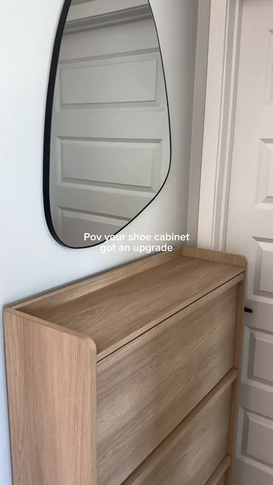
Footwear quickly becomes visual clutter when left exposed near the door. Closed storage offers a practical solution while preserving order and cleanliness. Slim cabinets, benches with concealed compartments, or pull-out drawers maximize capacity without crowding the entry. Ventilation is important to prevent odor buildup, particularly in daily-use households. Interior dividers improve organization and accessibility. Exterior finishes should align with surrounding elements to avoid drawing unnecessary attention. By concealing shoes, the entry immediately appears calmer and more spacious. This adjustment also improves hygiene, protecting flooring from dirt and moisture. Families benefit most, as contained storage reduces daily cleanup. When storage integrates seamlessly, functionality improves without sacrificing aesthetics. Over time, this solution reinforces habits that keep the entry tidy, making arrivals and departures smoother and less stressful.
Create a Single Focal Point
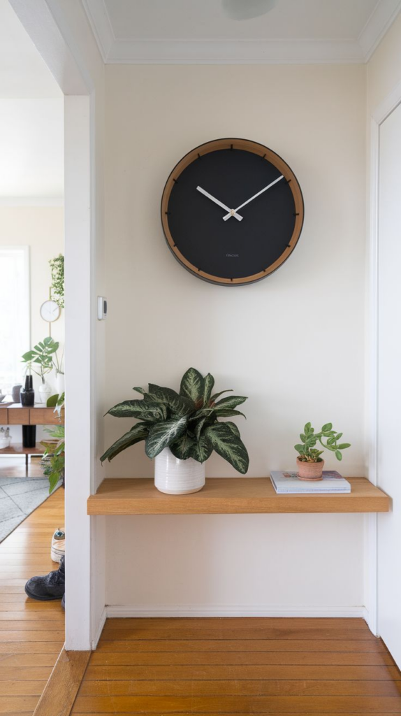
Visual clarity improves when attention is guided deliberately. Establishing one focal point prevents the entryway from feeling scattered. This could be achieved through lighting, artwork, a mirror, or architectural detail. The key lies in restraint; surrounding elements should support rather than compete. Scale and placement determine effectiveness, with central alignment often providing the strongest impact. Neutral backgrounds enhance focal visibility, while consistent finishes maintain balance. This strategy simplifies design decisions by reducing the need for multiple decorative elements. Homes with limited space benefit significantly, as a singular emphasis creates cohesion without excess. Over time, a clear focal point strengthens identity and reinforces intentional design. Visitors immediately understand where to look, creating a composed and confident first impression.
Match Hardware Finishes

Small details collectively shape overall perception. Matching hardware finishes across doors, lighting, furniture, and accessories creates visual continuity. Mixed metals can work, but only when intentionally balanced. Consistency reduces distraction and improves perceived quality. Warm finishes introduce softness, while cooler tones feel structured and modern. Durability should guide selection, especially in high-touch areas. Coordinated hardware also simplifies future updates, allowing changes without visual conflict. This approach requires minimal investment but delivers noticeable refinement. Over time, unified finishes age better and maintain cohesion as other elements evolve. Attention to hardware detail signals thoughtful design and elevates the entire entry experience.
Add a Subtle Signature Scent
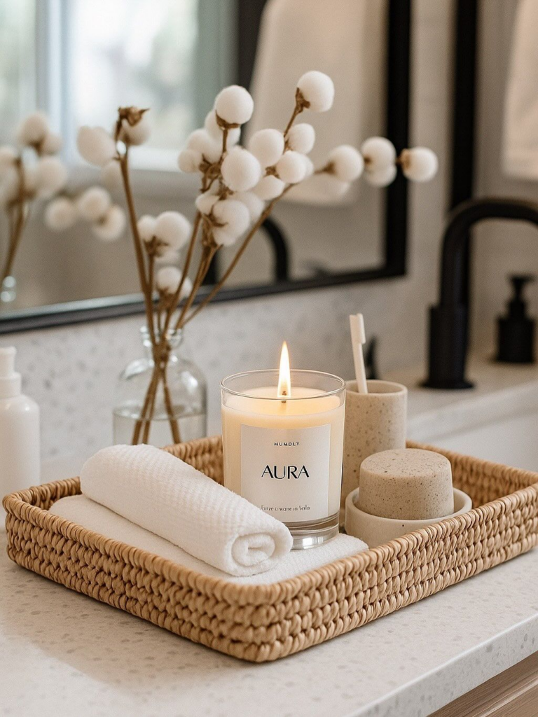
Scent influences memory and comfort more deeply than visual elements alone. Introducing a subtle fragrance establishes atmosphere immediately upon entry. Light, clean notes work best, avoiding overpowering intensity. Placement should allow gentle diffusion without direct contact. Consistency matters; using the same scent reinforces familiarity and comfort. Seasonal adjustments can refresh the experience while maintaining identity. This sensory layer complements visual updates, completing the entryway experience. When applied sparingly, scent enhances warmth and hospitality without distraction. Over time, it becomes associated with home, creating a welcoming impression that lingers beyond first glance.