
Color, personality, and character often meet at the front door, where first impressions are formed in seconds. A colorful eclectic entryway offers a practical way to express individuality while keeping daily routines functional and organized. Layered hues, mixed materials, statement art, and global accents create visual interest without sacrificing usability. This approach suits modern homes that value creativity, flexibility, and lived-in style rather than rigid design rules. Thoughtful combinations of color, pattern, and texture help small or awkward entryways feel intentional and inviting. The ideas ahead focus on realistic, high-impact solutions that reflect current interior trends and personal storytelling.
Color-Blocked Entry Walls
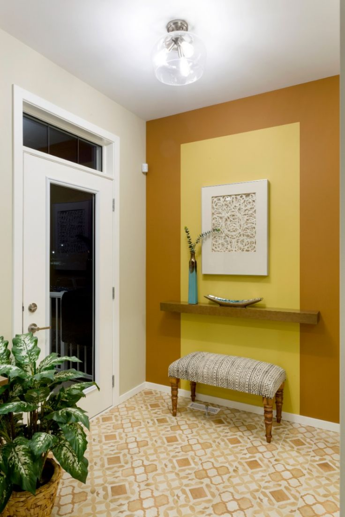
Color-blocking works best in entryways when zones feel intentional rather than decorative. Dividing the wall horizontally or vertically using two to three confident hues helps define scale, especially in narrow or low-light foyers. A darker tone near the floor hides scuffs, while a lighter or brighter upper section lifts visual height. Clean edges matter more than color choice, so painter’s tape and measured proportions keep the look architectural. Eclectic homes benefit from blocks that echo nearby furnishings, artwork, or textiles instead of random contrasts. Matte finishes reduce glare and keep bold tones grounded. This approach also solves the problem of busy décor by letting color do the talking without extra objects. For renters, removable paint panels or peel-and-stick wall color sections mimic the same effect without commitment. Color-blocked walls guide the eye forward, making small entryways feel purposeful rather than transitional. When paired with simple hooks or a floating shelf, the wall remains functional and uncluttered. Thoughtful spacing prevents overwhelm and keeps the palette cohesive. This idea suits high-traffic homes because it balances personality with durability, offering an easy-maintenance solution that still feels expressive, curated, and visually strong from the moment the door opens.
Statement Console in Unexpected Color
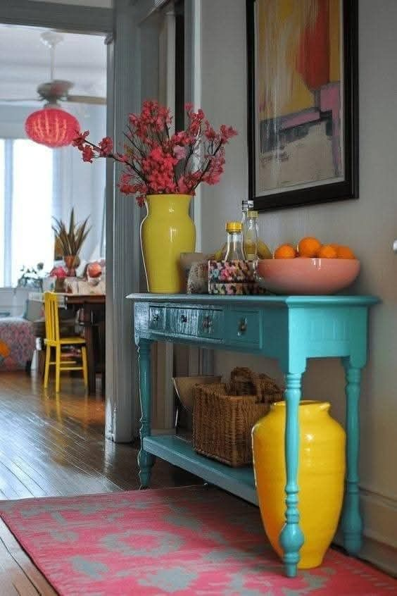
A console table becomes a focal point when its color contrasts with the surrounding palette instead of blending in. Choosing an unexpected shade like muted coral, inky teal, or chartreuse instantly sets an eclectic tone without crowding the entryway. Slim silhouettes work best, allowing color to command attention rather than bulk. Painted wood or powder-coated metal finishes handle daily wear while maintaining saturation. This strategy solves neutral-heavy entryways that feel forgettable by anchoring the space with one decisive element. Styling should remain restrained: a mirror, a small lamp, and one sculptural object keep the console functional. Open-legged designs prevent visual heaviness, especially in apartments or townhomes. Tying the console color to a small accent elsewhere, such as artwork or a runner, builds cohesion without matching sets. Storage drawers add practicality for keys and mail while preserving clean lines. This approach suits renters and homeowners alike, as repainting furniture is lower risk than wall changes. A strong console color signals confidence and creativity, making the entryway feel intentional rather than transitional, while still supporting everyday routines and traffic flow.
Pattern Mixing with Shared Color Thread
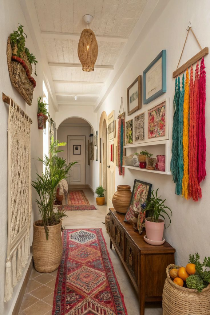
Pattern mixing succeeds in entryways when a single color quietly connects every surface. Rugs, wallpaper, cushions, and art can vary in scale and motif as long as one consistent hue repeats throughout. This shared thread prevents visual chaos while supporting an eclectic aesthetic. Smaller entryways benefit most because pattern distracts from limited square footage and adds depth. Geometric runners pair well with organic wall art or vintage prints when colors overlap subtly. Limiting the palette to two or three dominant tones keeps the space readable at a glance. This method also allows homeowners to use collected pieces rather than buying matching sets. Durability matters in high-traffic zones, so washable textiles and sealed wallpaper finishes help patterns last. Lighting should remain neutral to avoid color distortion. Pattern mixing works as a problem-solving tactic for bland entryways, introducing personality without large furniture investments. When done thoughtfully, the result feels layered yet calm, expressive yet controlled. The key lies in repetition, not symmetry, allowing individuality while maintaining balance. This approach reflects lived-in style, making the entryway feel welcoming, curated, and confidently eclectic without appearing cluttered or accidental.
Gallery Wall with Color Rhythm
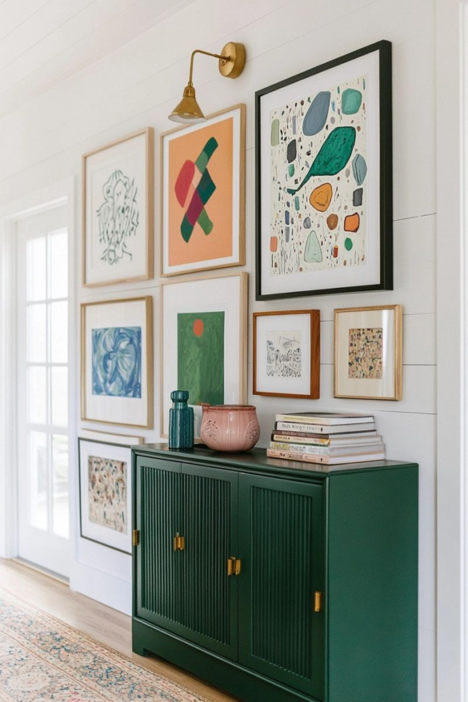
A gallery wall feels cohesive when color placement follows a rhythm rather than random spacing. Alternating artwork with shared tones creates movement across the wall, guiding the eye naturally from piece to piece. Entryways benefit from tighter spacing and smaller frames to avoid overwhelming narrow corridors. Mixing frame finishes works when at least one color repeats consistently. Artwork sizes should vary, but alignment along a central axis keeps the arrangement structured. This technique solves the common issue of mismatched art collections by unifying them visually. Neutral wall colors allow artwork hues to stand out without competition. Lightweight frames reduce installation stress and make updates easier over time. A gallery wall also distracts from awkward layouts or short sightlines, adding depth where architecture falls flat. Keeping the lower edge above shoulder height prevents damage in high-traffic areas. Color rhythm brings order to eclectic displays, ensuring personality doesn’t sacrifice clarity. The result feels intentional, personal, and visually engaging, offering guests an immediate sense of style while remaining practical for everyday use and frequent movement.
Neutral Floor Anchor
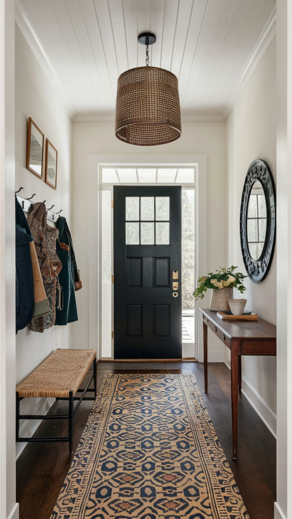
Neutral flooring acts as a stabilizing base in colorful eclectic entryways. Materials like light oak, terrazzo, concrete, or warm stone ground bold walls and furnishings without competing for attention. This approach prevents visual overload, especially in compact foyers where multiple colors converge. Durable finishes handle dirt, moisture, and foot traffic while maintaining a calm backdrop. Rugs layered on neutral floors stand out more clearly, allowing pattern and color to shine. This strategy also future-proofs the space, making palette updates easier over time. Neutral floors solve the problem of clashing elements by quietly supporting them. Matte or lightly textured surfaces reduce glare and hide wear. In open-plan homes, consistent flooring helps the entryway flow into adjacent rooms seamlessly. The neutrality doesn’t read as boring when surrounded by expressive décor; instead, it enhances contrast. By anchoring the design, the floor keeps the entryway feeling balanced, practical, and visually resolved, ensuring bold choices elsewhere feel deliberate rather than overwhelming or disconnected.
Colorful Runner as Visual Guide
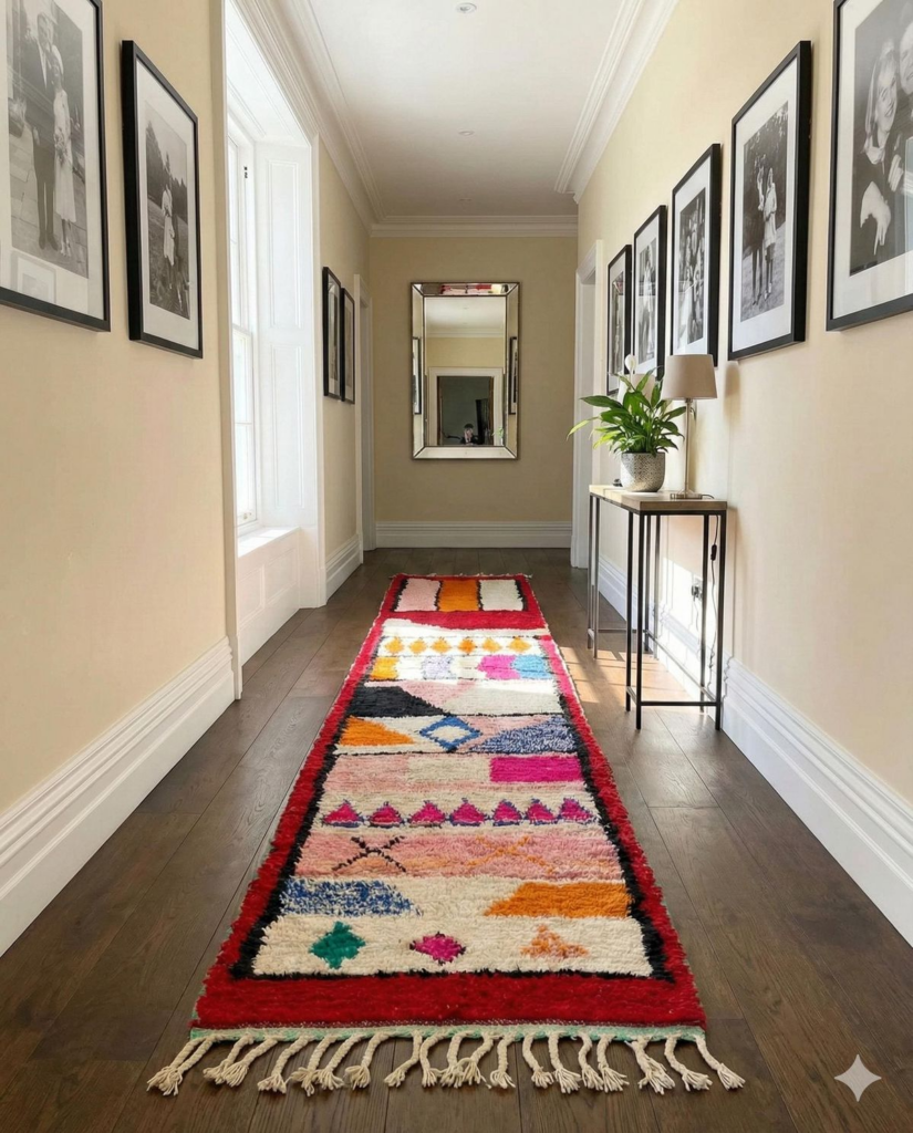
A runner rug functions as both décor and navigation tool in an entryway. Bright colors and patterns naturally pull guests inward, guiding movement through narrow or elongated spaces. Flat-weave or low-pile runners suit high-traffic zones, offering durability without tripping hazards. Color choice should echo nearby accents to maintain cohesion. This solution addresses awkward layouts by visually defining a clear path. Runners also protect flooring from wear while softening acoustics. In eclectic homes, vintage or kilim-style rugs add character without bulky furniture. Non-slip pads improve safety and extend rug life. Length matters; a runner should stop short of doors to avoid obstruction. This approach adds personality quickly and affordably, making it ideal for renters or frequent refreshers. A well-chosen runner transforms transitional space into a designed moment, balancing function and expression. The entryway feels intentional, welcoming, and easy to navigate, all while showcasing color in a controlled, practical way.
Single Saturated Accent Moment
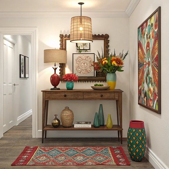
One highly saturated element can define an eclectic entryway more effectively than multiple competing accents. A painted niche, sculptural vase, or upholstered stool in a vivid hue creates a focal point without clutter. This tactic works well in small spaces where restraint matters. Surrounding elements should remain quieter, allowing the accent to stand out clearly. Saturated colors read best against neutral or lightly textured backgrounds. This approach solves the issue of over-decoration by concentrating impact into a single moment. Durable finishes ensure longevity in busy households. Repeating the accent color subtly elsewhere maintains cohesion without duplication. This method supports quick updates, as swapping one piece refreshes the entire space. The result feels confident and curated rather than busy. A single accent moment communicates personality immediately while preserving function, making the entryway visually memorable yet easy to maintain and adapt over time.
Eclectic Bench with Functional Limits
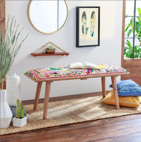
An eclectic bench adds seating and storage when its size respects the entryway’s scale. Slim profiles prevent congestion while still offering a practical spot for shoes or bags. Mixing materials like wood, metal, and fabric enhances character without excess. Colorful upholstery works best when paired with simple legs to maintain balance. Storage beneath should remain partially open to avoid visual heaviness. This idea addresses clutter by defining boundaries for everyday items. Benches also support accessibility, making transitions easier for all ages. Durable fabrics and finishes handle frequent use. Positioning the bench along a wall keeps pathways clear. In eclectic spaces, the bench becomes a functional anchor rather than decorative filler. Limiting accessories on and around it preserves clarity. The result is a welcoming, organized entryway that balances personality with real-life needs, ensuring style never interferes with movement or daily routines.
Mixed-Era Decor with Color Filter

Blending décor from different eras feels cohesive when color acts as the unifying filter. Vintage mirrors, modern lighting, and traditional furniture coexist comfortably when they share a common palette. This approach allows collected pieces to shine without visual conflict. Entryways benefit because scale and style differences become secondary to color harmony. Limiting finishes prevents overload. This method solves mismatched décor challenges common in eclectic homes. Color repetition across eras creates continuity, making transitions feel intentional. Neutral backdrops help highlight contrasts in form and texture. Mixed-era styling adds depth and storytelling to small spaces. The entryway feels layered yet controlled, reflecting personality without chaos. This approach encourages thoughtful curation, ensuring every piece contributes to a cohesive visual narrative while remaining functional and welcoming for daily use.
Unexpected Color on Door or Frame
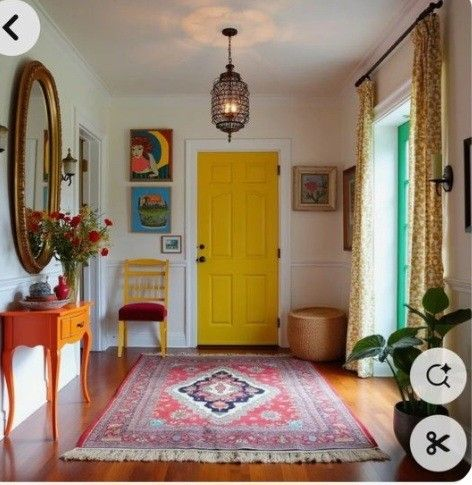
Color applied to doors or frames adds impact without occupying floor space. Painting interior entry doors, trim, or sidelights in a bold shade introduces personality instantly. This tactic works well in rentals when permitted, as it’s easier to reverse than full walls. Semi-gloss finishes withstand frequent contact and clean easily. This solution highlights architectural features that often go unnoticed. Tying the door color to accessories maintains balance. In small entryways, this single move transforms the space without clutter. It also improves wayfinding in multi-room homes. The contrast draws attention inward, making the entry feel designed rather than leftover. A colored frame acts as a visual threshold, signaling transition while supporting eclectic style through a controlled, practical application.
Layered Lighting for Bold Colors
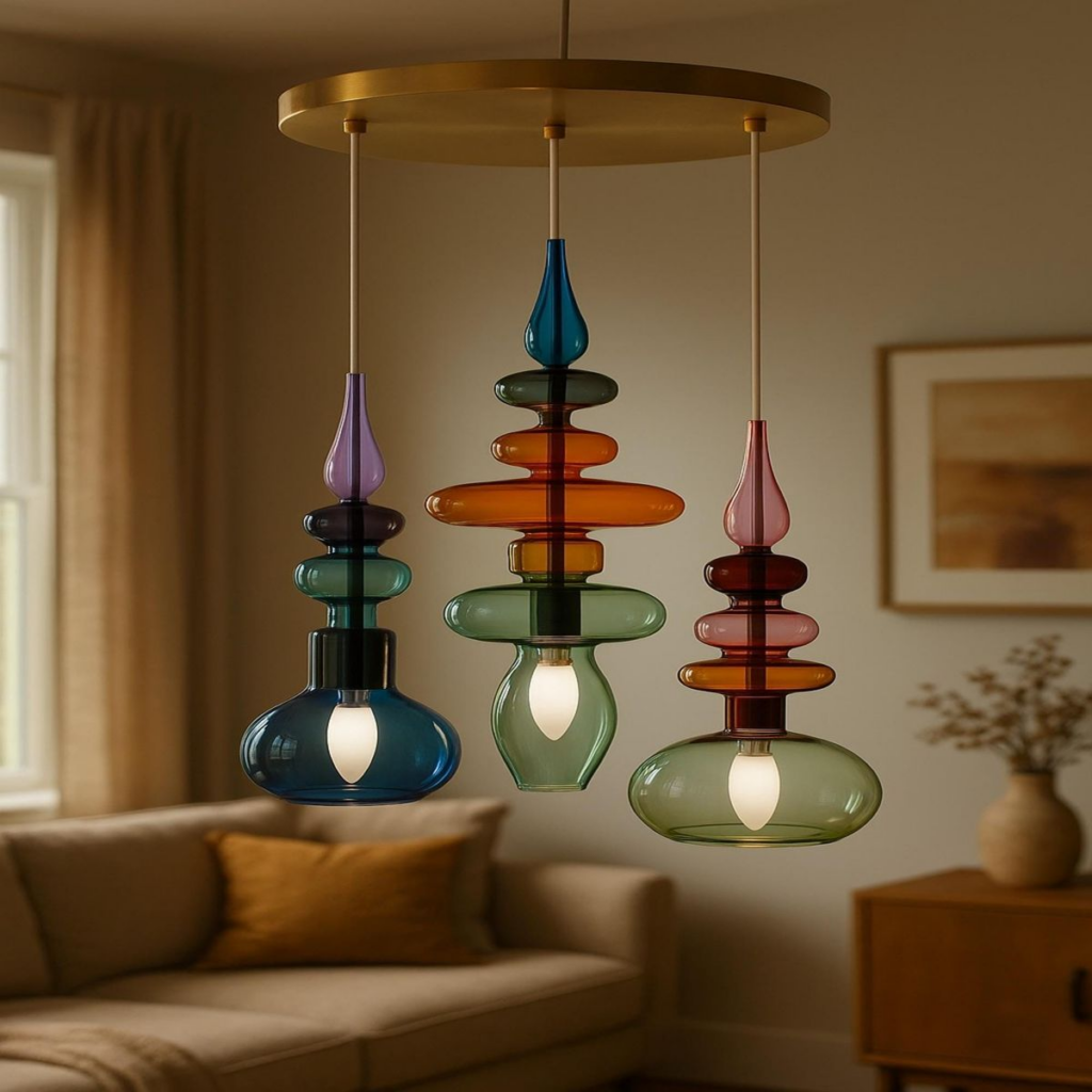
Lighting determines how bold colors read in an entryway. Layering ambient, task, and accent lighting prevents saturation from feeling harsh. Wall sconces soften shadows, while overhead fixtures provide clarity. Accent lights highlight artwork or color-blocked walls, adding depth. Warm bulbs balance vivid hues, preventing distortion. This approach solves the issue of colors appearing flat or overwhelming. Dimmers allow flexibility throughout the day. Compact fixtures suit small spaces without crowding. Thoughtful lighting ensures colors remain intentional rather than overpowering. The entryway feels inviting and functional at all hours, supporting both aesthetics and daily routines through controlled illumination.
Colorful Drop Zone with Structure
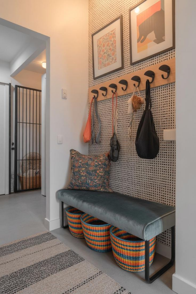
A structured drop zone keeps colorful entryways organized. Wall-mounted shelves, trays, and hooks in coordinated hues define storage without clutter. Clear boundaries prevent overflow of daily items. Durable finishes handle frequent use. Color coding helps distinguish functions, improving efficiency. This setup solves common entryway mess by assigning purpose to every element. Compact arrangements suit small homes. Visual order supports eclectic style without chaos. The result is a lively yet disciplined entryway that balances expression with practicality, ensuring color enhances function rather than disrupting it.