Color has the power to completely shift the mood, size perception, and overall style of a bathroom. Bathroom-Transforming Color Combos showcase how the right pairings can make small spaces feel open, dated designs look modern, and plain rooms appear luxurious. From calming neutrals balanced with natural tones to striking contrasts that add drama, these palettes are both timeless and practical. Readers will discover expert-approved ideas that work for different layouts, lighting conditions, and personal styles. With the right combinations, any bathroom can feel refreshed, inviting, and thoughtfully designed—without the need for costly renovations or complicated updates.
Greige + Sage Green — soft neutral + muted green brings calm & nature

Layering greige with sage green produces a soothing balance that feels timeless yet grounded. Greige works as a versatile foundation, blending the warmth of beige with the freshness of gray, while sage green adds a natural note reminiscent of eucalyptus and soft herbs. In bathrooms, this pairing makes walls, cabinetry, or even textiles feel understated but serene. Consider greige on larger surfaces such as floor tiles or painted walls, while sage accents shine through towels, a vanity finish, or subtle mosaic tilework. Natural light enhances this duo, reflecting the soft green undertones without overwhelming the space. The combination pairs well with matte black or brushed nickel fixtures, further elevating a contemporary spa-like setting. For added warmth, integrate natural wood shelving or woven baskets, which complement both tones effortlessly. Unlike harsher contrasts, this scheme avoids visual tension, making it particularly effective in smaller bathrooms where tranquility is valued. Whether styled with leafy plants or minimal accessories, greige and sage create a calm, fresh aesthetic that feels modern yet organic. It’s a palette designed for those who want their bathroom to be more than functional—an environment that encourages daily relaxation and a subtle connection to nature.
Slate Blue + Warm White — cool tone with warmth for balance
Pairing slate blue with warm white produces a refreshing, versatile palette perfect for bathrooms seeking clarity without sterility. Slate blue introduces a refined, slightly moody undertone, while warm white softens its coolness, creating harmony that feels both crisp and inviting. Applied to cabinetry, wall panels, or vanity surfaces, slate blue anchors the design with a coastal yet sophisticated vibe. Meanwhile, warm white walls, tiles, or ceiling areas brighten the space, ensuring the bathroom doesn’t lean too dark. This combination works especially well with brushed brass hardware or natural wood accents, which lend depth and warmth. For an airy effect, include open shelving styled with soft linens, woven baskets, or glass apothecary jars. Slate blue tiles in shower niches or backsplash areas become subtle focal points without feeling overpowering. Lighting choices also play a key role: sconces with warm bulbs highlight the white while drawing out the richness of the blue. Unlike stark black-and-white contrasts, this duo offers balance and approachability, ideal for small or large layouts alike. The result is a bathroom that feels fresh year-round, with enough personality to stand apart from pure neutrals while remaining timeless and calming.
Charcoal Black + Cream — high contrast without harshness

Opting for charcoal black and cream strikes a balance between drama and softness. Charcoal brings depth and grounding, acting as a sophisticated backdrop, while cream offsets the intensity with its warm undertone, keeping the room approachable rather than stark. In bathrooms, this pairing works beautifully when used strategically: consider cream for wall paint or large tiles, and charcoal for cabinetry, shower framing, or accent tiling. The high-contrast look feels polished yet avoids the sharp severity that pure black and white often create. Brass or matte gold fixtures elevate this combination further, adding warmth and elegance, while matte finishes help maintain a relaxed sophistication. Accessories such as cream towels, ceramic vases, or woven baskets soften the darker surfaces, ensuring the room remains balanced. Large mirrors framed in charcoal add dimension, reflecting cream tones throughout the space. For lighting, warm white bulbs prevent the scheme from feeling cold, amplifying cream’s welcoming effect. This duo particularly suits contemporary or transitional bathrooms, offering a sense of luxury without appearing overly formal. By blending bold depth with gentle warmth, charcoal and cream deliver a timeless scheme where contrast works as a tool for balance rather than intimidation.
Mushroom Taupe + Dusty Rose — moody neutrals with subtle color

Taupe in a mushroom shade delivers understated elegance, while dusty rose introduces a muted warmth that avoids being overtly feminine. Together, they create a bathroom palette that feels layered, cozy, and refined. Mushroom taupe works beautifully on larger surfaces like wall paint or stone-inspired tiles, establishing a grounded backdrop. Dusty rose then adds dimension through textiles, cabinetry accents, or subtle tile details, lending a whisper of color that enriches the neutral base. The pairing shines in vintage-inspired or modern farmhouse bathrooms, where softness meets structure. Consider brushed brass or aged bronze fixtures to enhance the warmth of both shades. Wood accents, such as oak shelves or walnut vanities, pair naturally with the taupe undertones, while rose-tinted accessories—soap dispensers, artwork, or candles—introduce gentle highlights. The result is moody but not dark, cozy without overwhelming small spaces. Unlike brighter pinks, dusty rose feels sophisticated and grown-up, making it versatile enough for shared bathrooms. Good lighting ensures both hues appear rich rather than muted, while layered textures like linen towels or patterned rugs add depth. This palette offers a romantic yet practical approach, ideal for anyone seeking color that whispers rather than shouts.
Olive Green + Terracotta — earthy duo with depth

Earth-inspired tones of olive green and terracotta bring warmth, grounding, and natural texture to a bathroom setting. Olive introduces calm, organic depth reminiscent of outdoor landscapes, while terracotta layers on a rustic richness that evokes clay and sun-warmed stone. Used together, they create an atmosphere rooted in nature, ideal for spa-like relaxation. Olive works beautifully on cabinetry, wall paint, or patterned tiles, while terracotta can shine through accent tiling, terracotta-hued floor ceramics, or even decorative accessories like pottery and planters. The combination pairs naturally with warm wood finishes, woven baskets, and linen textiles. Brass or black fixtures further emphasize its earthy sophistication. Lighting should lean warm, echoing the glow of natural sunlight and highlighting terracotta’s warmth. Unlike overly trendy tones, these shades feel timeless due to their organic inspiration. Styling with potted plants or clay vessels enhances the connection to nature, ensuring the scheme remains vibrant but grounded. The balance between olive’s cool undertone and terracotta’s fiery warmth creates visual depth without clashing. The overall effect is a bathroom that feels serene yet rich, offering a subtle nod to Mediterranean and desert influences while remaining universally appealing.
Navy + Blush Pink — classic + soft for drama without heaviness

Navy provides timeless depth, while blush pink softens its boldness, creating a sophisticated yet approachable palette. Navy’s richness works well for cabinetry, tilework, or accent walls, while blush tones bring warmth through textiles, shower curtains, or subtle accent tiles. The contrast is striking but softened, making it ideal for bathrooms that need drama without feeling overly heavy. This combination resonates in both modern and transitional styles, offering a balance between masculine structure and feminine warmth. Fixtures in brushed brass or polished nickel amplify the elegance, while natural textures like marble countertops or light wood shelving ensure the scheme feels grounded. In smaller bathrooms, navy can be used sparingly—perhaps on a vanity or as a shower wall accent—while blush adds lightness across accessories. Lighting is key: warm bulbs highlight pink undertones and prevent navy from appearing too cool. Unlike traditional black-and-white contrasts, navy and blush achieve balance through complementary depth and softness. This duo works year-round, feeling fresh in spring while still cozy in winter. The pairing ultimately delivers a bathroom that feels tailored, stylish, and thoughtfully balanced between boldness and gentle charm.
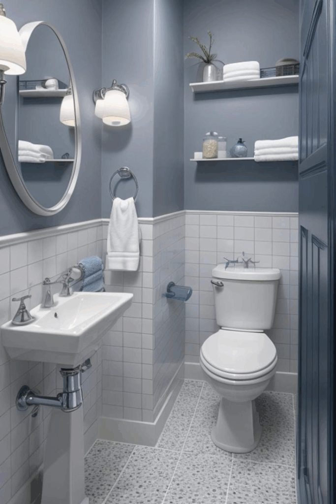
Teal + Light Gray — vibrant yet soothing

Vivid teal offers energy and richness, while light gray tempers the palette with calm neutrality. In bathrooms, this duo balances vibrancy with sophistication, preventing teal from overwhelming the space. Teal can be introduced through accent walls, patterned tiles, or a statement vanity, while light gray creates a subtle backdrop across larger surfaces such as floors, shower walls, or countertops. Together, they evoke both freshness and stability, ideal for modern or coastal-inspired interiors. Fixtures in chrome or brushed nickel accentuate the cool undertones, while wood or woven textures add warmth. The key is proportion: too much teal can dominate, but balanced with gray, the look becomes refined and soothing. Layered lighting enhances both shades, allowing teal to pop without darkening the room. For accessories, gray towels and rugs pair seamlessly, while teal glassware or framed artwork add personality. Unlike more conventional blue-and-white pairings, teal and gray bring a contemporary twist that feels energetic but livable. This scheme works particularly well in medium-sized bathrooms where color can shine without closing in the space. The result is a design that feels both refreshing and grounded, offering vibrancy with just the right dose of calm.
Mustard Yellow + Soft White — cheerful accent in small doses

Warmth and playfulness emerge when mustard yellow is paired with soft white. In bathroom design, this combination feels cheerful without becoming overpowering, especially when mustard is used thoughtfully as an accent rather than the dominant color. Consider soft white walls and cabinetry as the canvas, allowing mustard to highlight smaller elements such as towels, framed prints, shower curtains, or even a painted vanity. The contrast delivers brightness while ensuring longevity, as white provides timeless appeal. Brass or gold-toned fixtures align perfectly with mustard, reinforcing its warmth while elevating the overall aesthetic. To maintain balance, integrate natural elements like rattan baskets or pale wood finishes, which ground the scheme and prevent it from feeling too stark. In smaller bathrooms, mustard provides personality without crowding the room, while in larger layouts, it adds a lively edge. Lighting should lean warm to harmonize with yellow’s undertones, avoiding harsh fluorescent effects. This palette creates a welcoming, optimistic environment that suits households seeking freshness and individuality. Unlike pastel yellows that can fade into the background, mustard has depth and character, making it the perfect choice for those who want a bathroom with uplifting energy but lasting elegance.
Forest Green + Pale Beige — grounded + airy
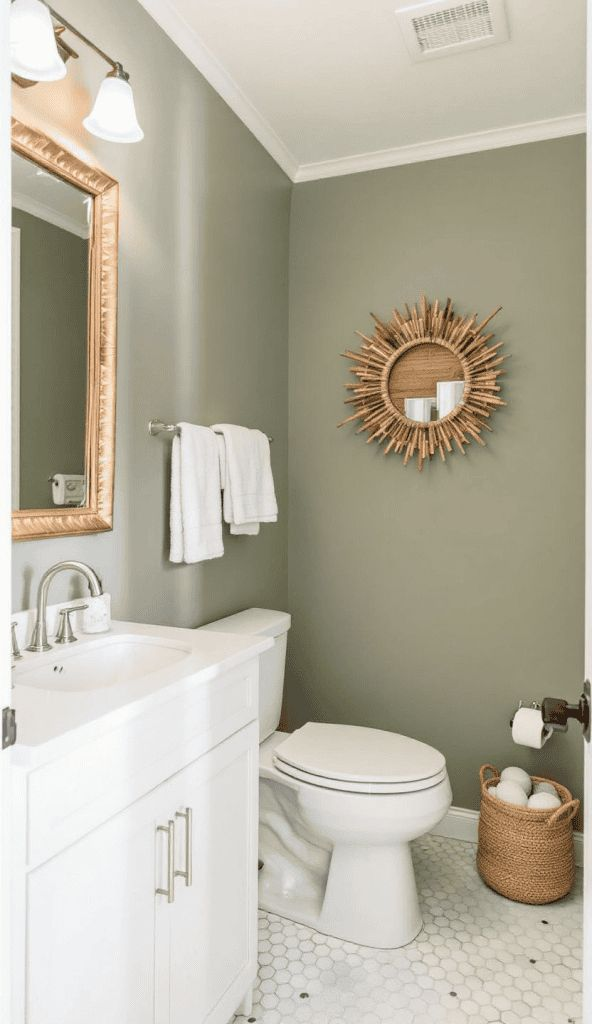
Nature-inspired design finds harmony in forest green paired with pale beige. Forest green introduces depth and richness, reminiscent of woodland tones, while pale beige lightens the scheme, preventing heaviness. The result is a bathroom that feels both grounded and airy, offering comfort and balance. Forest green works beautifully for cabinetry, accent tiling, or even a feature wall, while beige provides a neutral backdrop across floors, walls, or countertops. The interplay mirrors outdoor landscapes, making the bathroom feel serene and connected to nature. Fixtures in brushed brass or matte black enhance the earthy tones, while stone countertops or wooden shelving amplify the natural theme. In smaller bathrooms, forest green can be restricted to cabinetry or accessories, with beige dominating to keep the space open. Larger layouts benefit from bolder use of green, such as shower tile surrounds or dramatic wall paint. Warm lighting is essential to prevent green from appearing too cool, while beige ensures brightness throughout. This palette is versatile, bridging rustic farmhouse charm and contemporary minimalism. Its timeless appeal lies in its connection to nature, delivering a bathroom that feels restorative, balanced, and welcoming for daily routines.
Muted Plum + Creamy Beige — elegant with warmth
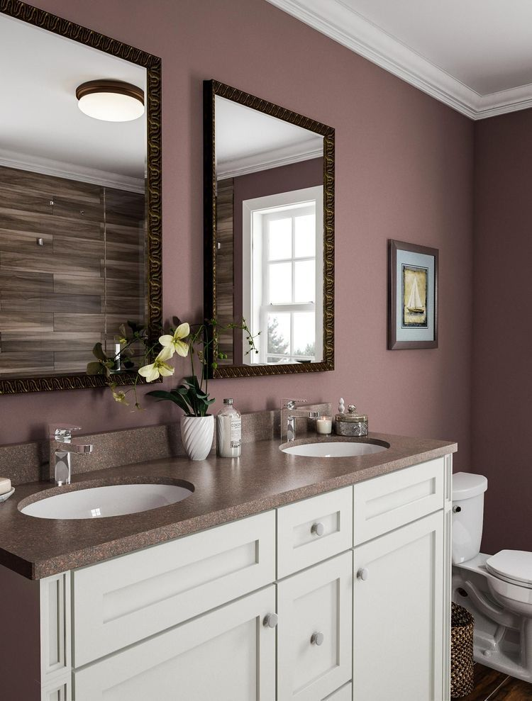
Refinement and warmth define the pairing of muted plum with creamy beige. Plum offers richness without the sharpness of traditional purples, while beige tempers its boldness, creating balance and approachability. In bathrooms, this palette feels sophisticated and inviting, ideal for those who want subtle color without overwhelming vibrancy. Muted plum works well for accent walls, shower niches, or cabinetry finishes, while creamy beige dominates larger surfaces like walls, flooring, or countertops. Fixtures in brushed nickel or aged bronze highlight the richness of plum, while natural textures such as stone and wood tie everything together. Lighting with a warm glow enhances plum’s depth, making it appear luxurious rather than dark. Accessories like beige towels, plum-colored candles, or patterned rugs reinforce the palette without feeling contrived. Unlike more common neutrals, muted plum adds personality while still maintaining elegance. The combination works beautifully in both traditional and modern bathrooms, offering versatility across design styles. This duo’s success lies in the balance of moody tones and soft warmth, creating a space that feels both stylish and comfortable. The result is a bathroom palette that feels thoughtfully curated, warm, and enduringly elegant.
Soft Aqua + Sand — coastal calm

Calming and breezy, soft aqua paired with sand tones creates a palette reminiscent of coastal serenity. Aqua brings in the freshness of ocean hues, while sand grounds the design with warmth and natural ease. Together, they form a bathroom aesthetic that feels light, airy, and endlessly relaxing. Aqua works best as an accent—consider glass tiles, vanity paint, or subtle wall treatments—while sand shades dominate flooring, larger wall surfaces, or countertops. The combination resonates strongly with coastal-inspired or spa-like bathrooms, offering a sense of escape within everyday routines. Fixtures in brushed nickel or chrome enhance the cool aqua, while woven baskets, driftwood-inspired shelving, or linen textiles tie in sand’s warmth. Light is crucial: natural or warm artificial lighting ensures the aqua sparkles without becoming cold. Unlike stark blue-and-white schemes, aqua and sand feel softer, offering color without harsh contrast. Accessories such as sea-glass jars, sandy-toned rugs, and soft towels reinforce the coastal feel, making the bathroom inviting yet timeless. The result is a palette that transports the senses, delivering tranquility and freshness ideal for those seeking a daily reminder of calm seaside living.
Deep Teal + Brass Accents — jewel tone with metallic pop

Sophistication emerges when deep teal is paired with brass, a combination that blends richness with opulence. Teal acts as a jewel-toned anchor, delivering depth and vibrancy, while brass adds metallic warmth, preventing the palette from feeling too heavy. In bathrooms, deep teal works perfectly on cabinetry, dramatic walls, or tiled shower surrounds, while brass enhances fixtures, lighting, and mirror frames. The interplay feels luxurious, echoing art-deco influences while remaining fresh for contemporary design. To maintain balance, introduce neutral surfaces—such as white countertops or light stone floors—that prevent teal from overpowering the room. Layered textures like velvet-style towels, patterned rugs, or wood accents ensure warmth and balance. Lighting plays a critical role: brass sconces or pendants amplify teal’s richness while glowing against darker surfaces. This pairing thrives in both small powder rooms, where it delivers instant drama, and spacious master baths, where it conveys timeless luxury. Unlike simple dark-and-neutral palettes, deep teal with brass feels curated, striking, and memorable. The result is a bathroom that radiates sophistication, offering boldness tempered by warmth, with a timeless jewel-like quality that elevates everyday routines into an indulgent experience.