
Custom detail often begins underfoot, especially in a foyer where flooring sets expectations for the entire home. Tile patterns influence scale, movement, and visual interest far more than color alone. Strategic layouts can frame the entry, guide foot traffic, and create a high-end look without custom construction. Pattern direction, grout contrast, and tile shape all contribute to a space that feels intentional rather than standard. Since foyers face heavy use, these choices must balance durability with design impact. This guide highlights tile pattern ideas that deliver a tailored, designer feel, helping homeowners achieve a foyer that looks thoughtfully customized and visually memorable.
Checkerboard With a Soft Border
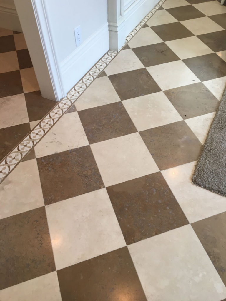
Balance becomes immediate when alternating tiles are framed by a subtle perimeter that defines the entry zone without overpowering it. This pattern works especially well in foyers that open directly into living areas, as the border creates a natural transition while keeping the layout intentional. Using neutral contrasts such as warm ivory paired with muted charcoal prevents the checkerboard from feeling dated or overly graphic. The surrounding border, often executed in a single complementary tone, reins in visual movement and keeps the floor grounded. Proper scale matters here; medium-format tiles maintain clarity without crowding limited square footage. Grout color should remain understated to avoid interrupting the rhythm of the pattern. This approach adds architectural character while still supporting resale-friendly appeal. Borders can be adjusted to echo door casings or trim tones, reinforcing cohesion throughout the home. When installed with precision, the result feels custom rather than decorative. Homeowners seeking definition without heavy ornamentation often gravitate toward this layout because it provides structure, symmetry, and timeless appeal while remaining practical for daily foot traffic and easy maintenance.
Diagonal Grid Layout
Angled placement introduces movement that subtly reshapes perception, making narrow or boxy foyers feel wider and more dynamic. By rotating square tiles on a forty-five-degree axis, sightlines are extended, which helps reduce the boxed-in feeling common near front doors. This layout pairs well with medium to large tile sizes, allowing the diagonal lines to read clearly rather than appearing busy. Consistent grout spacing is essential, as irregular joints quickly disrupt the visual flow. Neutral palettes work best, letting geometry take precedence over color contrast. This pattern performs particularly well in transitional and contemporary homes, though it can also modernize traditional spaces when paired with classic materials like stone or porcelain. Cutting accuracy along walls becomes more critical, so professional installation is strongly recommended. When executed correctly, the diagonal grid feels deliberate and tailored rather than decorative. It draws attention downward in a refined way, encouraging a sense of arrival without overwhelming surrounding elements. Homeowners appreciate how this layout disguises minor floor irregularities while still delivering a polished, custom-floor appearance.
Micro-Herringbone Tile Run
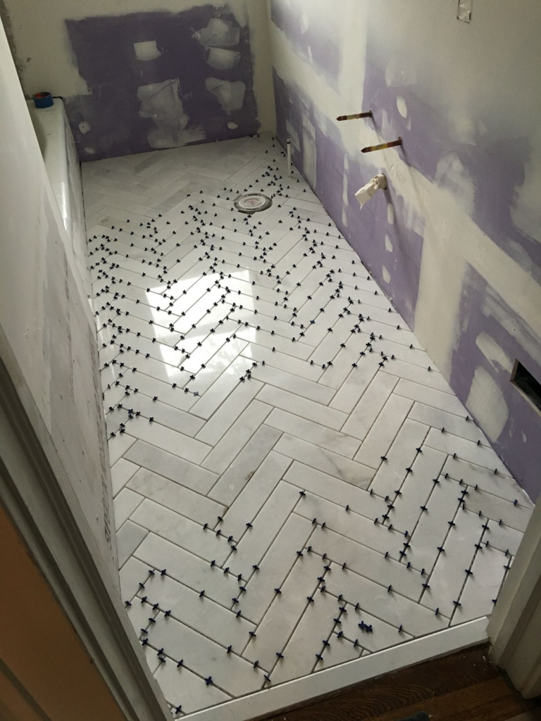
Fine-scale patterning introduces craftsmanship through repetition, especially when narrow tiles are arranged in a compact zigzag formation. Unlike oversized herringbone floors, smaller units maintain proportion in foyers with limited square footage. This layout excels when executed in stone-look porcelain or matte ceramic finishes that soften contrast and reduce glare. Directional placement should follow the longest wall or primary entry path, allowing the pattern to guide movement naturally into the home. Subtle color variation within the tile adds depth without visual clutter. Grout selection remains critical; closely matched tones preserve continuity and prevent the pattern from feeling fragmented. This approach delivers a tailored, European-inspired feel while remaining durable enough for high-traffic entry zones. Installation precision determines success, as alignment errors become noticeable at this scale. When done correctly, the floor reads as a cohesive surface rather than a busy mosaic. The result balances texture, rhythm, and restraint, making it a strong option for homeowners seeking refined detail that still supports long-term functionality and broad design appeal.
Inset Tile Rug Design

Defined flooring zones help establish hierarchy, especially in open-plan layouts where boundaries are otherwise limited. An inset tile rug achieves this by framing a central pattern within a surrounding field of simpler tile. The effect mirrors a textile rug while maintaining the durability needed for entryways. Contrast should remain intentional rather than dramatic; complementary tones prevent the insert from overpowering the space. This layout works particularly well in larger foyers or those aligned with staircases, where a focal point enhances visual structure. Straight, clean edges reinforce a custom-built appearance, while careful alignment with doorways ensures symmetry. Materials should share similar thickness to avoid uneven transitions. Homeowners appreciate how this design introduces personality without relying on loose rugs that shift or wear unevenly. Maintenance remains straightforward, as the inset is fully integrated into the floor. When thoughtfully planned, this pattern elevates the entry experience and communicates attention to detail from the moment the door opens.
Vertical Brick Stack Pattern

Linear alignment can subtly influence how space is perceived, especially when rectangular tiles are stacked vertically from threshold inward. This orientation draws the eye forward, elongating shorter foyers and emphasizing ceiling height indirectly. Unlike staggered brick patterns, straight vertical stacks deliver a cleaner, more architectural look. Tile proportions matter; elongated planks enhance the directional effect without overwhelming the footprint. Neutral finishes, particularly stone or concrete-inspired surfaces, maintain sophistication and versatility. Grout lines should remain minimal and consistent to preserve clarity. This pattern complements modern and transitional interiors, pairing well with streamlined millwork and understated wall treatments. Installation accuracy is essential, as misalignment becomes immediately visible in stacked layouts. When executed correctly, the result feels intentional and refined rather than decorative. Homeowners often select this pattern for its ability to introduce structure without excessive ornamentation, offering a tailored solution that feels contemporary, durable, and visually calming in high-traffic entry zones.
Mixed-Scale Neutral Mosaic

Variation in tile size creates texture through composition rather than color, offering depth without visual overload. A mixed-scale mosaic blends small and medium units in coordinated neutral tones, allowing subtle contrast to emerge naturally. This pattern performs well in foyers where architectural detail is minimal, as it adds interest underfoot without competing with surrounding elements. Stone-look porcelain or matte ceramic finishes keep the surface grounded and practical. Balanced distribution of tile sizes prevents random appearance, ensuring the layout feels curated. Grout should remain understated to allow the mosaic to read as a unified field. This approach suits both traditional and contemporary homes, adapting easily to various trim styles and wall colors. Durability remains high, as the segmented surface helps disguise wear over time. Homeowners value the handcrafted impression this pattern conveys, even when using manufactured materials. When installed with care, the floor communicates thoughtful design while supporting everyday use, making it a reliable option for those seeking subtle character and long-term performance.
Bordered Hexagon Field

Geometric shapes introduce visual interest through repetition, and hexagon tiles offer a balanced alternative to squares or rectangles. Framing the field with a linear border refines the look, preventing the pattern from feeling overly playful. Scale selection remains critical; medium hexagons provide clarity without crowding smaller foyers. Neutral palettes maintain versatility, allowing the geometry to stand out through form rather than color contrast. Borders often mirror trim or door hardware finishes, reinforcing cohesion throughout the space. Precision during installation ensures clean transitions between the hex field and perimeter. This layout works particularly well in homes that blend classic and modern influences. Homeowners appreciate how the border anchors the pattern, lending structure and permanence. Maintenance remains manageable, as quality materials resist chipping and staining. When thoughtfully executed, this design feels intentional, architectural, and custom, delivering a strong first impression without sacrificing practicality or long-term appeal.
Oversized Grid With Tight Grout

Larger-format tiles arranged in a clean grid create a calm, expansive effect that suits both small and generous entryways. Tight grout spacing minimizes visual interruption, allowing the surface to read as continuous rather than segmented. This layout pairs well with stone-inspired porcelain or concrete-look finishes that emphasize texture over pattern. Precision cutting and leveling are essential, as imperfections are more noticeable at scale. Neutral tones enhance longevity, supporting evolving décor styles over time. The grid layout reinforces order and symmetry, offering a tailored appearance that feels deliberate rather than decorative. Homeowners often select this option for its ability to make spaces feel larger and more refined. The simplicity of the pattern highlights material quality, making tile selection particularly important. When installed correctly, the floor delivers understated elegance and durability, providing a custom look rooted in restraint, balance, and long-term functionality.
Offset Square Pattern

Subtle movement emerges when square tiles are shifted slightly rather than aligned in a strict grid. This offset arrangement introduces rhythm while maintaining a sense of order. The pattern works best with uniform tile sizes and muted color palettes that prevent visual clutter. Slight staggering helps disguise minor imperfections in subfloor alignment, making it a practical choice for older homes. Grout lines should remain consistent to preserve cohesion. This layout bridges traditional and contemporary aesthetics, adapting easily to various architectural styles. Homeowners appreciate its understated character, which adds interest without dominating the space. Installation accuracy remains important, though the offset provides flexibility compared to rigid grids. When executed thoughtfully, the result feels relaxed yet intentional. The floor supports daily wear while contributing subtle sophistication, making it a dependable option for foyers that require both visual appeal and practical performance.
Tone-on-Tone Pattern Play

Depth can emerge through nuanced color variation rather than bold contrast. Using tiles within the same color family but differing slightly in shade creates a layered effect that feels refined and intentional. Patterning remains subtle, allowing texture and light interaction to carry visual interest. This approach works well in foyers with limited natural light, as it avoids harsh contrasts. Matte finishes further enhance softness and reduce glare. Consistent grout tones help unify the surface, preventing fragmentation. This layout complements a wide range of interior styles, from classic to contemporary. Homeowners value the understated elegance and versatility it offers. Installation precision ensures the pattern reads cohesive rather than random. When done well, the floor feels custom through restraint, delivering visual richness without overwhelming the entry experience.
Framed Medallion Centerpiece

Centralized detailing draws attention intentionally, especially in foyers with sufficient floor space to support a focal element. A medallion framed within a surrounding field creates a sense of formality and craftsmanship. Symmetry becomes essential, with precise alignment to doorways and architectural features. Neutral or muted color schemes prevent the centerpiece from feeling overly ornate. Material consistency ensures durability and cohesion. This layout suits homes with traditional or transitional influences, though simplified designs can adapt to modern spaces as well. Professional installation is strongly recommended due to the complexity involved. Homeowners appreciate how this pattern establishes a strong sense of arrival. When balanced carefully, the result feels bespoke rather than decorative, offering a statement that remains timeless and well-integrated.
Straight Lay With Accent Strip

Clean alignment provides structure, while a narrow accent strip introduces definition without overwhelming the floor. Tiles laid in a straight pattern maintain clarity and order, supporting both small and large foyers. The accent strip, often placed near thresholds or transitions, adds subtle distinction. Material contrast should remain restrained, relying on texture or finish differences rather than bold color shifts. This layout complements a wide range of interior styles, offering flexibility and longevity. Installation accuracy ensures the accent reads intentional rather than incidental. Homeowners appreciate the balance of simplicity and detail, making this pattern a reliable choice for those seeking understated customization. When executed thoughtfully, the floor feels polished, practical, and quietly distinctive.