
Color choices at the foyer influence mood, light perception, and how the entire home is experienced from the first glance. The right paint shade can make narrow entryways feel open, highlight architectural details, and create a smooth visual transition into adjoining rooms. Undertones, sheen level, and interaction with natural and artificial lighting matter more here than in most spaces. Neutral paints, warm whites, muted greens, and soft grays often perform best when selected thoughtfully. This guide breaks down reliable, designer-approved paint colors that support flow, durability, and long-term appeal, helping homeowners avoid guesswork and achieve a welcoming, polished entry experience.
Warm Limestone Greig
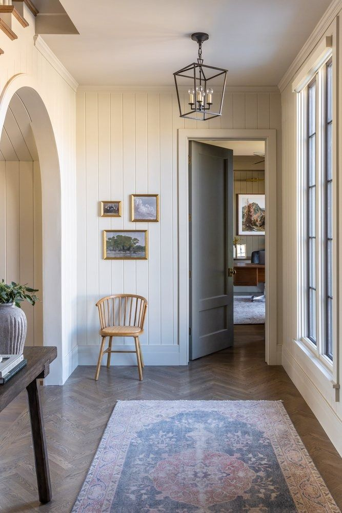
Natural light interacts beautifully with this balanced neutral, giving foyers a grounded yet welcoming presence. The subtle fusion of beige and gray allows walls to feel substantial without appearing heavy, which is critical in transitional spaces that connect outdoors to interiors. This color works especially well in entryways with stone flooring, light wood accents, or black metal details, as it supports both warm and cool materials effortlessly. Morning light enhances its softness, while evening lighting reveals gentle depth rather than flatness. Homes with open sightlines benefit from this shade because it maintains visual continuity into adjacent rooms. Trim painted in warm white or off-white sharpens architectural edges without harsh contrast. Artwork, mirrors, and console tables stand out clearly against this backdrop, making styling straightforward. This option suits homeowners seeking long-term appeal rather than trend-driven color choices. Its adaptability supports modern, classic, and transitional aesthetics equally. Busy households appreciate how well it masks minor scuffs near doors. Overall, this shade delivers a calm first impression that feels intentional, polished, and easy to maintain while remaining visually interesting throughout the day.
Soft Mushroom Taupe
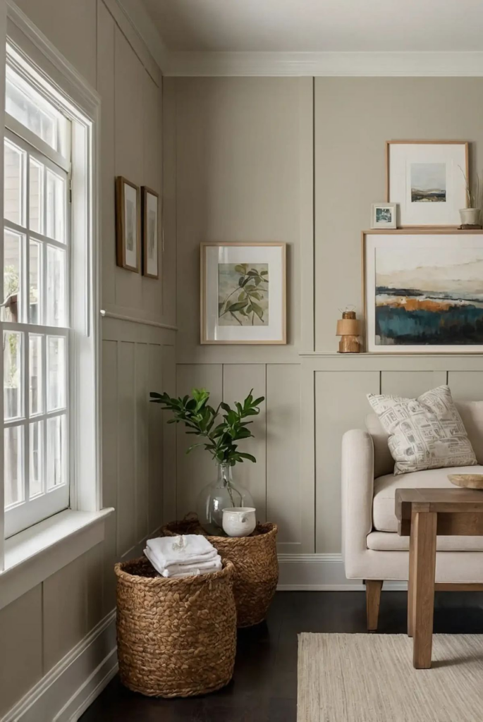
Subtle warmth defines this refined neutral, making it ideal for foyers that need softness without losing structure. The gentle taupe base introduces warmth, while muted gray undertones prevent the space from feeling dated or overly beige. Entryways with limited natural light benefit from its ability to reflect artificial lighting evenly, reducing harsh shadows. This shade pairs seamlessly with brass hardware, oak flooring, and neutral stone finishes. Wall decor appears balanced rather than stark, helping artwork and mirrors integrate naturally. Homes with traditional or transitional architecture often find this color enhances molding and trim details. Seasonal decor transitions easily against this backdrop, from darker winter accents to lighter summer textures. Practical considerations matter here as well, since this hue disguises fingerprints and dust better than lighter creams. It creates a sense of continuity when flowing into living areas painted in similar neutrals. Overall, this option offers dependable elegance, visual warmth, and versatility, making it suitable for homeowners who value subtle sophistication and long-term usability in a high-traffic entry space.
Muted Olive Clay

Earth-driven undertones give this shade a grounded character that works especially well in foyers aiming for warmth with personality. The olive influence introduces depth without overpowering the space, while clay tones soften the overall effect. Natural materials such as wood, rattan, and stone feel especially cohesive against this backdrop. Entryways opening directly to the outdoors benefit from how this color bridges exterior and interior environments. It performs well in both daylight and evening conditions, maintaining a calm appearance under varied lighting. Matte or eggshell finishes enhance its organic quality. This color supports minimal decor by adding inherent visual interest to walls. It also complements black, bronze, and aged brass accents effectively. Homes seeking a nature-connected aesthetic often favor this option for its calming influence. Practicality remains strong, as this shade conceals everyday wear better than pale neutrals. The result is a foyer that feels intentional, welcoming, and rooted in natural design principles without appearing overly rustic or heavy.
Smoky Blue-Gray Slate

Cool sophistication defines this option, offering a refined alternative to standard neutrals. The blue-gray balance introduces depth while remaining controlled and versatile. Foyers with ample natural light benefit from how this shade shifts subtly throughout the day, adding visual interest without distraction. It pairs well with white trim, polished nickel hardware, and darker wood floors. This color supports contemporary and modern interiors, especially where clean lines and minimal decor dominate. Evening lighting brings out its smoky quality, creating a composed and elegant entrance. Artwork and mirrors gain clarity against this background, making styling intentional rather than busy. It also transitions well into adjacent rooms with cooler palettes. Maintenance remains manageable, as mid-tone saturation reduces the appearance of marks near doors. This shade suits homeowners seeking a calm yet confident first impression that balances coolness with warmth through controlled undertones and thoughtful lighting interaction.
Creamy Putty Neutral

Balanced undertones make this shade reliable for foyers requiring warmth without yellowing. The putty influence adds body, ensuring walls feel substantial rather than flat. Entryways with limited square footage benefit from its light-reflective quality, which helps spaces feel open and cohesive. This color works well with both light and dark flooring, offering flexibility during future updates. Trim in crisp white or soft ivory defines edges cleanly. Decorative elements such as benches, baskets, and wall hooks appear intentional rather than crowded. Its neutrality allows architectural details to take priority. Families appreciate its forgiving nature when it comes to everyday wear. Seasonal accessories transition easily without clashing. This option supports both classic and modern interiors, making it suitable for long-term use. Overall, it provides dependable warmth, visual clarity, and adaptability, all essential qualities for a high-traffic foyer that sets the tone for the rest of the home.
Dusty Eucalyptus Green
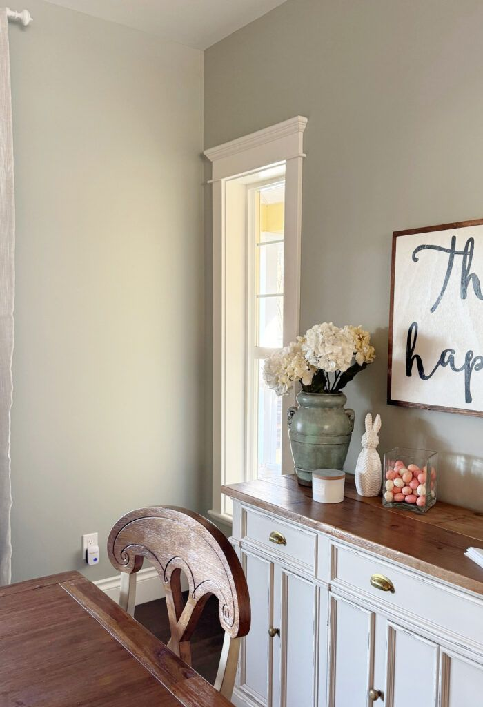
Muted green undertones bring a sense of calm that works particularly well in entry spaces. The eucalyptus influence feels fresh without leaning vibrant, keeping the foyer grounded and inviting. Natural light enhances its softness, while artificial lighting maintains balance rather than casting harsh tones. This shade pairs well with light woods, neutral stone, and black accents. Homes aiming for a relaxed, nature-inspired look often favor this option. It introduces color without overwhelming decor or architectural features. Artwork and mirrors remain prominent, supported by a gentle backdrop. Practical benefits include reduced visibility of scuffs and dust. This shade transitions smoothly into adjacent neutral rooms, maintaining cohesion. It suits homeowners seeking subtle color that still feels distinctive. The overall effect is welcoming, composed, and thoughtfully connected to natural design influences without feeling trend-dependent or overly bold.
Moody Charcoal with Warm Undertone
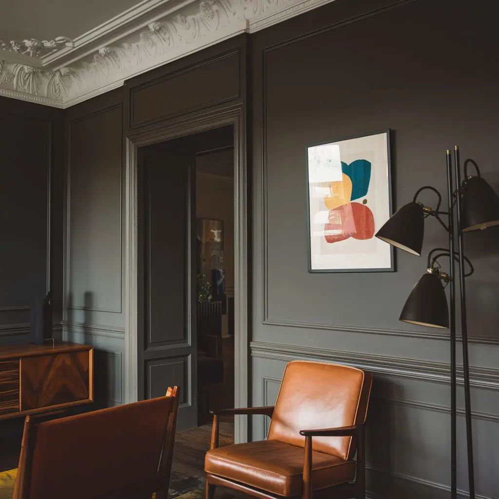
Depth and warmth combine here to deliver a dramatic yet approachable foyer color. The warm undertone prevents the charcoal base from feeling cold or stark. Entryways with good lighting benefit most, as the shade creates contrast without closing in the space. Lighter trim and ceilings balance the richness effectively. This color highlights architectural details and creates a strong backdrop for statement mirrors or artwork. Homes with modern or industrial influences often find this option aligns well with metal accents and darker flooring. Despite its depth, maintenance remains manageable due to mid-range saturation. It sets a confident tone while remaining livable for daily use. This choice suits homeowners seeking a bold first impression that still feels grounded, intentional, and welcoming rather than overpowering.
Pale Sandstone Beige
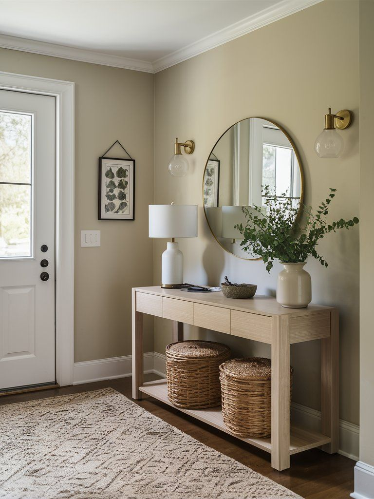
Subtle warmth defines this versatile neutral, offering a safe yet refined option for foyers. The sandstone influence adds depth beyond standard beige, preventing a washed-out appearance. Entryways benefit from its ability to reflect light gently, improving brightness without glare. This shade works well with natural wood, stone tiles, and neutral textiles. It supports both traditional and contemporary interiors with ease. Wall decor feels cohesive rather than stark, allowing flexibility in styling. Practical considerations include strong resistance to visible wear near entrances. Seasonal changes feel seamless against this backdrop. This option appeals to homeowners seeking reliability, warmth, and understated elegance. The overall result is a welcoming, balanced foyer that feels timeless and adaptable without drawing unnecessary attention.
Subtle Blush-Beige Wash

Gentle warmth sets this shade apart, offering a soft alternative to standard neutrals. The blush undertone remains restrained, preventing the foyer from feeling overly decorative. Natural light enhances its warmth, while evening lighting maintains balance. This color pairs well with brass accents, light wood, and neutral stone. Entryways gain a welcoming, refined character without appearing themed. It works especially well in homes seeking a softer first impression. Decor elements stand out clearly without harsh contrast. Practicality remains strong, as mid-light saturation reduces visible wear. This option suits homeowners wanting warmth with subtle personality, delivering a calm, inviting entry that feels polished and approachable.
Deep Ink Blue Accent
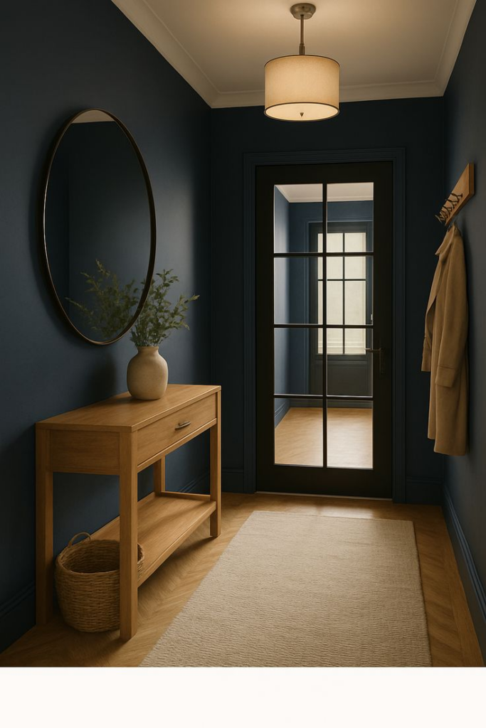
Used thoughtfully, this shade delivers depth and sophistication to foyer spaces. The ink-like quality offers richness without appearing overly bold when balanced with light trim and flooring. Entryways with strong lighting benefit most, as the color maintains clarity rather than heaviness. It pairs effectively with brass, black, and natural wood accents. This option works well for accent walls or full applications in larger foyers. Artwork and mirrors gain prominence against this backdrop. Despite its intensity, maintenance remains manageable due to controlled undertones. This choice suits homeowners seeking a confident, tailored first impression that feels modern and intentional.
Earthy Terracotta Tint

Warm mineral tones define this inviting option, offering character without overwhelming the space. The terracotta influence feels softened, making it suitable for everyday living. Entryways benefit from its warmth, especially in cooler climates or north-facing homes. This shade pairs beautifully with natural wood, woven textures, and neutral stone. Lighting enhances its richness without pushing it too dark. Practical benefits include excellent camouflage for everyday wear. It supports homes seeking warmth and personality rooted in natural materials. The result is a welcoming foyer that feels grounded, expressive, and thoughtfully styled.
Quiet Sage with Gray Base
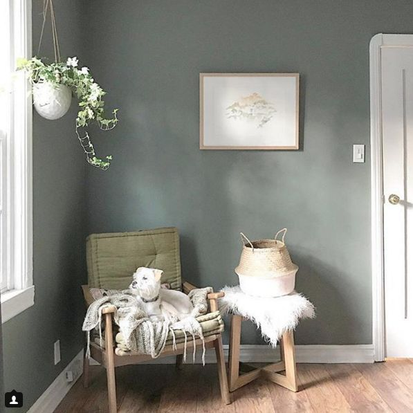
Balanced undertones make this shade dependable for foyers seeking calm color. The gray base keeps the sage influence muted and refined. Natural light enhances its softness, while artificial lighting maintains consistency. This color pairs well with light woods, matte black accents, and neutral flooring. It introduces color without dominating the space. Practicality remains high due to mid-tone depth. This option suits homeowners seeking subtle color that feels timeless. The overall effect is composed, welcoming, and visually balanced, making it an excellent choice for entryways that prioritize calm and cohesion.