
First impressions matter most at the front door, where color, light, and layout quietly shape how a home feels. Blue and white entryway styling offers a balance of freshness and order that works across modern, coastal, farmhouse, and classic interiors. This palette brightens narrow foyers, enhances natural light, and creates visual calm without sacrificing character. Practical styling choices also help manage daily clutter while keeping the space polished. This guide focuses on smart, real-world ideas that blend function with visual impact, making it easier to design an entryway that feels welcoming, cohesive, and effortlessly put together from the moment guests step inside.
Soft Blue Walls With Crisp White Trim

Subtle color contrast at the entry immediately sets a refined tone while remaining welcoming and practical for daily use. Pale blue wall finishes introduce calm visual depth without overwhelming the space, while sharply defined white trim keeps architectural lines clean and intentional. This pairing works especially well in entryways with limited square footage because lighter blues reflect natural light and prevent walls from feeling closed in. Trim around doors, baseboards, and ceilings acts as a visual frame, giving the entire area a finished appearance that feels thoughtfully designed rather than incidental. This approach also offers flexibility for homeowners who enjoy seasonal styling, as both hues adapt easily to warmer or cooler decor changes throughout the year. Blue walls help mask minor scuffs common in high-traffic entry zones, while white trim maintains clarity and structure. When paired with simple lighting and understated hardware, the color balance feels timeless instead of trend-driven. Homes with open floor plans benefit from this combination because it transitions smoothly into adjoining spaces without abrupt contrast. The result is an entryway that feels composed, bright, and visually grounded while still allowing furniture, artwork, or rugs to stand out naturally.
White Console Anchored By Blue Accent Art
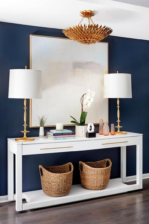
Visual balance often begins with a single focal point that anchors the entire entryway layout. A streamlined white console provides a neutral foundation while blue-toned artwork above it introduces personality without clutter. This arrangement draws the eye upward, making ceilings appear taller and the space more intentional. Blue accent art works particularly well when it echoes subtle tones found elsewhere, such as runners, cushions, or decorative bowls, creating cohesion without repetition. White furniture keeps the entry light and adaptable, especially in narrow foyers where darker pieces may feel heavy. Art selections featuring abstract brushwork, coastal motifs, or muted geometric patterns add interest without overwhelming the setting. Practicality also plays a role, as console surfaces remain easy to style and maintain. Storage baskets or trays beneath can mirror the blue accents while keeping essentials organized. This combination suits both modern and transitional homes because it blends clean structure with expressive detail. Over time, artwork can be updated without replacing furniture, making this setup both cost-effective and visually versatile. The entry feels curated, calm, and polished, offering guests a clear sense of the home’s overall aesthetic upon arrival.
Navy Entry Door Framed With Clean White Walls
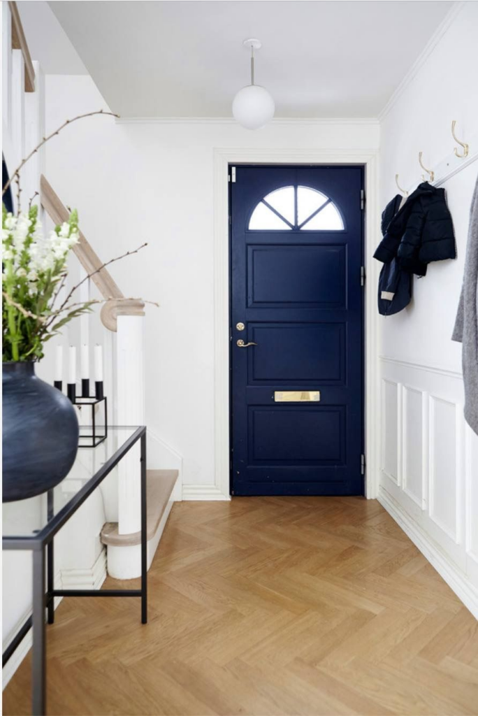
Strong contrast at the threshold creates immediate curb appeal while establishing a confident interior tone. A navy-painted entry door introduces depth and sophistication, especially when surrounded by crisp white walls that highlight its presence. This pairing defines the doorway as a focal feature rather than a background element, making arrivals feel intentional and memorable. Inside the home, the same contrast continues seamlessly, reinforcing visual consistency from exterior to interior. White walls reflect light effectively, preventing darker door tones from dominating the space. Navy finishes also prove practical in busy households, as they conceal wear better than lighter shades. Hardware in brushed brass or matte black complements the color pairing without competing for attention. This approach works across architectural styles, from classic to contemporary, because the contrast remains clean and structured. Seasonal decor becomes easier to integrate, as both colors support a wide range of textures and materials. The overall effect is welcoming yet defined, offering a sense of stability and refinement the moment the door opens. This design choice elevates the entryway experience while remaining timeless and highly functional.
Blue Pattern Runner Paired With White Flooring
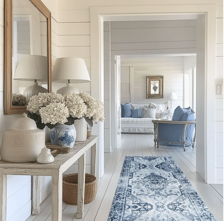
Floor treatments often carry the visual weight of an entryway, especially in homes with open layouts. A patterned blue runner placed over white flooring introduces movement and texture while guiding foot traffic naturally through the space. The contrast ensures the rug stands out without feeling visually heavy, keeping the area bright and approachable. Blue patterns add character while disguising everyday dirt and wear, making them ideal for high-use zones. White flooring, whether tile or sealed wood, enhances light reflection and keeps the entry feeling expansive. The runner’s linear form also helps elongate narrow spaces, subtly improving proportions. Pattern choices ranging from classic motifs to modern geometrics allow homeowners to personalize the look without overwhelming the room. This combination works especially well when nearby furnishings remain simple, letting the rug serve as the primary decorative element. Easy maintenance and replaceability make runners a practical investment for evolving tastes. Together, blue pattern and white flooring create a grounded yet fresh entryway that balances style, durability, and visual clarity for daily living.
Dusty Blue Built-Ins With White Hardware
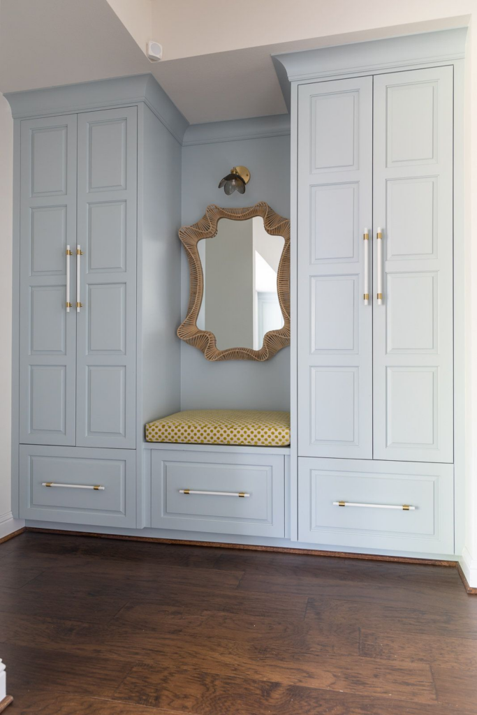
Built-in storage becomes a design feature when color and finish are thoughtfully coordinated. Muted blue cabinetry offers visual softness while still providing definition against neutral walls. White hardware adds contrast without drawing unnecessary attention, keeping the look clean and cohesive. This combination works well in entryways that require practical storage for shoes, bags, or seasonal items without sacrificing style. Dusty blue tones feel grounded and timeless, avoiding the intensity of darker shades while offering more interest than standard neutrals. White knobs or pulls reflect light and maintain clarity, especially in compact areas. These built-ins integrate seamlessly with surrounding decor, allowing benches, hooks, or shelving to feel intentional rather than utilitarian. The color pairing also supports long-term flexibility, as accessories can shift without clashing. Families appreciate the durability and organization benefits, while guests notice the refined finish. The result is an entryway that feels calm, structured, and thoughtfully planned, balancing everyday function with enduring visual appeal.
White Entry Bench With Blue Cushions
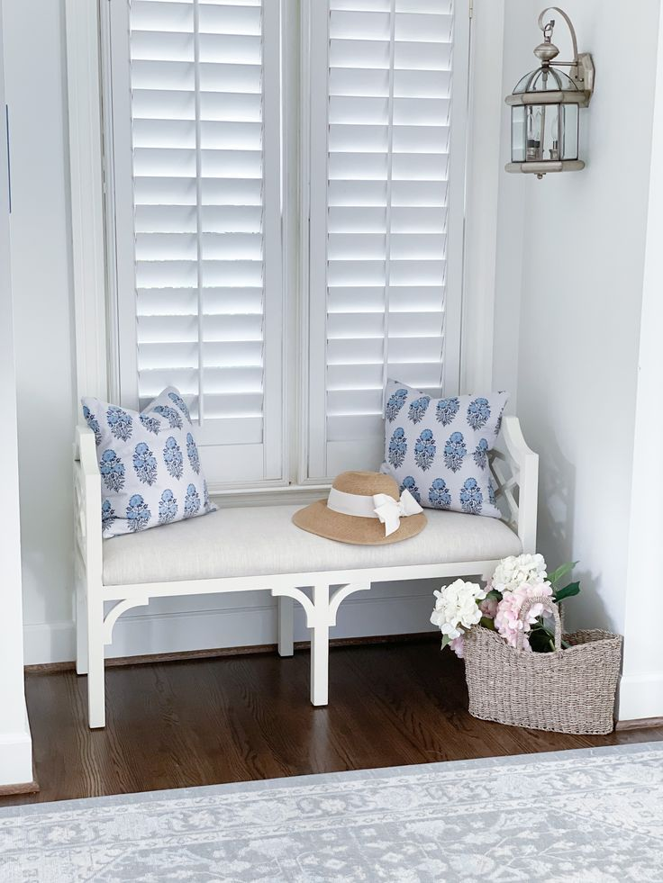
Seating in an entryway improves comfort while contributing to overall visual balance. A white bench keeps the foundation light and adaptable, while blue cushions introduce color in a controlled, flexible way. This setup works well in both large and compact foyers, offering functionality without visual clutter. Cushions provide an opportunity to layer pattern or texture subtly, enhancing interest without overwhelming the space. Blue tones add calmness and pair easily with surrounding decor elements like runners or wall art. White seating surfaces reflect light, helping the entry feel open and organized. Cushions can be updated seasonally, making the arrangement versatile and budget-friendly. Practical storage beneath the bench maintains order while keeping essentials within reach. This combination suits a wide range of design styles, from coastal to transitional, due to its simplicity and balance. The overall effect feels inviting and purposeful, creating a comfortable pause point while reinforcing a cohesive blue and white palette throughout the entryway.
Blue And White Gallery Wall With Minimal Frames
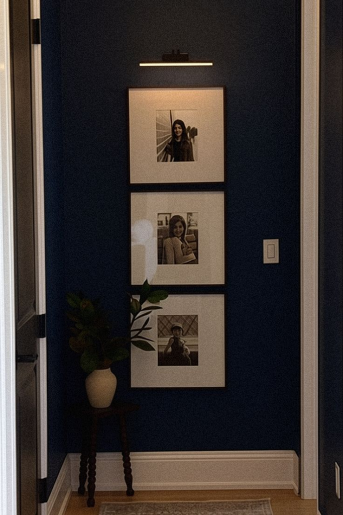
Wall displays gain impact when color and structure remain disciplined. A blue and white gallery wall using minimal frames introduces personality without overwhelming the entryway. Clean-lined frames keep attention on the artwork rather than the hardware, ensuring visual clarity. Blue-toned prints, sketches, or photography create cohesion while allowing individual pieces to stand out. White matting enhances contrast and keeps the arrangement feeling light. This approach works well in narrow or transitional spaces where decor must remain visually controlled. Consistent spacing and alignment contribute to a polished appearance that feels intentional rather than casual. The gallery format allows homeowners to mix personal and decorative pieces, making the space feel lived-in yet refined. Over time, artwork can rotate without disrupting the overall look. The result is an entryway wall that feels curated, expressive, and balanced, offering visual interest while maintaining a calm and organized first impression.
Coastal Blue Tones Balanced With Warm White
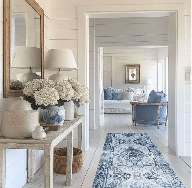
Color balance plays a key role in shaping atmosphere, particularly in entryways that set expectations for the rest of the home. Coastal-inspired blues paired with warm white finishes create a relaxed yet polished impression. Blue hues bring freshness and visual depth, while warmer whites prevent the space from feeling stark or cold. This combination works especially well in homes that receive natural light, enhancing brightness without glare. Subtle texture through paint finishes or woven accessories adds dimension without clutter. Warm white surfaces soften contrasts and create cohesion across walls, trim, and furnishings. Blue accents can appear through art, rugs, or seating, maintaining flexibility in styling. This palette adapts easily to seasonal decor shifts while preserving a consistent base. The overall result feels approachable, airy, and thoughtfully layered, offering a welcoming transition from exterior to interior spaces without sacrificing structure or refinement.
Blue Statement Mirror On White Backdrop
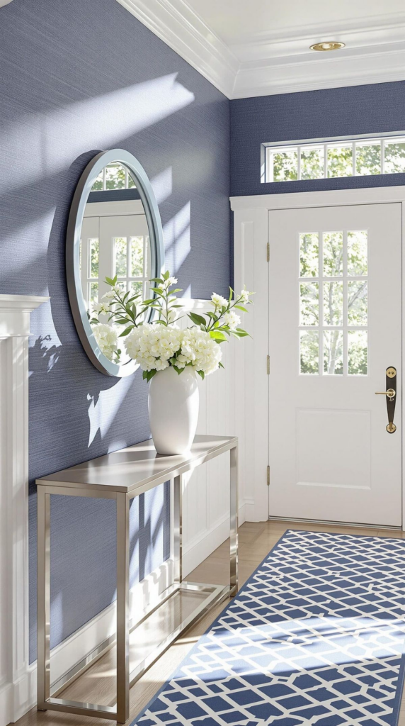
Reflective surfaces amplify both light and space when positioned with intention. A bold blue-framed mirror set against a white wall immediately draws focus while enhancing brightness. The contrast ensures the mirror functions as a decorative feature rather than a background accessory. Blue framing introduces color at eye level, creating balance with lower furnishings or rugs. White walls allow the mirror to stand out cleanly, preventing visual competition. This setup works particularly well in smaller entryways where added depth improves spatial perception. Practical benefits include quick checks before leaving while visually expanding the room. Frame styles can range from classic to contemporary, adapting easily to different interiors. The result feels polished and purposeful, offering both utility and style. This pairing reinforces a cohesive color story while making the entryway feel more open, composed, and visually engaging.
Layered Blue Decor Against White Shiplap
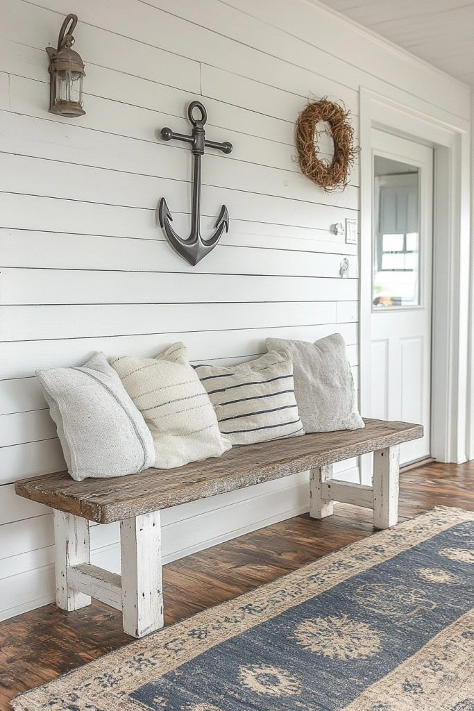
Textured walls provide an ideal backdrop for controlled decorative layering. White shiplap introduces architectural interest while remaining neutral and light-reflective. Blue decor layered thoughtfully against it adds contrast without overpowering the space. Items such as vases, framed prints, or small sculptures bring depth and personality when spaced intentionally. The linear structure of shiplap helps keep displays organized and visually grounded. Blue accents stand out crisply against white, creating clarity and balance. This approach suits both farmhouse-inspired and modern homes due to its adaptable foundation. Decorative layers remain easy to adjust over time, allowing the entry to evolve without major changes. The final impression feels curated rather than crowded, blending texture, color, and restraint for a welcoming and visually cohesive entryway.
Muted Blue Entry Rug With White Console Table
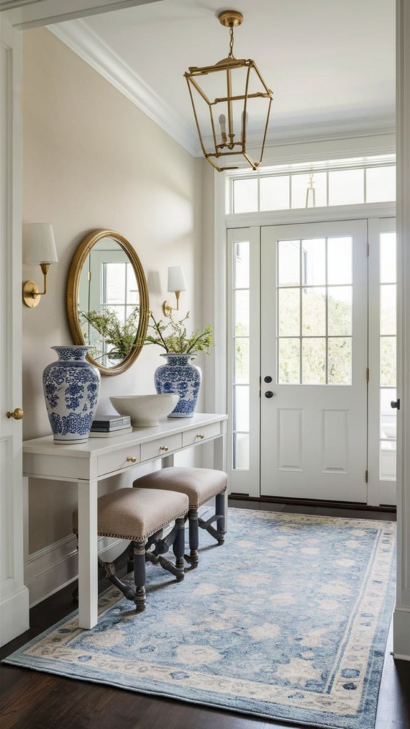
Floor and furniture pairings influence how an entryway functions and feels. A muted blue rug grounds the space while introducing subtle color underfoot. Paired with a white console table, the combination feels balanced and intentional. Blue tones hide everyday wear effectively, making them practical for high-traffic zones. White furniture keeps the area visually open and adaptable. The rug defines the entry boundary, while the console provides surface space for essentials. This pairing works well in both compact and open layouts, offering structure without heaviness. Texture through the rug adds warmth, while clean-lined furniture maintains clarity. Together, they create a cohesive foundation that supports additional decor without visual overload. The entryway feels calm, organized, and welcoming from the first step inside.
Minimal Blue Accents In All-White Entry Space
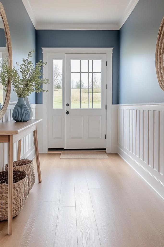
Restrained color use often delivers the most enduring results. An all-white entryway enhanced with minimal blue accents feels fresh, organized, and visually calm. White surfaces maximize light and create a clean foundation, while carefully placed blue elements add interest without distraction. Accents such as bowls, artwork, or cushions provide subtle contrast and prevent the space from feeling sterile. This approach suits modern lifestyles by remaining easy to maintain and adaptable over time. Blue details can shift in tone or placement without disrupting the overall look. The balance supports both functionality and style, ensuring the entry feels purposeful rather than decorative alone. Guests experience a clear, composed introduction to the home, while residents benefit from a timeless palette that evolves effortlessly with changing preferences.