
Layered textures and varied materials bring depth and personality to an entryway without overwhelming the space. Mixed-media walls combine elements such as framed art, mirrors, sculptural objects, wood accents, and textiles to create a gallery-inspired look that feels curated rather than static. This approach works especially well in transitional areas, helping define the entry while connecting it visually to the rest of the home. Thoughtful composition also improves scale, balance, and movement along the wall. For homeowners seeking character beyond traditional gallery frames, this strategy offers flexibility and creative control. The ideas ahead focus on practical ways to mix materials with intention, resulting in an entryway that feels expressive, organized, and visually engaging from the first glance.
Plaster Patch Wall With Soft-Tone Art Frames
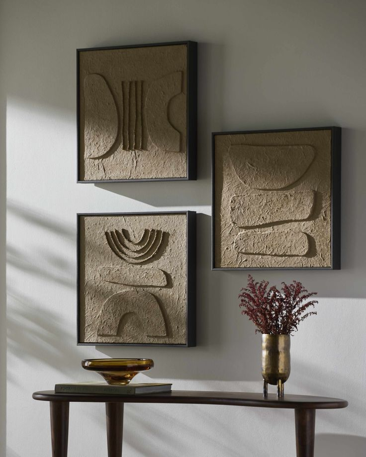
Subtle wall surfaces bring depth when intentionally imperfect textures meet calm visual styling. Plaster patch walls work particularly well in entryways because they soften hard architectural lines while offering a neutral canvas for art. Gentle variations in the plaster finish create organic movement, preventing the space from feeling flat or overly styled. Soft-tone frames in muted beige, clay, greige, or pale taupe reinforce that calm while allowing artwork to feel cohesive rather than busy. Spacing matters here; slightly irregular gaps between frames echo the handcrafted nature of the wall. Lightweight paper art, charcoal sketches, and abstract washes complement plaster without competing for attention. Lighting should remain warm and directional to highlight texture rather than flatten it. This approach suits narrow or transitional entryways where visual calm improves flow. Maintenance stays minimal since plaster naturally disguises small scuffs and wear. When executed thoughtfully, the combination reads intentional, refined, and quietly artistic. It supports mixed-media styling without overwhelming visitors the moment they enter. Designers often favor this setup in gallery-inspired homes because it balances artistry with restraint. The result feels curated, tactile, and timeless, offering visual interest that grows more engaging the longer it’s observed.
Slim Picture Ledges Mixing Art, Objects, And Paper
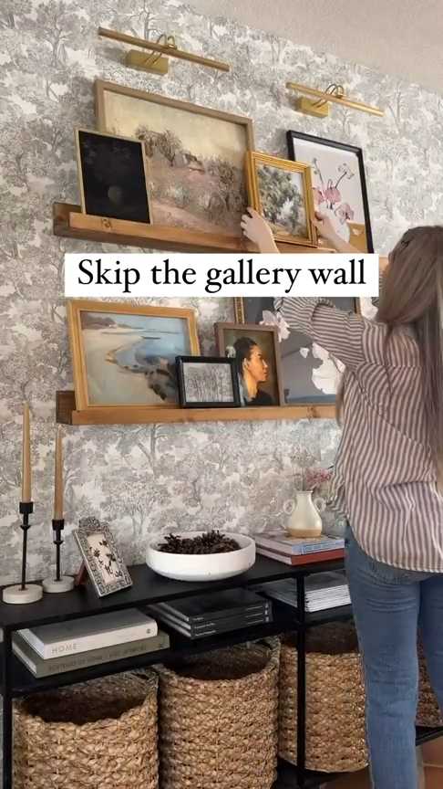
Wall displays feel more flexible when art doesn’t rely solely on nails and fixed placement. Slim picture ledges allow pieces to rest, overlap, and evolve over time, making them ideal for entryways that benefit from seasonal refreshes. Artwork can lean casually against the wall, layered with small sculptural objects, folded prints, or framed sketches. The shallow depth keeps everything visually light while preventing clutter. Paper elements such as sketches, handwritten notes, or monochrome photography add softness and variation without visual heaviness. Ceramic pieces or small stone objects introduce texture, balancing flat surfaces with subtle dimension. Spacing between ledges matters more than quantity; fewer rows feel intentional and gallery-like. Neutral wall colors help unify mixed elements, while darker ledges create contrast and definition. This setup works especially well in rental-friendly homes since adjustments require minimal wall damage. The overall effect feels curated yet relaxed, reflecting personal taste rather than rigid design rules. Over time, the ledges become a living gallery that adapts easily while maintaining visual order and thoughtful balance.
Textured Panel Inserts Paired With Floating Frames
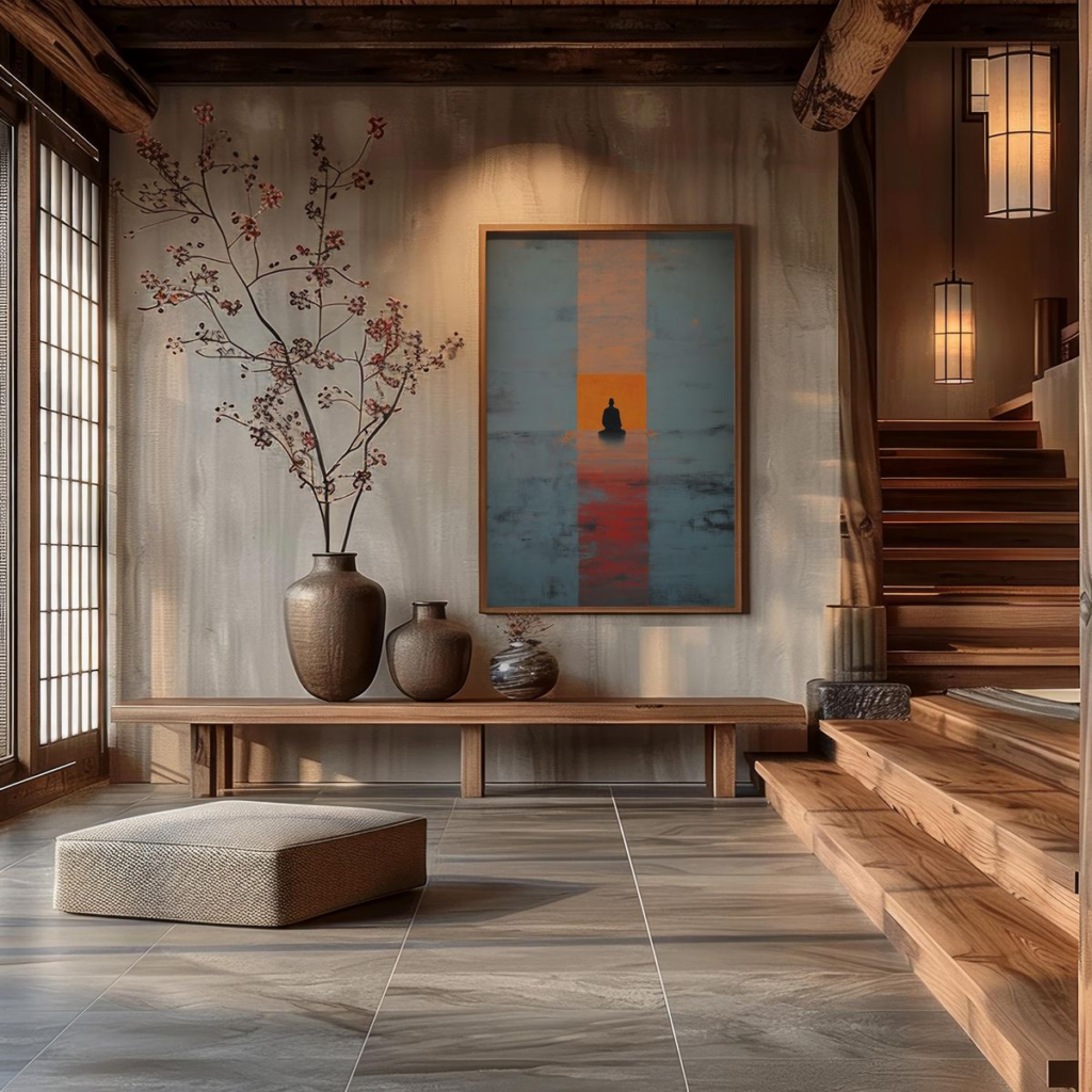
Architectural detail becomes a natural backdrop when wall panels introduce depth behind art. Textured panel inserts, whether subtle grooves, fluting, or raised profiles, create visual rhythm that enhances framed pieces without overpowering them. Floating frames work best in this context because their shadow gaps allow both panel texture and artwork to breathe. Consistent spacing ensures the wall feels intentional rather than busy. Neutral panels in off-white, stone, or warm gray keep the focus balanced between surface and display. Artwork with restrained color palettes or simple line compositions complements the dimensional backdrop. This pairing suits entryways with higher ceilings, where vertical panels elongate the space. Lighting placed at a slight angle emphasizes texture while preventing glare on frames. The result feels architectural and refined, blending interior design with gallery sensibility. Panel inserts also protect walls from everyday wear near doors. When thoughtfully planned, this approach elevates the entryway into a curated transition zone rather than a pass-through space, offering structure, depth, and understated artistic presence.
Single-Color Backdrop With Vintage Frame Mix

Visual cohesion strengthens when a single wall color anchors varied art styles. A monochromatic backdrop allows vintage frames of different shapes, finishes, and eras to coexist without chaos. Muted tones such as warm linen, mushroom gray, or soft olive provide contrast without overpowering ornate details. Patina finishes, aged wood, and brushed metals gain presence against a unified background. Artwork choices can vary widely, from classic portraits to abstract prints, as long as scale remains balanced. The wall color acts as a visual editor, tying disparate elements together. This method suits entryways where personality matters more than symmetry. Vintage frames often tell stories, making the space feel lived-in rather than staged. Consistent mat colors help maintain order within the mix. Strategic spacing prevents overcrowding and preserves clarity. The result feels intentional, expressive, and timeless, offering a gallery-inspired look rooted in character rather than trend.
Art-Integrated Wall Hooks For Visual Balance

Functional elements can become part of the art composition when designed thoughtfully. Wall hooks integrated with artwork serve dual purposes, especially in entryways where storage matters. Sculptural hooks placed beneath or within framed pieces create visual grounding while remaining practical. Materials such as wood, brushed brass, or matte black metal blend seamlessly with gallery walls. Placement is critical; hooks should align with frame edges or negative space rather than interrupting focal art. Lightweight jackets, hats, or scarves add soft movement without overwhelming the display. This approach supports smaller entryways by reducing clutter elsewhere. Art remains the focus while daily essentials stay accessible. Balanced correctly, the wall feels intentional rather than utilitarian. The combination enhances usability without sacrificing aesthetic integrity, proving that mixed-media walls can be both functional and visually composed.
Wallpaper Panels Used As Framed Wall Sections

Pattern gains sophistication when treated as art rather than background. Wallpaper panels framed directly onto walls create structured visual moments that mimic large-scale artwork. This technique works well in entryways where full wallpaper coverage may feel excessive. Framed sections allow pattern introduction without overwhelming the space. Subtle motifs such as linen textures, soft botanicals, or geometric repeats suit gallery-inspired settings. Neutral frames keep attention on the pattern itself. Spacing between panels should feel consistent to maintain rhythm. This approach pairs well with adjacent framed art, offering contrast between texture and imagery. Wallpaper panels also add depth without physical bulk, making them ideal for narrow corridors. The result feels curated and intentional, blending design and art seamlessly.
Wood Slat Accent With Monochrome Artwork
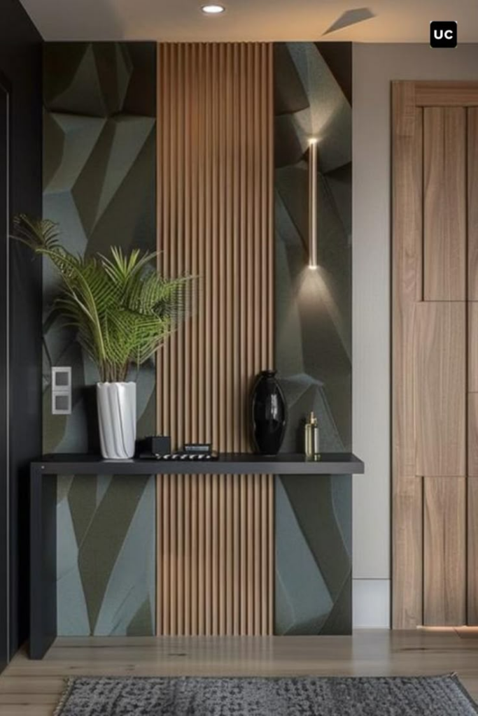
Linear wood elements introduce warmth and structure simultaneously. Slatted wood accent walls provide rhythm that pairs naturally with monochrome artwork. Black-and-white photography or minimal line drawings maintain clarity against the textured backdrop. Wood tones such as oak or walnut soften the contrast, preventing starkness. Even spacing between slats ensures visual order. Artwork should remain simple to avoid competing with the wall’s pattern. This combination suits modern entryways seeking balance between warmth and restraint. Integrated lighting enhances depth while highlighting grain variation. The result feels architectural, grounded, and gallery-ready without appearing decorative for its own sake.
Floating Shelf Blending Ceramics And Line Art
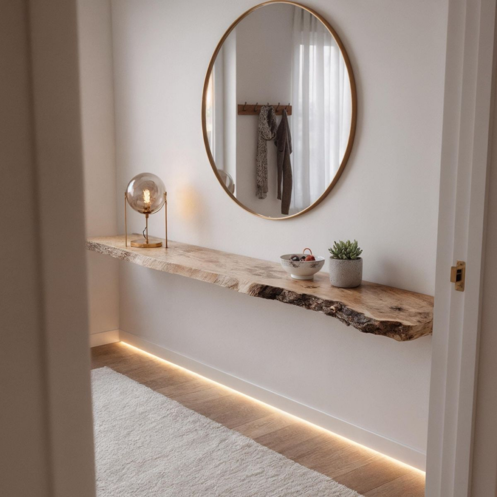
Visual depth becomes more approachable when horizontal surfaces support both art and objects. Floating shelves provide a controlled platform where ceramics and line art can interact without overwhelming the wall. Sculptural pottery introduces volume, shadow, and tactile interest, while framed line drawings offer visual pauses that keep the arrangement readable. Limiting the color palette to warm neutrals, chalky whites, or soft earth tones ensures cohesion across mixed materials. Varying object heights prevents the shelf from appearing flat, while consistent spacing preserves balance. Line art with negative space works best, allowing ceramic forms to stand forward visually. Shelf thickness should remain slim to avoid heaviness, especially in entryways with limited depth. Wall color plays a critical role; muted backdrops help both elements stand out without contrast fatigue. This configuration supports easy updates, making it practical for seasonal refreshes. Overall, the shelf functions as a curated vignette rather than storage, reinforcing a gallery-inspired entryway that feels intentional, flexible, and visually grounded without appearing staged or cluttered.
Canvas And Fabric Art Layered With Framed Prints

Material contrast adds warmth when soft surfaces intersect with structured forms. Canvas and fabric art introduce texture that offsets the rigidity of framed prints, creating a layered display that feels dimensional yet cohesive. Textiles such as linen, cotton, or subtly woven panels absorb light differently, preventing glare and adding visual softness. Framed artwork provides structure and definition, anchoring the arrangement. Keeping tones within a narrow neutral range avoids visual noise while allowing texture to take precedence. Overlapping placement works best when scale differences are intentional, with larger fabric pieces acting as backdrops for smaller framed works. This approach suits entryways that benefit from warmth without sacrificing clarity. Wall-mounted lighting should remain diffuse to highlight material variation rather than cast harsh shadows. The combination reads curated and relaxed, offering a tactile gallery effect that feels welcoming and refined. It balances artistry with comfort, making the entryway feel thoughtfully composed rather than purely decorative.
Oversized Statement Art Anchored By Small Pieces
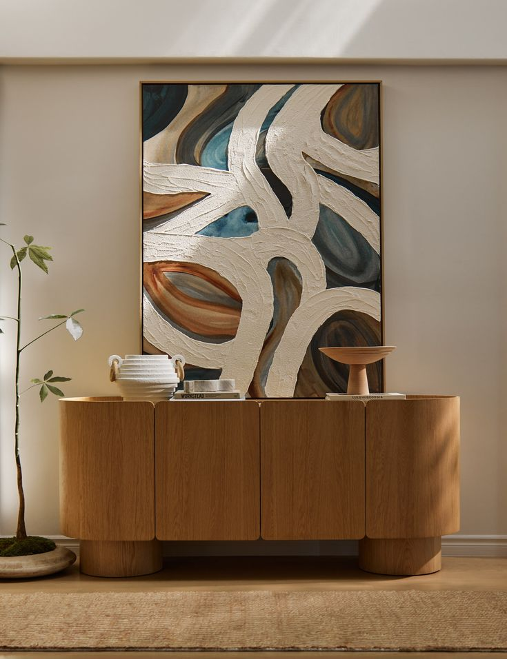
Strong visual hierarchy emerges when scale is used deliberately. Oversized statement art establishes an immediate focal point, grounding the entryway with confidence and clarity. Smaller surrounding pieces then function as visual anchors, preventing the large work from feeling isolated or overwhelming. Consistent framing or tonal alignment helps unify varying sizes. Neutral walls allow scale contrast to stand out without distraction. Spacing is critical; adequate breathing room preserves the impact of the main piece while maintaining balance across the wall. Smaller artworks should echo colors or themes found in the central piece to reinforce cohesion. This arrangement works particularly well in entryways with sufficient wall height, where vertical space supports larger formats. The result feels intentional and gallery-like, guiding the eye naturally while delivering a bold yet controlled first impression.
Shadow Box Frames Mixed With Flat Wall Art
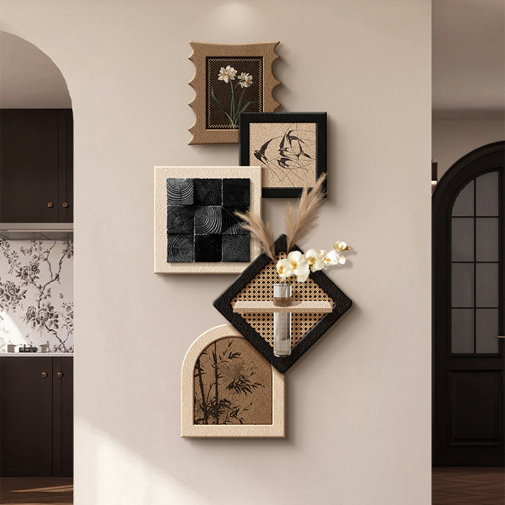
Dimensional contrast enhances gallery walls when depth is introduced selectively. Shadow box frames allow objects, relief pieces, or textured compositions to sit slightly forward, adding physical presence to the display. Flat wall art balances this depth, ensuring the arrangement remains visually legible rather than crowded. Consistent alignment along top or center lines maintains order despite varying depths. Neutral frame finishes help unify the mix, keeping focus on form rather than borders. Objects placed within shadow boxes should remain minimal to avoid visual clutter. This method works well in entryways where layered interest adds character without requiring large wall coverage. The interplay between depth and flatness creates rhythm, resulting in a curated wall that feels intentional, tactile, and thoughtfully composed.
Neutral Gallery Wall With One Sculptural Element
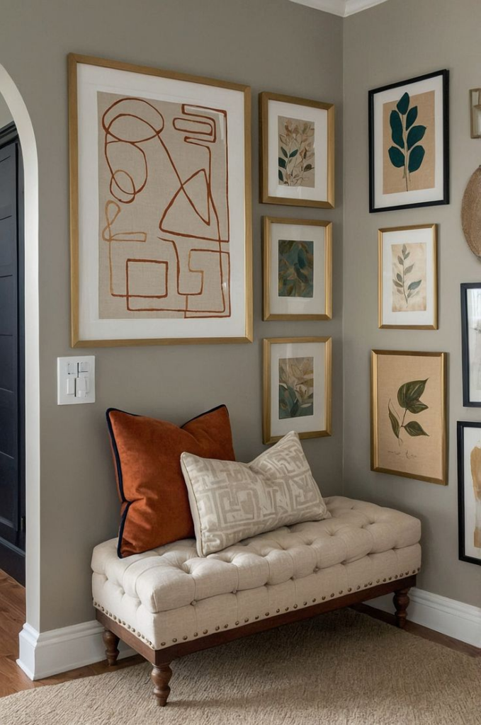
Subtlety gains strength when a single three-dimensional piece anchors an otherwise restrained display. A neutral gallery wall built from calm-toned artwork creates a quiet backdrop that allows one sculptural element to stand out. This focal piece introduces form and shadow, breaking the flatness without overwhelming the composition. Surrounding art should remain understated, relying on line, texture, or tonal variation rather than bold color. Placement matters; the sculptural element should sit slightly off-center to feel organic rather than staged. Neutral palettes ensure longevity and adaptability. This approach suits entryways seeking refinement and clarity, offering visual interest through contrast rather than excess.