The right cabinet color can make a significant difference in how spacious your kitchen feels. Whether dealing with a compact space or simply aiming for a more open and airy ambiance, strategic color choices can create an illusion of a larger kitchen. Lighter shades, reflective finishes, and well-balanced contrasts work together to enhance brightness and depth, making even the smallest kitchens appear more expansive. This guide highlights the best cabinet colors to maximize space perception while maintaining style and functionality. Read on to discover which shades can make your kitchen feel bigger, brighter, and more inviting.
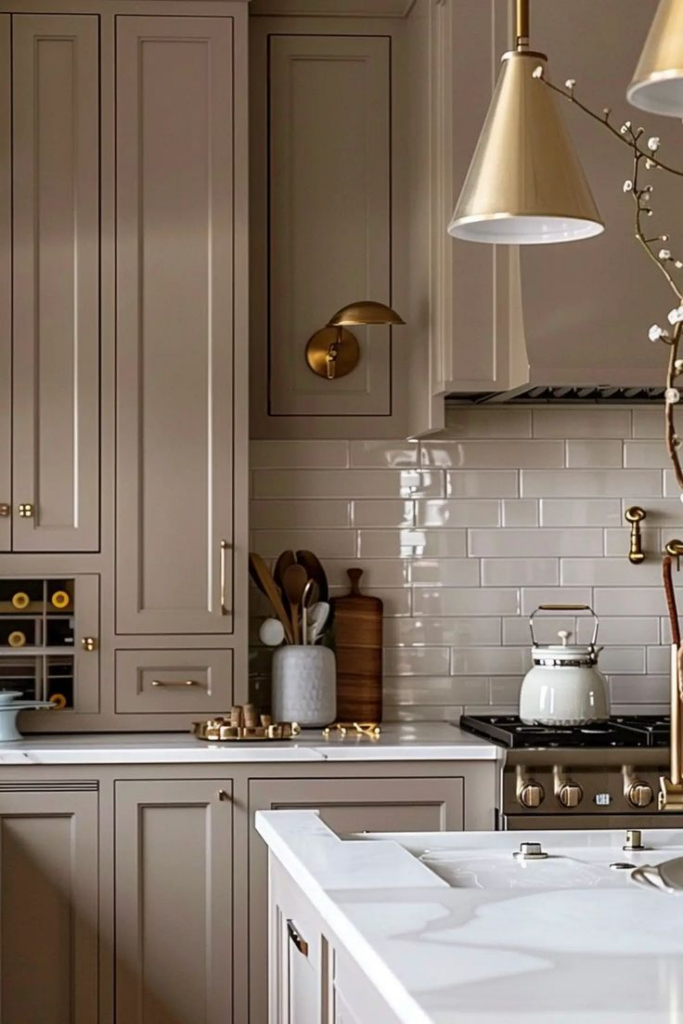
Soft Greige with Matte Finish
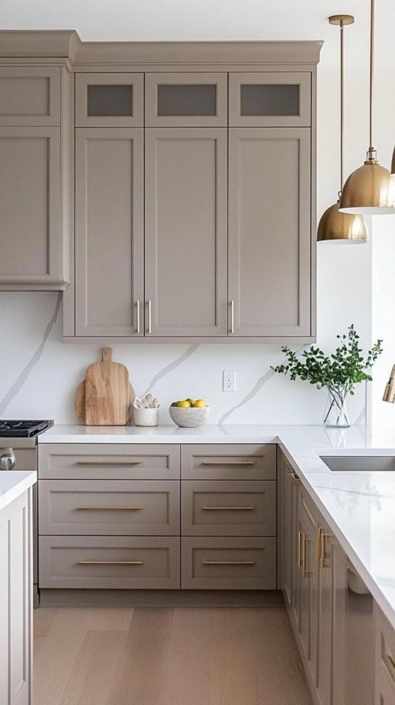
Warm neutrals create an inviting ambiance, and soft greige with a matte finish is an exceptional choice for kitchen cabinets. This hue balances beige and gray, offering a timeless aesthetic that complements various design styles. The matte finish minimizes glare, ensuring a smooth, understated elegance while enhancing the perception of space.
Pairing soft greige cabinets with light countertops and backsplash tiles promotes an open, airy feel. Subtle contrasts, such as brushed nickel or matte black hardware, can define the look without overwhelming the space. This versatile shade works well with natural light, making small kitchens appear more expansive.
Wood or marble countertops with soft veining enhance the muted warmth of this color. For a contemporary look, incorporate under-cabinet lighting to highlight the richness of the finish. Soft greige seamlessly blends with white, pastel, or earthy tones, allowing for effortless styling updates.
Choosing this color ensures a sophisticated yet cozy atmosphere, perfect for modern and traditional kitchens alike. The matte finish adds depth, reducing visual clutter and creating a sleek, polished appeal. Whether used in shaker-style cabinetry or flat-panel doors, this refined shade remains a top contender for expanding the perceived space in compact kitchens.
Powder Blue with White Trim
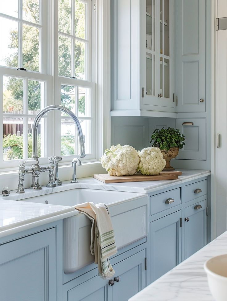
Soft, airy hues like powder blue introduce a refreshing aesthetic that enhances kitchen brightness. When paired with white trim, this color choice adds crisp contrast, making the space feel more expansive and refined. The delicate nature of powder blue reflects light effectively, ensuring a fresh and open ambiance.
Cabinetry in this shade pairs beautifully with white marble or quartz countertops, reinforcing a clean, modern look. Satin or semi-gloss finishes further amplify light dispersion, while silver or brass hardware adds a touch of sophistication. White trim on cabinet edges sharpens the overall design, creating subtle dimension without overpowering the room.
For a seamless transition, opt for light gray or warm beige flooring, which complements the soft blue without creating stark contrasts. Glass-front cabinets or open shelving can enhance the airy aesthetic while maintaining a functional layout. Strategic lighting, such as recessed or pendant lights, helps maintain the color’s vibrancy.
Ideal for coastal, farmhouse, or contemporary kitchen designs, powder blue cabinets with white trim offer a timeless appeal. This palette fosters a serene, welcoming environment while maintaining a sense of spaciousness, making it an excellent choice for smaller or enclosed kitchens.
Pearl White with Glossy Finish
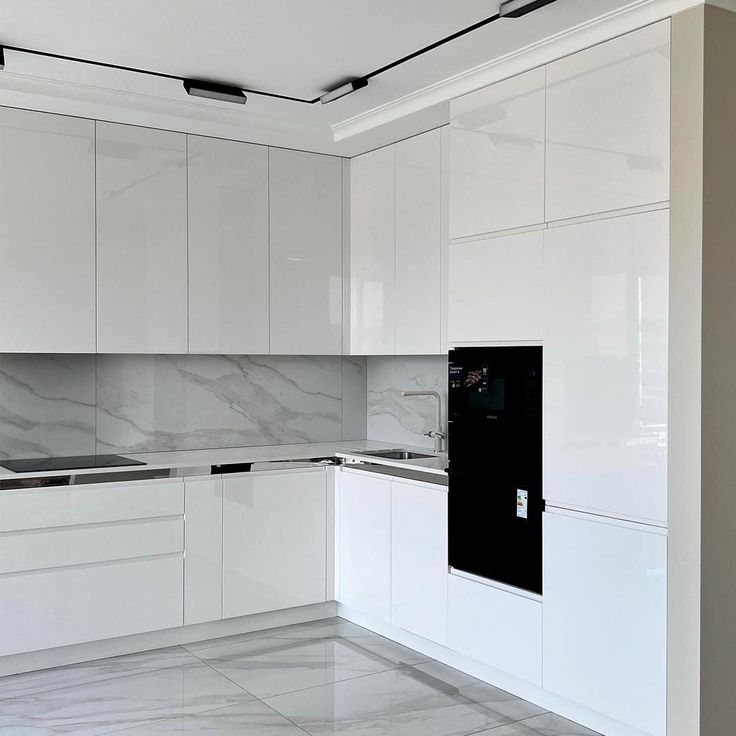
A bright and polished kitchen benefits from the reflective nature of pearl white cabinetry with a glossy finish. This combination enhances natural and artificial lighting, creating a visually expanded space. The glossy sheen not only provides a sleek, high-end appearance but also makes cleaning effortless.
Pairing pearl white cabinets with light gray or beige backsplashes introduces subtle warmth while maintaining a cohesive, open layout. Metallic or crystal-inspired hardware can further elevate the modern appeal, while soft under-cabinet lighting enhances depth. Opting for handle-free or minimalist hardware ensures a streamlined aesthetic, reinforcing spaciousness.
Flooring choices such as pale oak or white-washed wood help maintain an uninterrupted flow. The glossy surface reflects light, making even compact kitchens appear larger and more inviting. Integrating glass cabinet doors or mirrored backsplashes can add dimension while amplifying brightness.
A color palette centered around pearl white allows for flexible decor updates. Whether incorporating pastel accents or warm metallic fixtures, this shade remains effortlessly adaptable. Its sophisticated yet practical nature makes it a preferred choice for those seeking a luminous, spacious kitchen without compromising elegance.
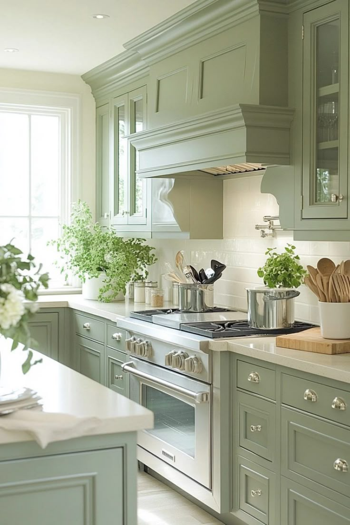
Cool Sage Green
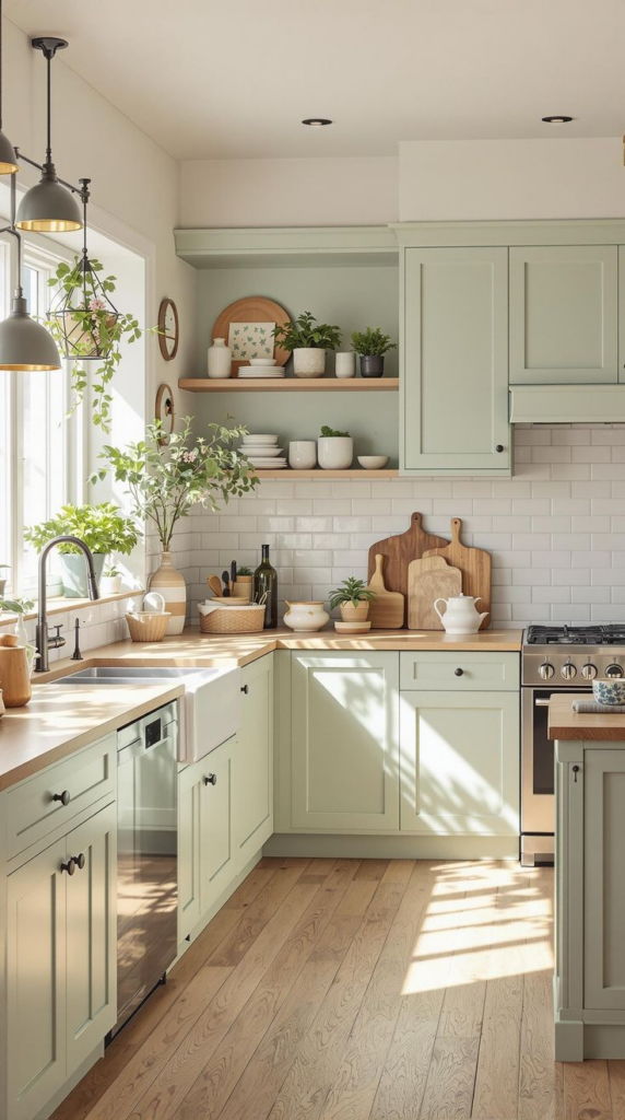
Subtle yet refreshing, cool sage green introduces a soft, nature-inspired touch that enhances the perception of space. This muted green hue reflects light while maintaining a soothing, neutral balance, making it ideal for kitchens with limited square footage.
Pairing sage green cabinets with white or light beige countertops creates a harmonious contrast that brightens the room. Brushed brass or matte black hardware adds sophistication without overwhelming the aesthetic. For added depth, incorporating open shelving in light wood or white finishes can break up the visual weight of solid cabinetry.
Strategic lighting plays a crucial role in maintaining this shade’s vibrancy. Under-cabinet LED strips or pendant lights with warm tones can subtly highlight the color’s calming nature. Complementing the cabinetry with off-white walls and pale wood flooring enhances the airy, spacious feel.
Sage green pairs effortlessly with natural elements such as stone or rattan, reinforcing an organic, inviting atmosphere. Whether used in traditional, modern, or farmhouse-style kitchens, this versatile hue promotes a balanced, elegant aesthetic. Its ability to blend seamlessly with neutral and warm tones makes it a favored choice for those looking to maximize kitchen brightness while maintaining a welcoming ambiance.
Light Taupe with Metallic Hardware
Neutral tones like light taupe provide a refined, understated look that visually expands kitchen spaces. This warm yet sophisticated hue creates a soft backdrop that complements various design elements. The subtle depth of taupe prevents the cabinetry from appearing flat while maintaining a bright, open feel.
Pairing taupe cabinets with metallic hardware—whether in brass, chrome, or matte black—introduces an elegant contrast that enhances depth. Light quartz or marble countertops with veining details add texture, preventing the design from feeling monotonous. A glossy or satin finish can further enhance the room’s brightness.
For flooring, pale wood or neutral tile ensures continuity without overwhelming the palette. Incorporating mirrored or glass cabinet fronts introduces reflective surfaces that amplify the sense of space. White or light gray backsplashes reinforce the open, airy aesthetic while maintaining a timeless appeal.
This color choice seamlessly adapts to contemporary, transitional, or classic kitchen designs. The presence of metallic accents elevates the cabinetry, offering a subtle touch of luxury. With the right lighting and complementary finishes, light taupe cabinets create a sophisticated yet inviting environment, making the kitchen feel more expansive and welcoming.
Frosted Gray
A soft, misty hue like frosted gray adds an understated elegance that enhances kitchen openness. This delicate shade strikes the perfect balance between warmth and cool undertones, ensuring versatility in both modern and traditional settings.
Pairing frosted gray cabinetry with white marble or quartz countertops fosters a clean, seamless aesthetic. Subtle metallic hardware, such as brushed nickel or matte gold, elevates the design without creating visual clutter. The addition of glass cabinet inserts or open shelving can break up solid cabinetry, reinforcing the feeling of spaciousness.
For a cohesive look, opt for a backsplash in muted tones like soft white or pale gray. Strategic lighting—such as recessed or pendant fixtures—helps maintain the color’s clarity, preventing it from appearing too dark. Light wood or gray-toned flooring enhances the room’s continuity, contributing to an effortlessly sophisticated ambiance.
Ideal for those seeking a timeless yet contemporary look, frosted gray cabinetry offers both depth and brightness. The subdued tone provides a refined backdrop that complements a variety of finishes, making it an excellent choice for expanding the visual space in compact or galley-style kitchens.
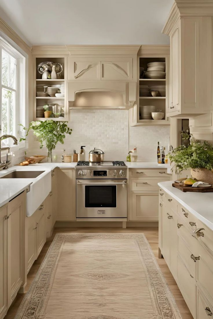
Ivory with Subtle Texture
Warm neutrals like ivory create a timeless foundation that maximizes kitchen brightness. A textured finish introduces depth and character, preventing cabinetry from appearing too uniform. This combination results in an inviting, light-enhancing space.
Pairing ivory cabinets with warm-toned stone countertops adds natural contrast while preserving a cohesive look. Gold or bronze hardware complements the warmth of the shade, while sleek stainless steel accents maintain a modern edge. A subtle texture—such as beadboard panels or a brushed finish—adds visual interest without overwhelming the design.
Soft lighting, including pendant fixtures or LED strips, accentuates the cabinetry’s depth. Complementary elements such as light wood or neutral tile flooring ensure seamless integration. Backsplashes in muted beige or off-white further enhance the room’s airy feel.
Ivory works well in both contemporary and traditional kitchen styles, offering a neutral yet elevated aesthetic. Its ability to reflect light while maintaining warmth ensures an open, welcoming atmosphere. By incorporating a mix of materials and textures, this shade remains an ideal choice for those looking to create a spacious yet inviting kitchen environment.
Chalky Pastel Peach
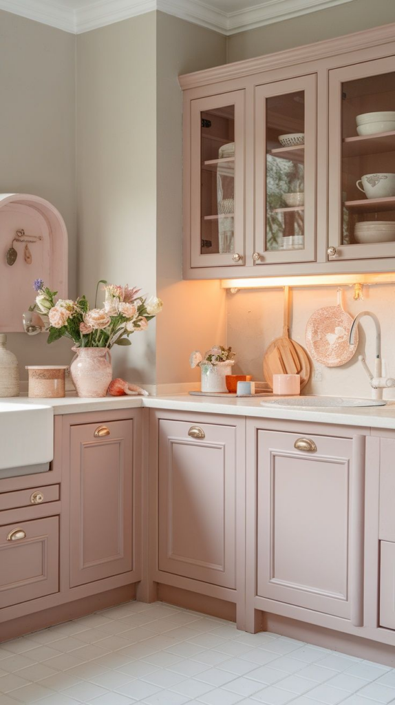
A soft, muted pastel like chalky peach introduces warmth without overpowering the kitchen’s overall aesthetic. The understated tone brings a subtle vibrancy that reflects light effectively, making small spaces appear more open and airy.
Combining pastel peach cabinets with white or cream countertops ensures balance, preventing the color from feeling too bold. Brass or copper hardware enhances the warmth of the shade, adding a touch of sophistication. Opting for a satin or matte finish helps maintain the color’s refined softness while minimizing glare.
To create depth, incorporating light-toned wooden accents—such as shelving or barstools—adds an organic element that complements the pastel hue. A backsplash in soft neutrals, such as beige or off-white, ensures a seamless transition while maintaining a spacious feel.
Soft peach pairs beautifully with warm lighting, making under-cabinet LED fixtures a practical addition. This color choice works well in vintage, farmhouse, or contemporary kitchens, offering a cheerful yet sophisticated aesthetic. Its ability to brighten a space while maintaining a welcoming tone makes it an excellent selection for those looking to subtly introduce color without compromising the sense of openness.
Misty Lavender with White Accents
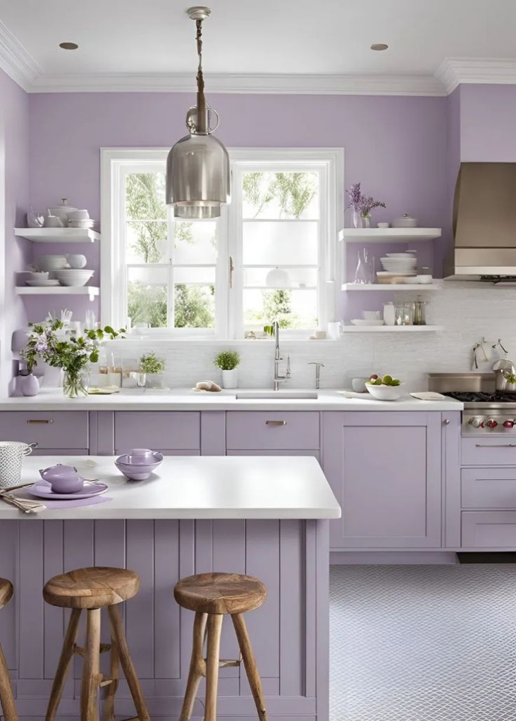
Soft and refined, misty lavender introduces a gentle color contrast that enhances kitchen brightness without overwhelming the space. This muted shade reflects light effectively, maintaining an airy and open ambiance. Paired with white accents, it achieves a balanced and sophisticated look.
White countertops, backsplashes, and trims provide crisp definition, ensuring that the lavender remains the focal point without appearing too saturated. Brushed nickel or matte silver hardware adds a contemporary touch, while glass cabinet inserts reinforce an open, spacious feel. Opting for a satin or semi-gloss finish enhances the subtle vibrancy of this pastel hue.
For flooring, light wood or neutral tiles ensure a cohesive, uninterrupted visual flow. Strategic lighting, such as recessed fixtures or under-cabinet LEDs, helps maintain the color’s luminosity, preventing it from appearing dull. Complementary décor elements, such as soft gray or blush textiles, enhance the overall aesthetic.
Ideal for modern, farmhouse, or French-inspired kitchens, misty lavender with white accents creates a serene yet sophisticated atmosphere. Its ability to introduce color without overpowering the room makes it an excellent choice for expanding visual space while maintaining an elegant and refreshing environment.
Seafoam Green with Satin Finish
Soft greens evoke tranquility, and seafoam green is an excellent choice for creating an inviting, expansive kitchen space. This subtle, cool-toned hue reflects natural and artificial light well, ensuring a bright, open feel. A satin finish enhances its vibrancy while maintaining a smooth, polished appearance.
Pairing seafoam green cabinetry with white or pale gray countertops creates a fresh contrast that enhances depth without cluttering the design. Stainless steel or brushed brass hardware adds a refined touch, complementing the color’s airy nature. Incorporating glass-front doors or open shelving further reinforces a spacious aesthetic.
For a cohesive look, opt for neutral backsplashes in white or soft beige. Light-toned wood flooring or pale ceramic tiles help maintain a continuous flow, preventing visual segmentation. Under-cabinet lighting highlights the satin finish, enhancing the reflective properties that make this color ideal for smaller kitchens.
Whether incorporated in modern, coastal, or transitional designs, seafoam green cabinetry provides a timeless yet contemporary appeal. Its balance between warmth and coolness ensures adaptability, making it an excellent choice for homeowners seeking a color that enhances spaciousness while maintaining a soothing, elegant atmosphere.
Creamy Almond with Light Wood Accents
A warm and inviting hue, creamy almond offers a soft, neutral foundation that enhances the feeling of spaciousness in the kitchen. This shade blends seamlessly with various design styles while providing a light, open aesthetic. Paired with light wood accents, it introduces a natural, organic touch that elevates the overall ambiance.
Cabinetry in this tone works beautifully with quartz or marble countertops in off-white or soft gray, ensuring a harmonious and sophisticated look. Brushed nickel or antique brass hardware enhances the warm undertones, while glass-front cabinets contribute to an open, airy feel. A satin finish further amplifies the light-reflecting properties of this shade.
Light wood flooring or butcher block countertops reinforce the warmth of the palette without compromising the sense of spaciousness. Subtle lighting, such as pendant fixtures in warm metallics, highlights the understated elegance of creamy almond cabinetry. A backsplash in white or beige tones ensures a seamless, uninterrupted flow.
This color choice is perfect for those seeking a balance between coziness and openness. Its timeless appeal, paired with complementary materials, makes it a practical and visually appealing option for expanding the perception of space in any kitchen.
Dusty Beige with Gold Accents
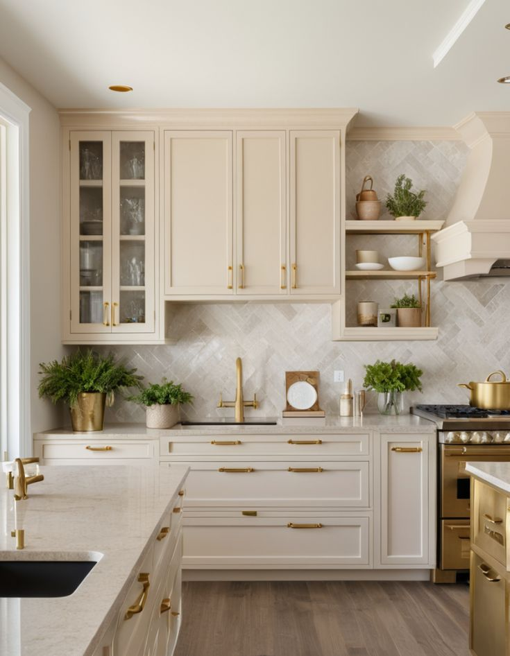
Soft and refined, dusty beige cabinetry introduces warmth while maintaining a neutral backdrop that enhances kitchen brightness. The muted tone prevents the space from feeling stark, creating a balanced environment that feels both spacious and welcoming. Gold accents add a touch of elegance, subtly elevating the overall aesthetic.
Pairing dusty beige cabinets with white marble or quartz countertops ensures a seamless, sophisticated look. The addition of gold hardware—whether in brushed, satin, or polished finishes—introduces a luxurious contrast without overwhelming the design. A semi-gloss or satin finish helps maintain the cabinetry’s soft, light-enhancing properties.
For a cohesive feel, backsplashes in ivory, light gray, or textured white tiles provide subtle depth while ensuring continuity. Light wood or cream-colored flooring reinforces an open, uninterrupted flow, preventing visual segmentation. Glass-front cabinets or mirrored backsplashes can further amplify the perception of space.
Dusty beige is a timeless, versatile hue that adapts to various kitchen styles, from classic to contemporary. Its warm neutrality makes it an excellent choice for smaller kitchens, ensuring an inviting yet open feel. With carefully selected gold accents, this color scheme achieves a refined, high-end look while maintaining an airy, spacious ambiance.
Cloud Gray with Mirror-Backed Panels
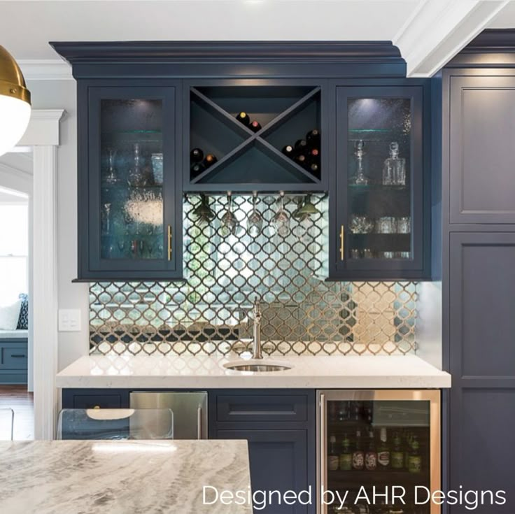
A soft, sophisticated gray brings understated elegance to kitchen cabinetry. Cloud gray, with its light and neutral undertones, enhances brightness while maintaining a modern and timeless appeal. When paired with mirror-backed panels, the reflective surfaces amplify natural light, creating an illusion of depth and expansiveness.
White or off-white quartz countertops complement this shade beautifully, ensuring a cohesive and airy design. Minimalist hardware in polished chrome or matte black provides a subtle yet refined contrast. A semi-gloss or satin finish helps maintain the cabinetry’s soft appearance while enhancing light diffusion.
To maintain a balanced aesthetic, opt for backsplashes in white or soft gray subway tiles. Light-toned flooring, such as pale oak or neutral ceramic tiles, enhances continuity while preventing visual clutter. The use of glass-front cabinetry or mirrored backsplashes further reinforces the feeling of spaciousness.
This combination is particularly effective in contemporary or transitional kitchens, where clean lines and subtle contrasts are key. Cloud gray, paired with mirror-backed elements, not only enhances brightness but also introduces a sense of refinement, making smaller kitchens feel significantly larger and more open.
Muted Lemon Yellow
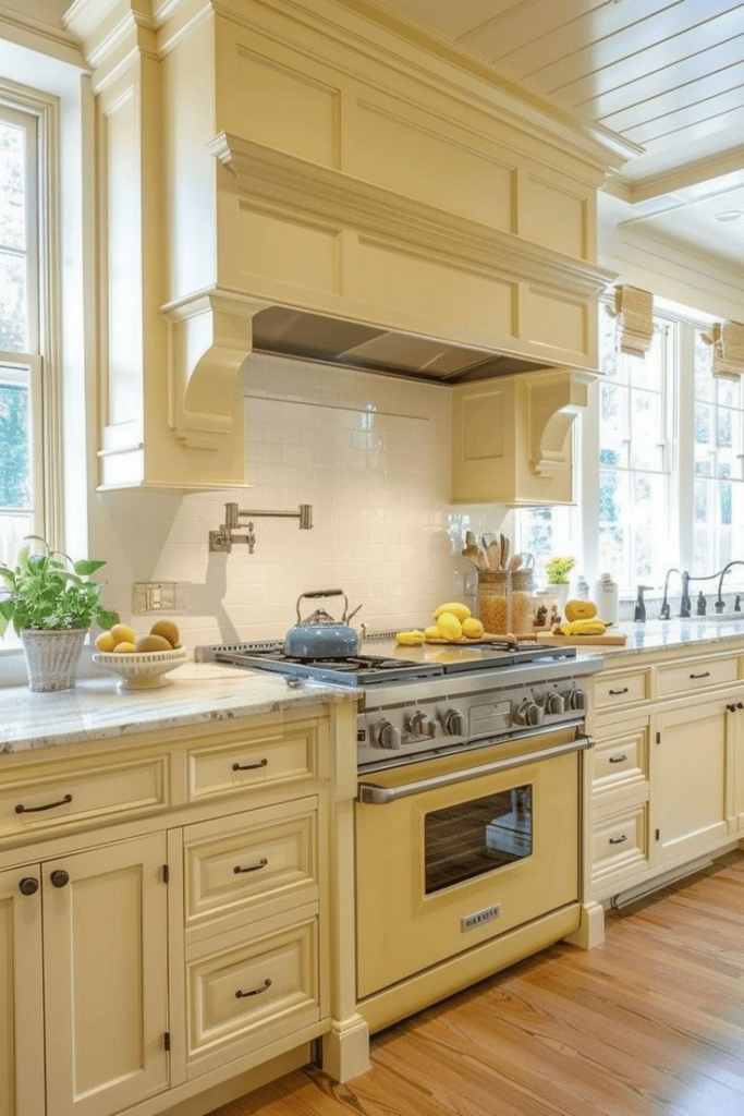
Soft and cheerful, muted lemon yellow cabinetry introduces warmth and light while maintaining a subtle, sophisticated presence. This gentle variation of yellow avoids being overly bold, making it ideal for creating a bright, airy kitchen space.
Pairing this shade with white or light gray countertops ensures a balanced contrast that prevents overwhelming the design. Matte gold or brass hardware enhances warmth, while a satin finish helps reflect light, keeping the space feeling open and inviting. Incorporating white trim or accents ensures a refined, cohesive look.
For flooring, pale wood or neutral-toned tiles maintain an uninterrupted visual flow. A backsplash in white or light beige helps reinforce the cabinetry’s soft vibrancy while ensuring a timeless aesthetic. Under-cabinet lighting highlights the muted tone, preventing it from appearing too saturated.
Ideal for modern, farmhouse, or transitional kitchens, muted lemon yellow provides an uplifting yet elegant ambiance. Its ability to brighten a space while maintaining a calming effect makes it a favored choice for homeowners seeking a color that enhances openness while introducing a subtle hint of warmth and charm.
Silver-Blue with Metallic Highlights
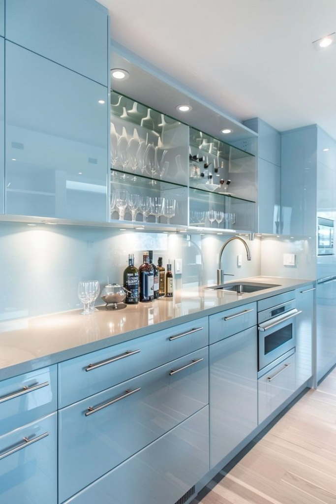
Subtle yet striking, silver-blue cabinetry introduces a refined blend of cool tones and light-enhancing properties, making kitchens feel significantly larger. This sophisticated shade carries a soft metallic undertone that interacts beautifully with both natural and artificial light, creating a fresh, open ambiance. When paired with metallic highlights, the result is a sleek, contemporary aesthetic with a touch of luxury.
For a balanced look, silver-blue cabinetry pairs effortlessly with white or light gray countertops. The addition of metallic elements—such as brushed nickel, chrome, or stainless steel hardware—amplifies the light-reflecting qualities, further expanding the perception of space. A semi-gloss or satin finish enhances the color’s natural luminosity without overpowering the design.
Backsplashes in white subway tiles, marble, or reflective glass contribute to a streamlined, airy atmosphere. To maintain visual continuity, flooring in pale wood, cool gray, or light ceramic tile ensures a seamless transition throughout the kitchen. Pendant lighting in metallic finishes, such as silver or brass, enhances depth while reinforcing the room’s contemporary feel.
Glass-front cabinets or mirrored panels can introduce an additional layer of reflection, maximizing the sense of openness. The combination of silver-blue cabinetry and metallic highlights is particularly well-suited for modern and transitional kitchen styles, offering a polished, spacious feel. Its ability to integrate with both warm and cool tones ensures long-term versatility, making it an excellent choice for those seeking a refined yet timeless kitchen design.